Why I Choose Materials
I choose materials because I always do the same things over and over again and I thought to my self I need to do something else and I need to challenge my self more and do something different I also thought it would be fun and interesting to do.
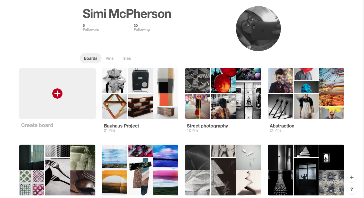
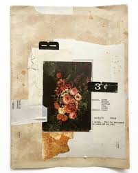
My Pinterest
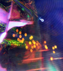

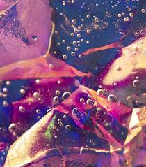
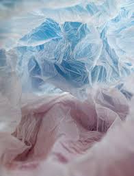
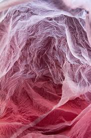
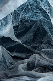
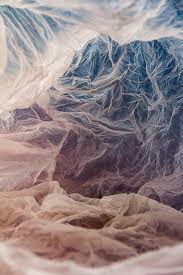
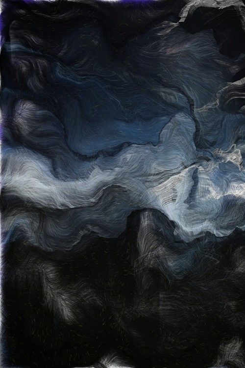
Erin O’Malley
Erin O'Malley's photos are bright, colourful, man made and very interesting because of the colours and shapes that the photographer you can not tell what is going on or the materials that the photographer has used the photos are all linked together by the colour ( blue and pink ) or by what it looks like some are photos of different colour water and the shadows as well with different types of paper more like plastic I like the photos because you can not tell whats going on and the colour they are all different but the same at the same time.
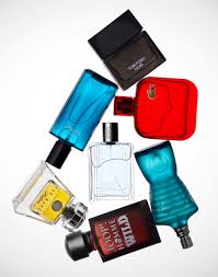

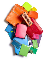
Steve Gallagher
Steve Gallagher's photos are bright, colourful, simple, plan but interesting the photographer used objects that we have at home like make-up, plastic bags and suitcases etc the photographer has thought out on whats he's going to do like the theme, the object, the background, lighting and colour most of the photos have a bright white background there are some different colour background like for example pink and cream as well the photos has a bright light on them to make the colour of the object catch your eyes some the colours the photographer has used ( blue, green, red and orange ) I like these photos because I have not seen some one take a photo of a plastic bag before because they are not very interesting I also like the planing and the themes the photographer uses.
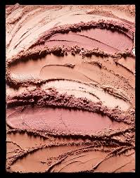
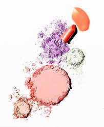
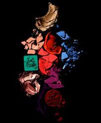
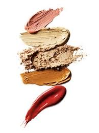
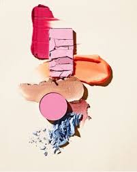
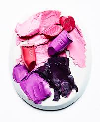
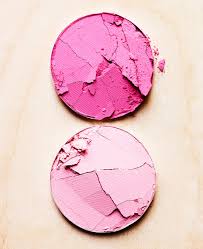
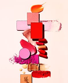
David Prince
David Prince's photos are bright and colourful the photographer has taken a photo of broken or smashed up make-up some of the objects the photographer has used are lip sticks, blush and foundation ( I think if its not right its because I'm not very interested in make-up I also do not us it and do not like ) the photos are plan and well thought out before taking the photo like for example where the object are going to be placed and the colour the objects are taken on a white background some times its different like ( black and cream ) the lighting in the photos are very bright which makes the colour come out more I like these photos because I think it is very interesting to break up make-up and make a photo out of it as well if I do recreate these photos it would be fun do break up some of my mums make-up because I do not have any and be fun to do.
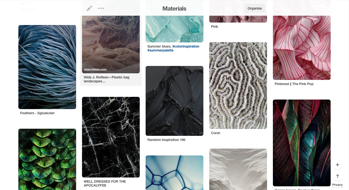
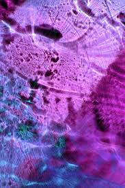
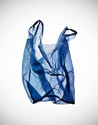
Vilde J. Rolfsen
Vilde J. Rolfsen's photos are bright, colourful and different the photographer has taken photos of the inside of plastic bags and has photoshopped the photos to put different colours in them or has different coloured light bulbs but I think its that the photographer has photoshopped the colour these photo has the same object ( the plastic bag ) as Steve Gallagher but it is very different I like these photos because its easy to do and look fun to do and if I recreate this photos I have a lot of plastic bags as well I'm not very good with photoshop so it will give me practice with it.
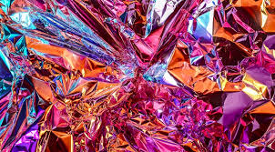
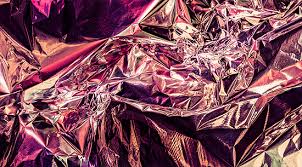
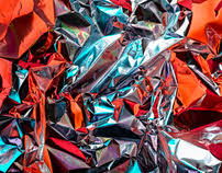
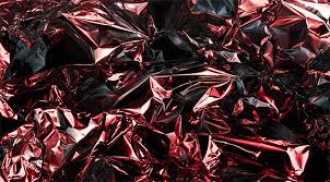
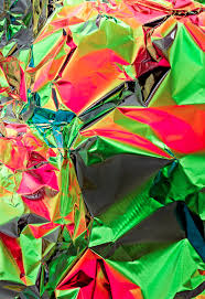
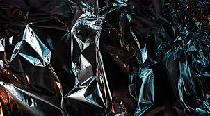
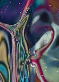
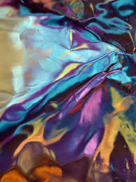
Bjoern Ewers
Bjoern Ewers' photos are bright and colourful the material the photographer has used is a foil that is different colour that was all ready coloured, photoshop the colour on there (I can tell by the three rows down left because the colour do not look real) or different colour lights shined on the foil I like theres photos because I think it will be fun and interesting to do and its like Vilde J. Rolfsen photos with the same object but changing the colour and I have a idea with the foil and plastic bag
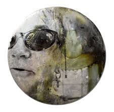
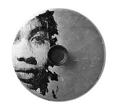
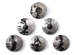
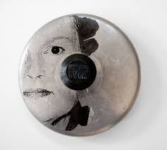
Sally Mankus
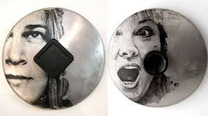
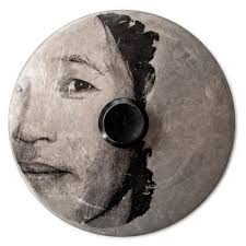
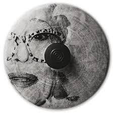
Sally Mankus' photos are plan, not much colour and artistic the photographer has got kitchen wear like for example the lids on pots and pans which are all grey and draws or paints people faces in black paint there photographer/artist does not us colour apart from one which has green the photographer/artist paints half of the persons faces the lids are laid on a bright white background I do not really like these photos so I will not be recreating theres photos.
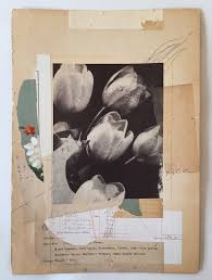
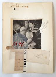
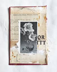
Lee McKenna
Lee McKenna's photos are calm and simple what it looks like that there is a ripped out page of a old book and the photographer has taken a photos of flowers and stuck them on the page of the old book a lot of the photo of the flowers are in black and white some are in colour the background is white I do like this better then the other one and I like the idea behind it.
Katherine D Crone
Katherine D Crone photos are colourful, simple and creative the photographer has taken a photo somewhere printed them out on different textured paper and cut them out the photographer has chosen to hang them on a string, plastic frame or a bright white cardboard, paper or foam the background of all of the photos have a grey, black or white the photos do have colours like dark blue, light blue maybe teal, organ and brown I do like this idea but I do not think I will be doing this.
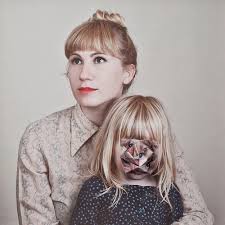
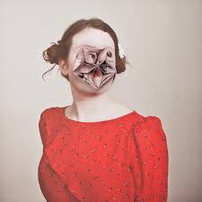
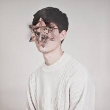
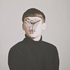
Alma Haser
Alma Haser's photos are calm, interesting and eye catching the photographer has taken a photos of people and has do geometric, 3D shapes out of there faces or but plant and paint on there faces and lot of the people are looking at the same place the models are different and are wearing there own cloths some of there cloths have bright colours and the way there hair and make-up the background is grey and cream the lighting is artificial I think the photos are a little bit creepy but to some people it may not but to me they are I do like the but I will not do this because I personally think it would creep me out when I do this and it does not go with the idea I want to do.
Homework

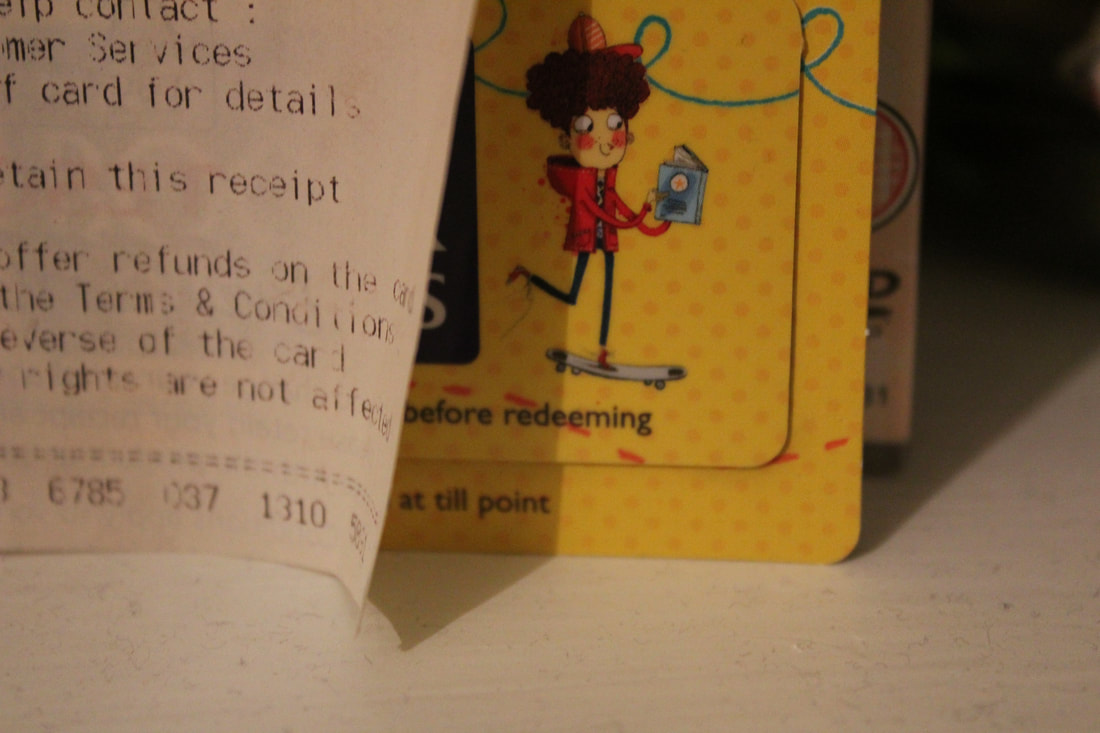
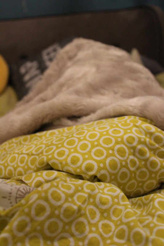

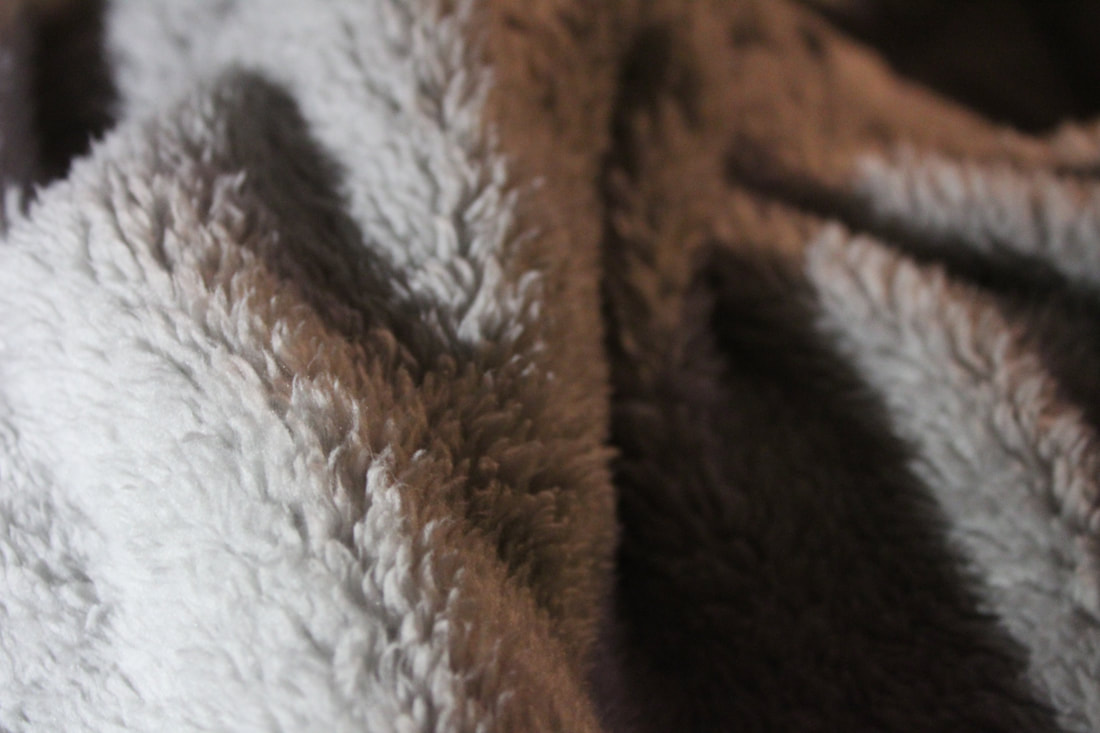
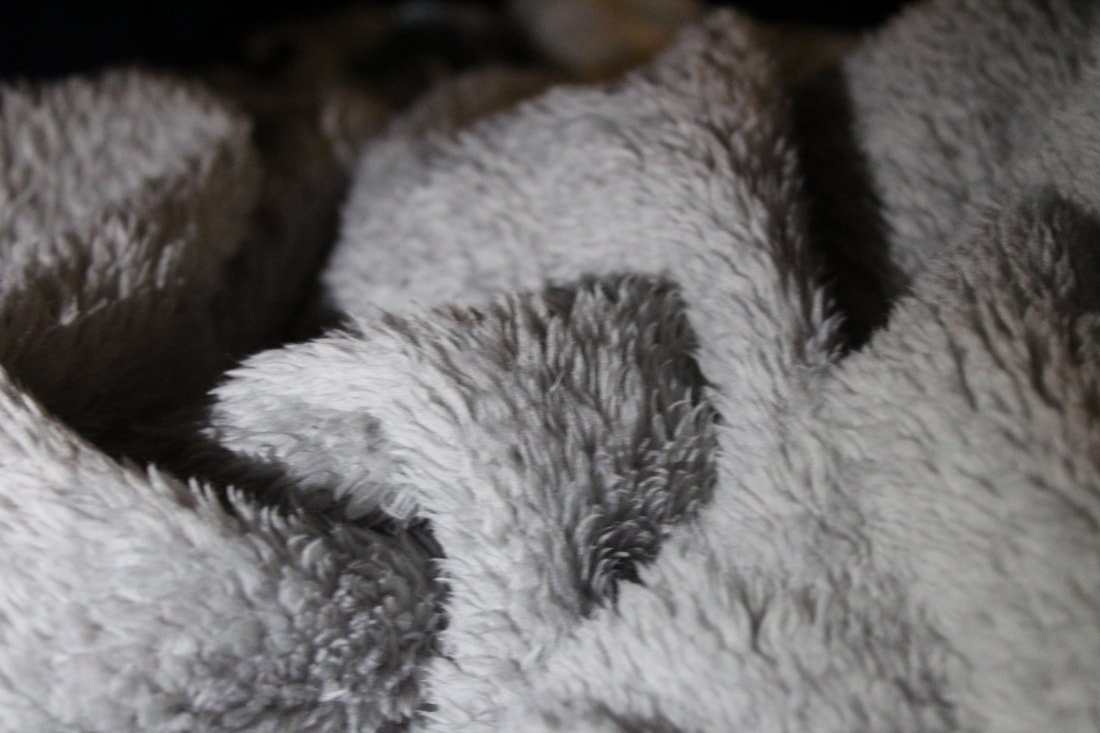
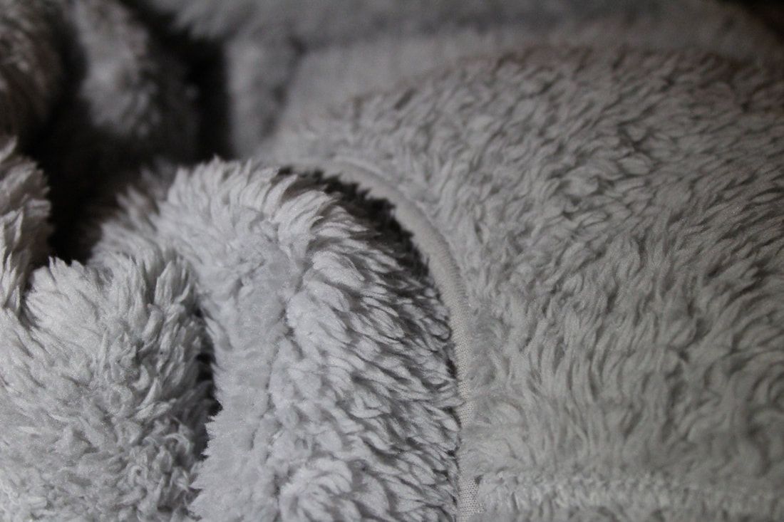
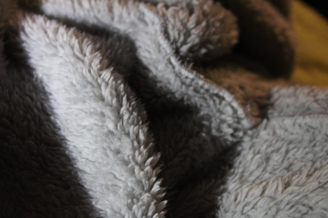
These photos that I have done I do not really like them I think I can do better I choose this because I have not done something like this before because I all ways do the same thing over and over again and I thought its time to do something different I think this subject that I have chosen would be fun to do so next time I take photos I will be a lot better. Why I took these photos because I did not have a idea on what to do I just started and had not thought about it well.
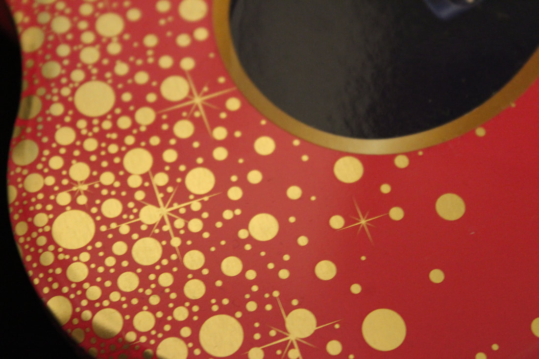
Photos That Worked Well


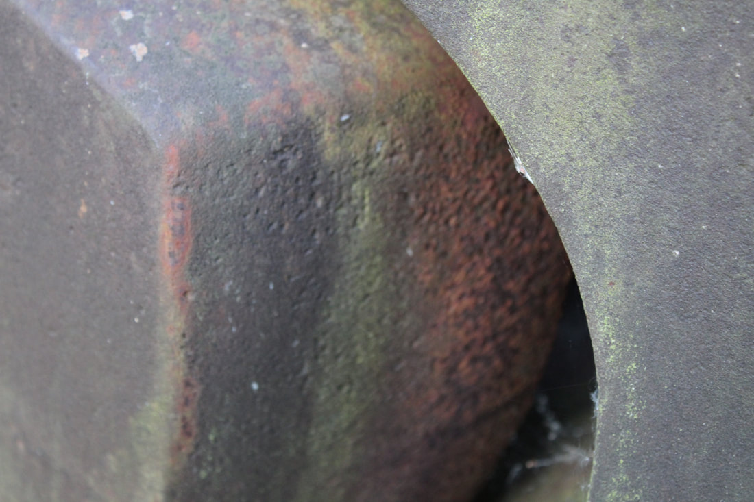
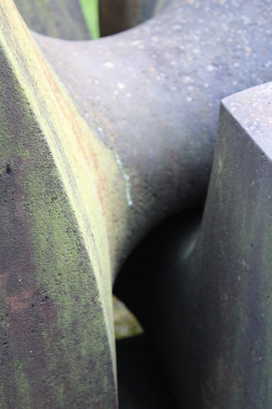
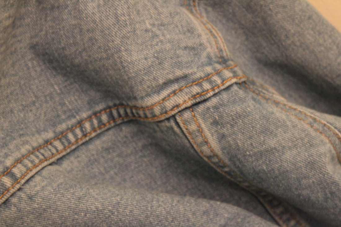
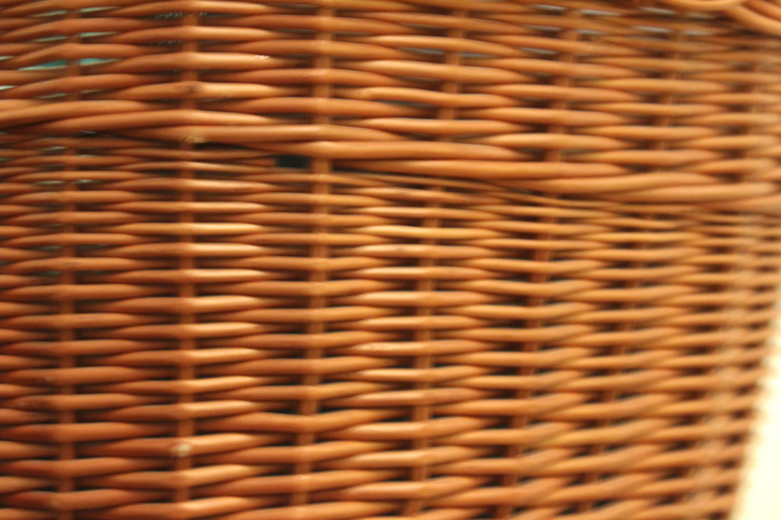
These photos I think are the best photos out of the recent photos I have taken why I think they are the best is because I think it goes with the subject I has chosen to do (materials) you can see all the different textures in the photos I think I can be better next time by doing more interesting objects to do for example do something like the photographers I have chosen and I need to think outside of the box and get out of my confent zone.
I do and do not like the photos I have taken I think they are plan, uninteresting, not that much colour and with the colour thats there it quit bland.
I do and do not like the photos I have taken I think they are plan, uninteresting, not that much colour and with the colour thats there it quit bland.
The plan I have for my next photos:
- Artificial and natural lighting
- Cropping
- Focus and out of focus
- Different texture and colour paper
Homework
Erin O’Malley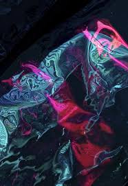
|
|
Homework
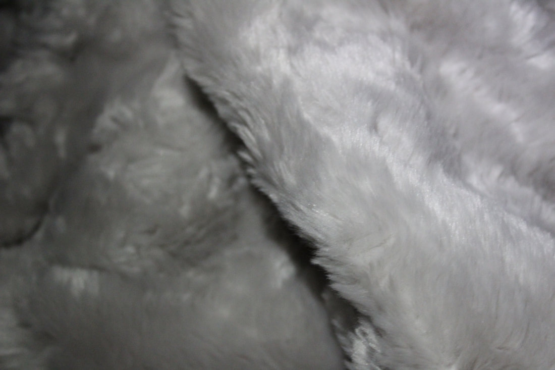
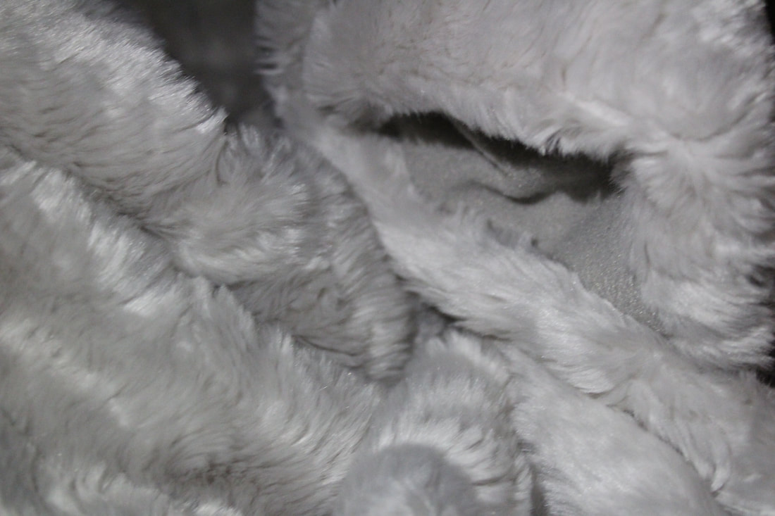
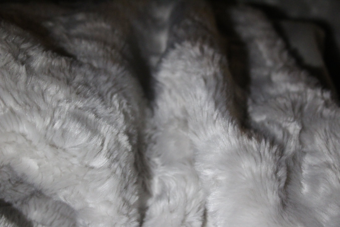
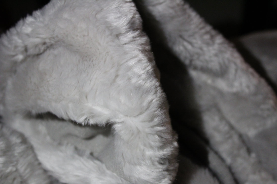
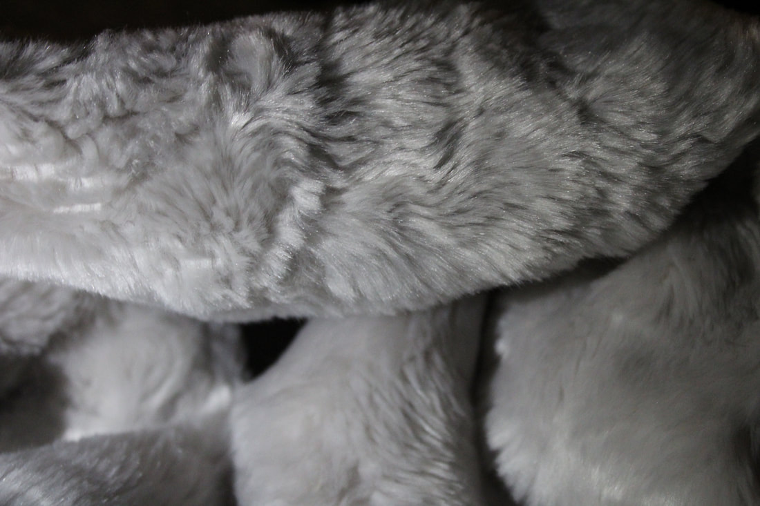
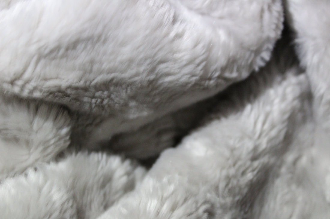
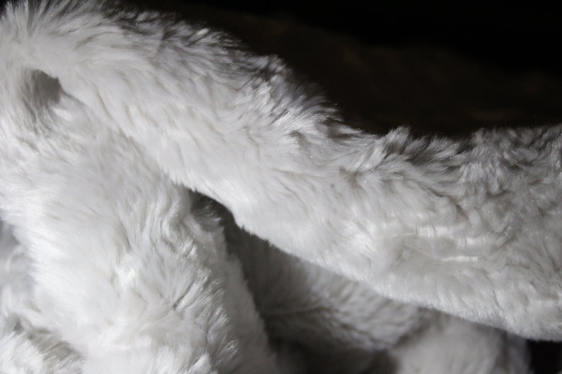
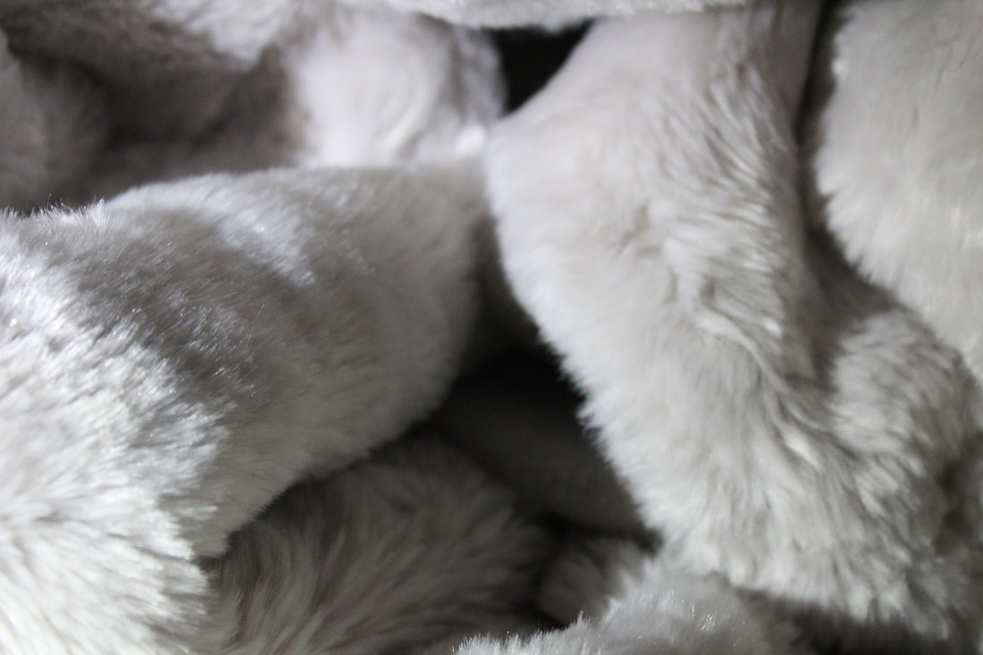
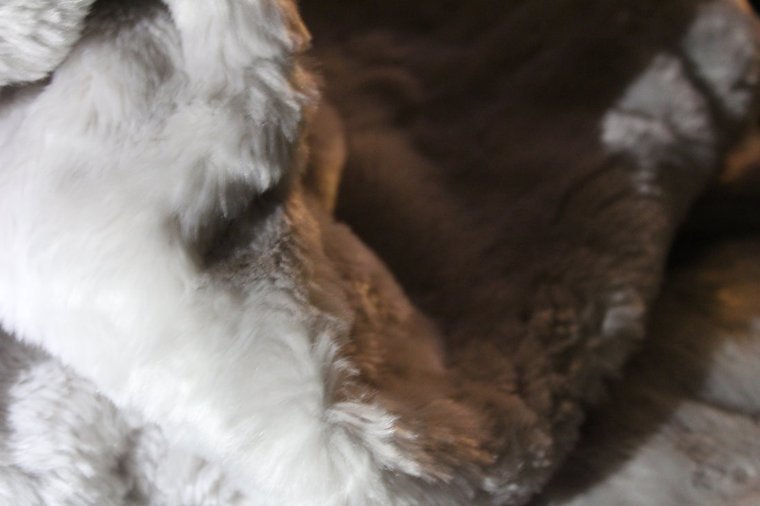

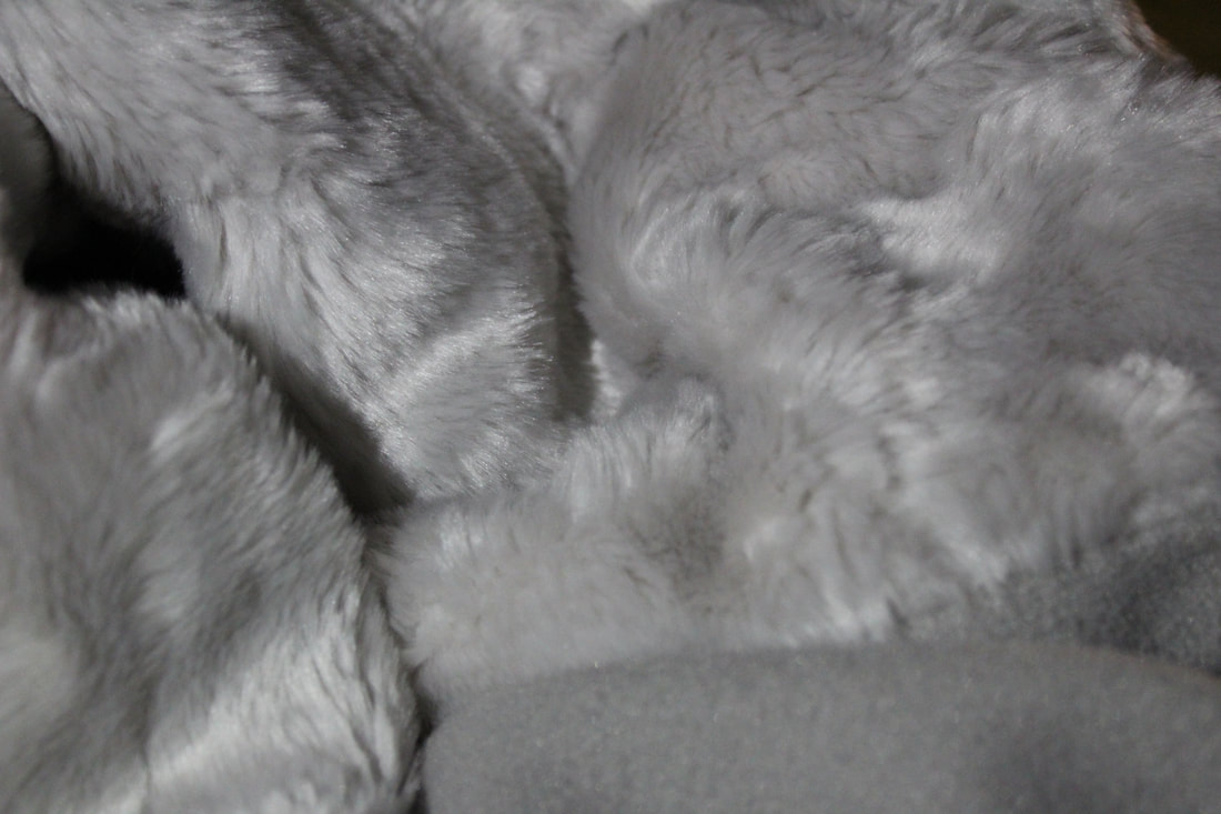
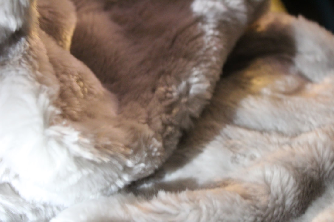
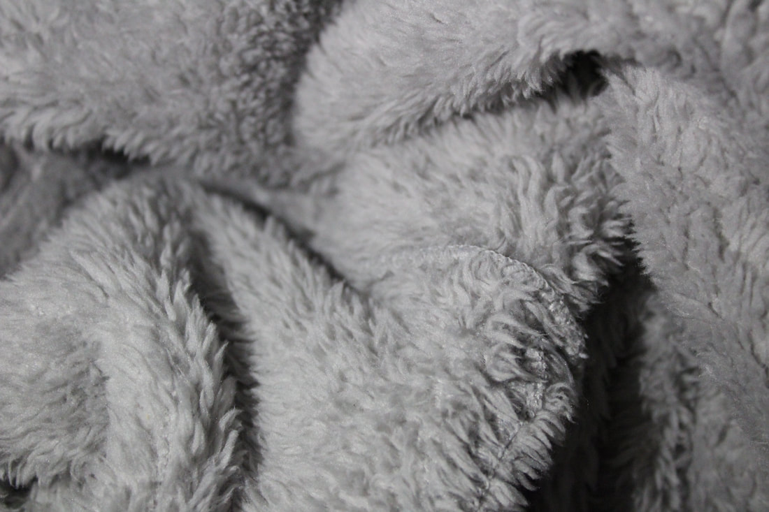
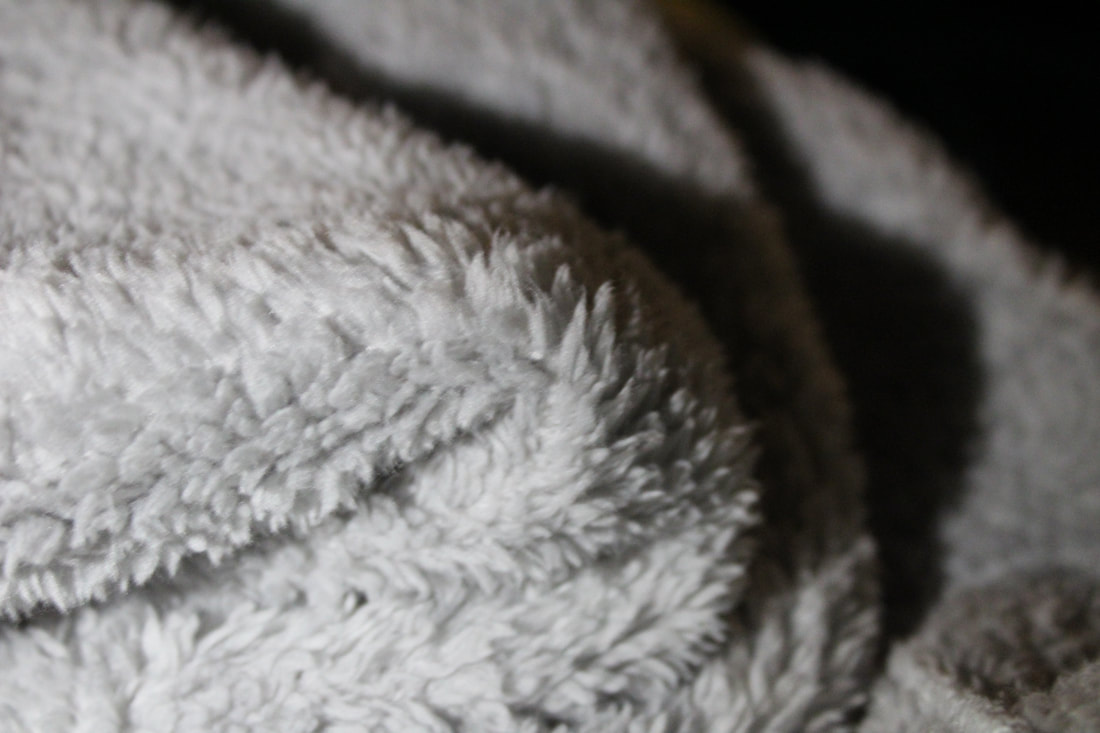
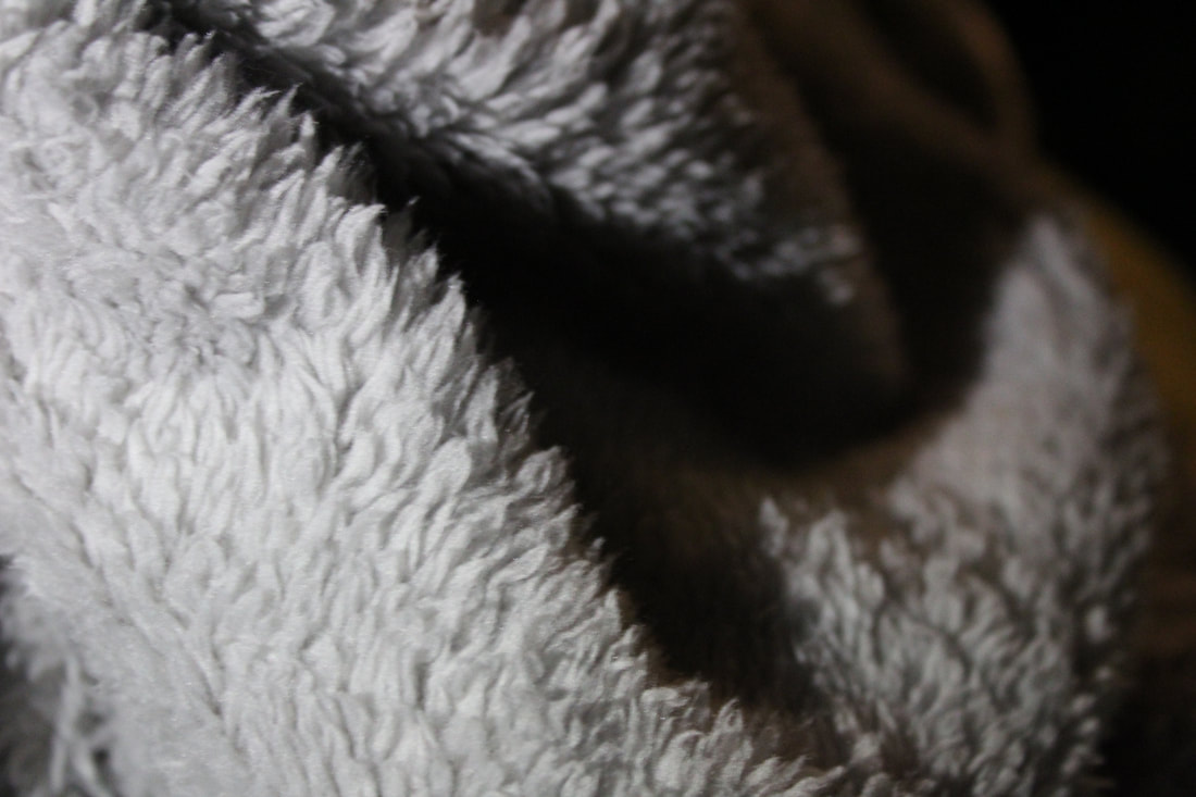
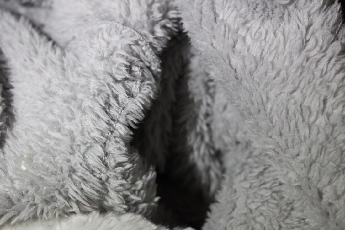
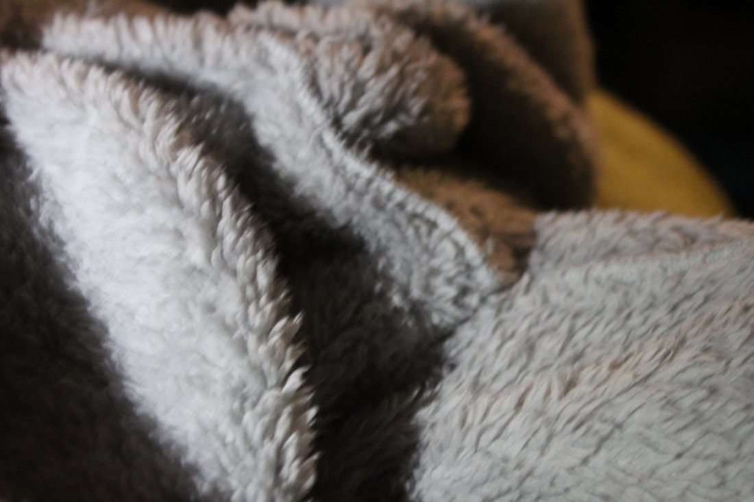
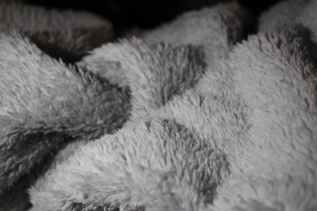
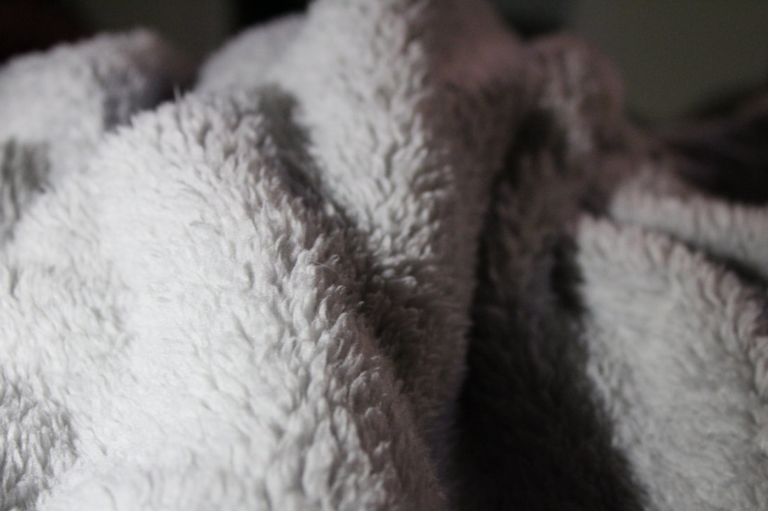
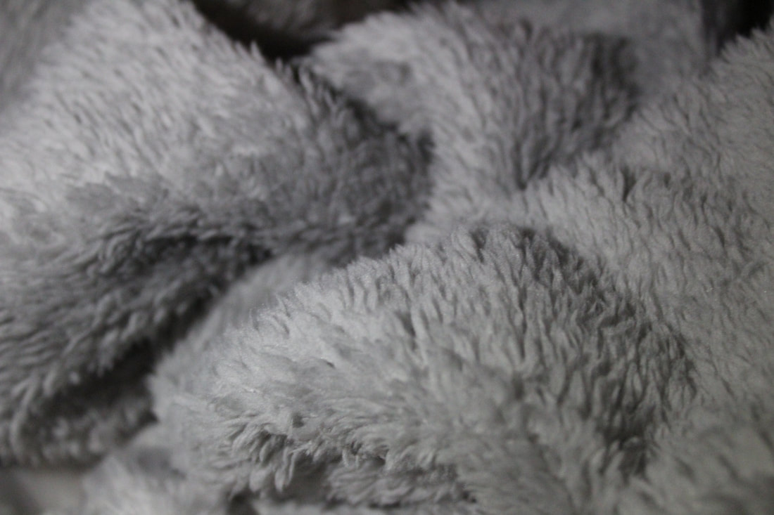
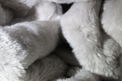

These six photos I think are the best photos out of all the photos I recently took why because there are different lighting and texture. Its like the same but different photos because they have the same object. I think these photos came out a lot better then the one I did before because I put more thought to it and time I do have some ideas on what I wanted to do the with the photos. The photos did not come out the way I wanted and I think I can do better but I am happy the way they did come out as well. Next time I will do different materials and play more with the lighting.
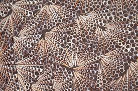
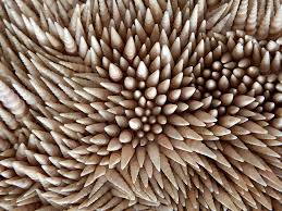
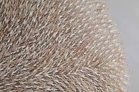
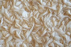
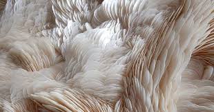
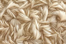
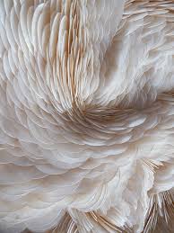
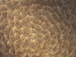
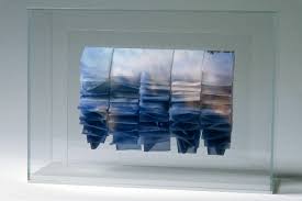
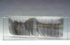
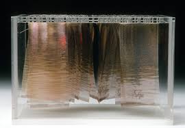
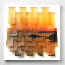
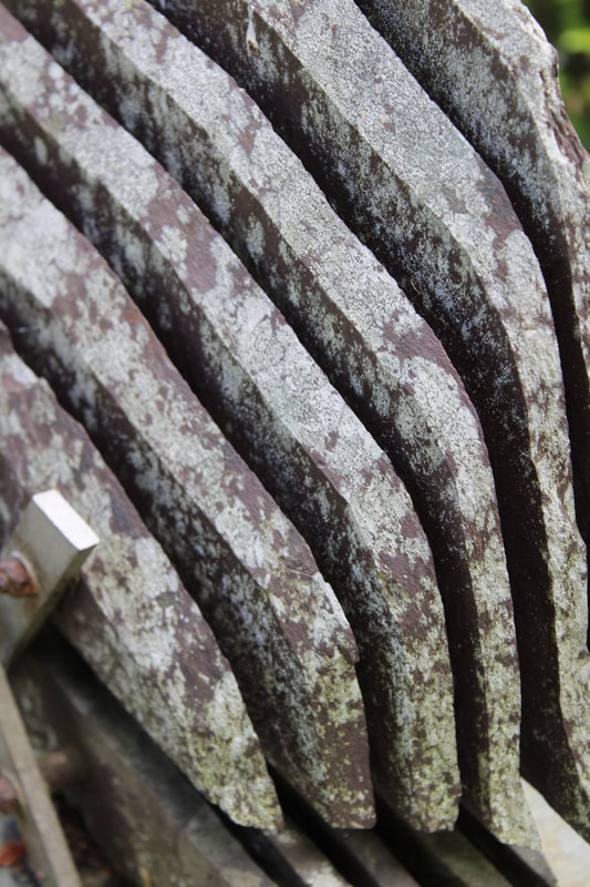
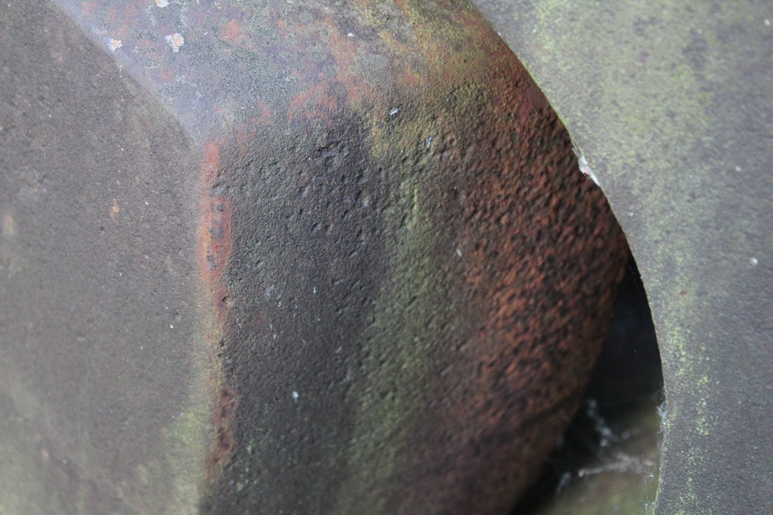
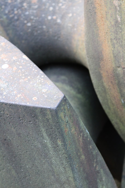
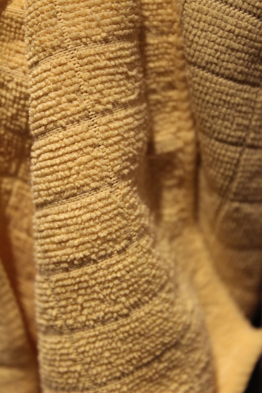
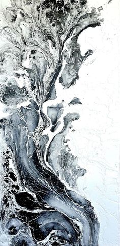
Rowan Mersh
Rowan Mersh's photos are interesting and have the same colour theme in all of there photos. Mersh's photos have some kind of fevers and metal objects and they are all the same colour scheme (cream, brown, yellow and white). The photographer really likes these colour or thinks they are good colours for this subject (which is materials). I do like how they have the same colour scheme because the images are separate but they work really well together but if the photographer chose to put them together it would work and you would not think they are supposed to be separated.
I like this photographers work and would like to do something like this and I do have some ideas to do with this and I would like do have photos that go together
I like this photographers work and would like to do something like this and I do have some ideas to do with this and I would like do have photos that go together
Experiment
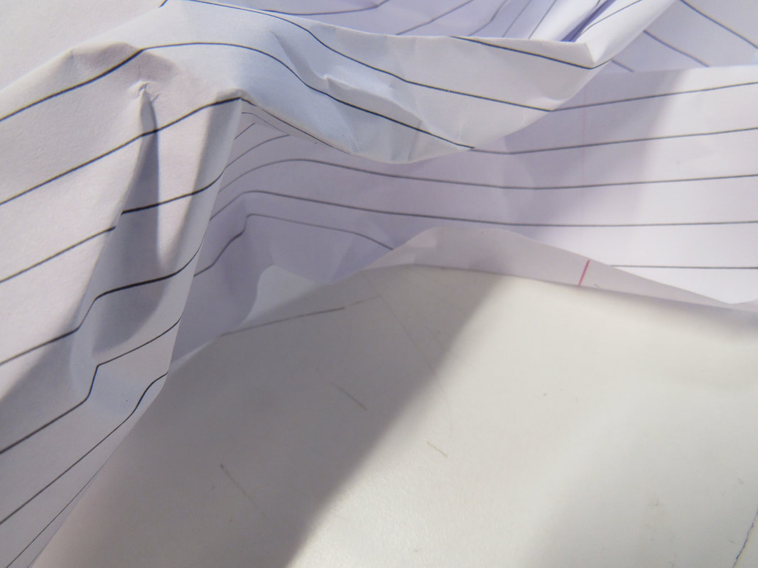
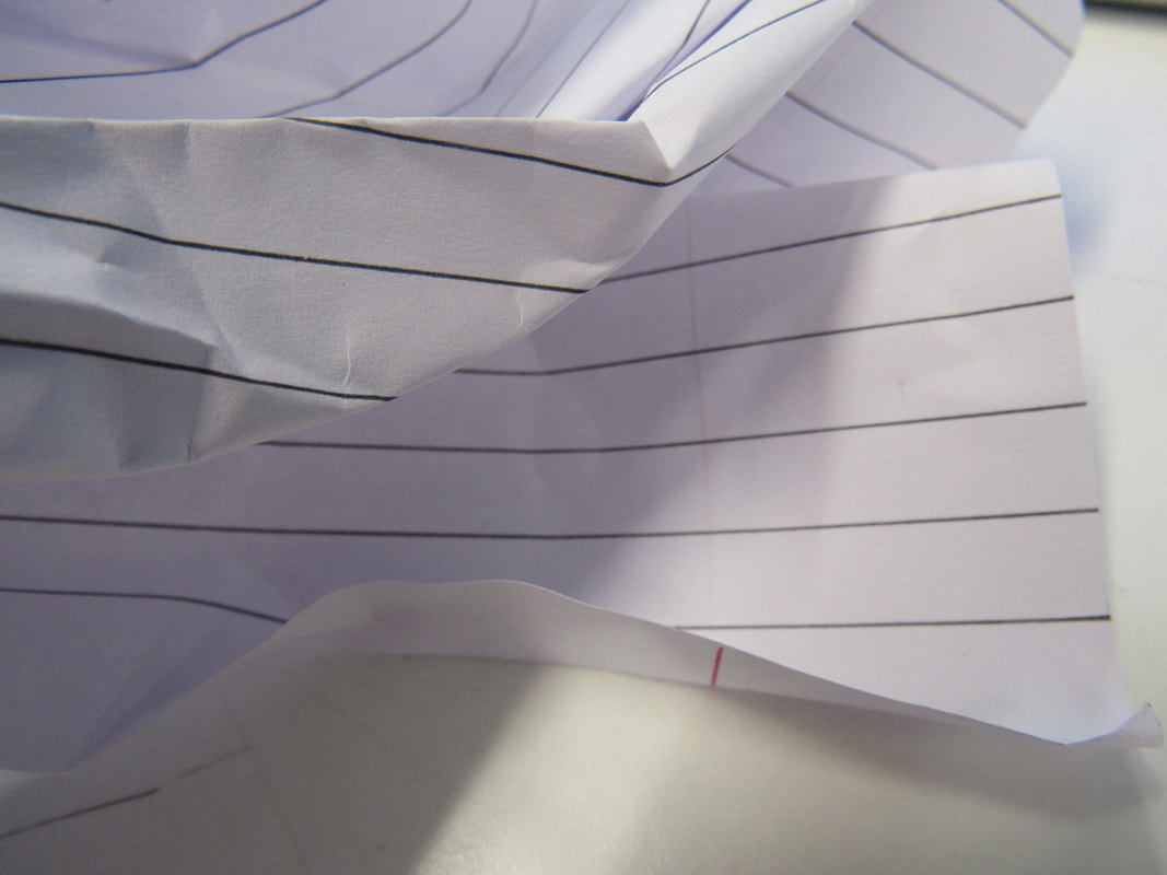
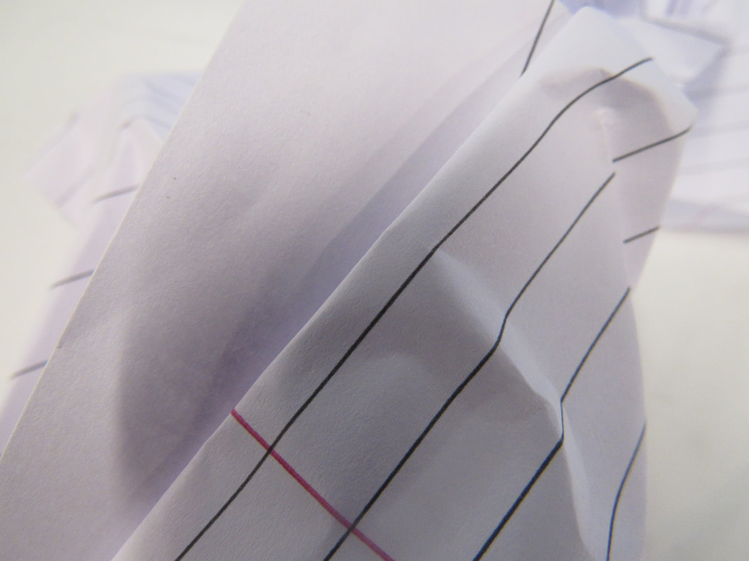
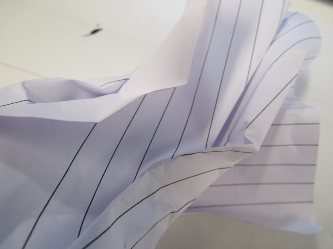
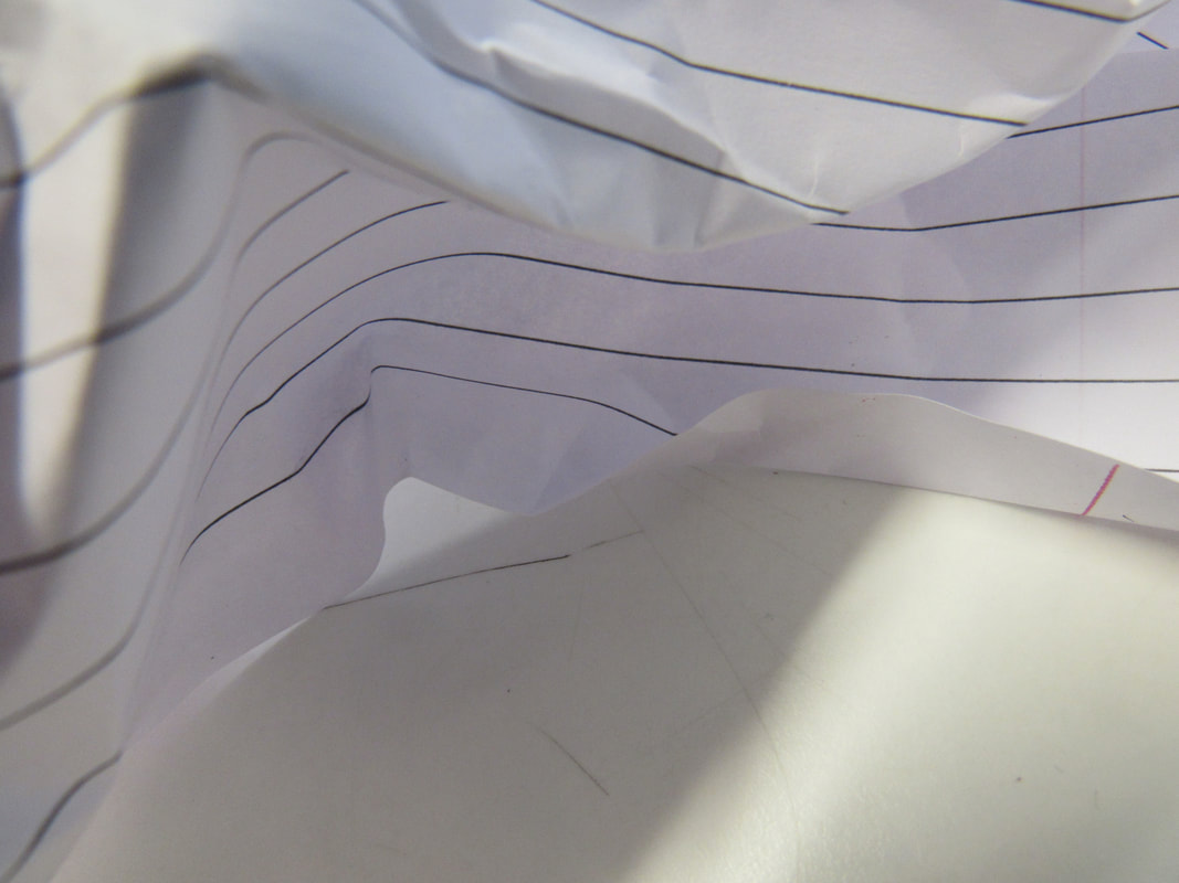
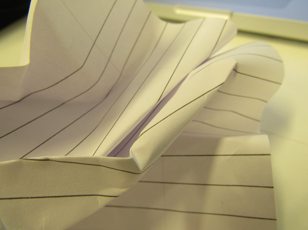
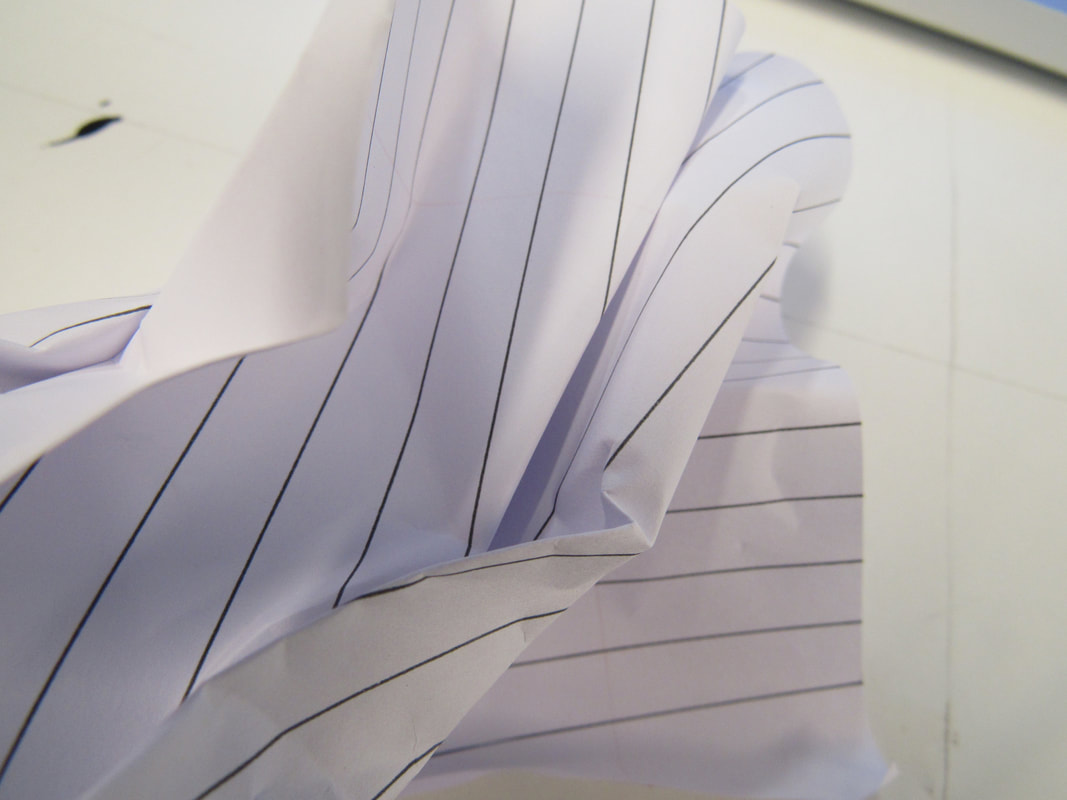
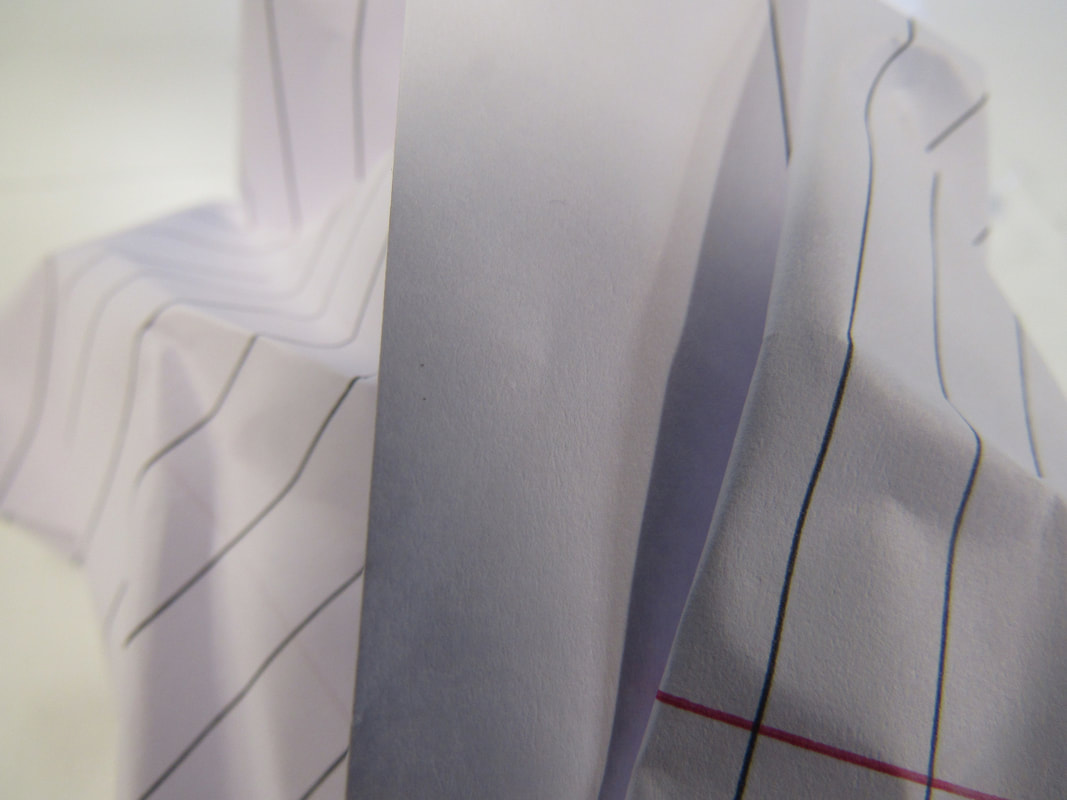
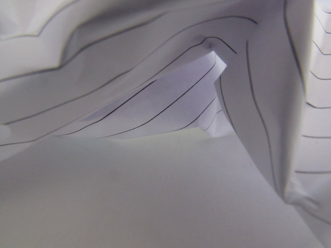
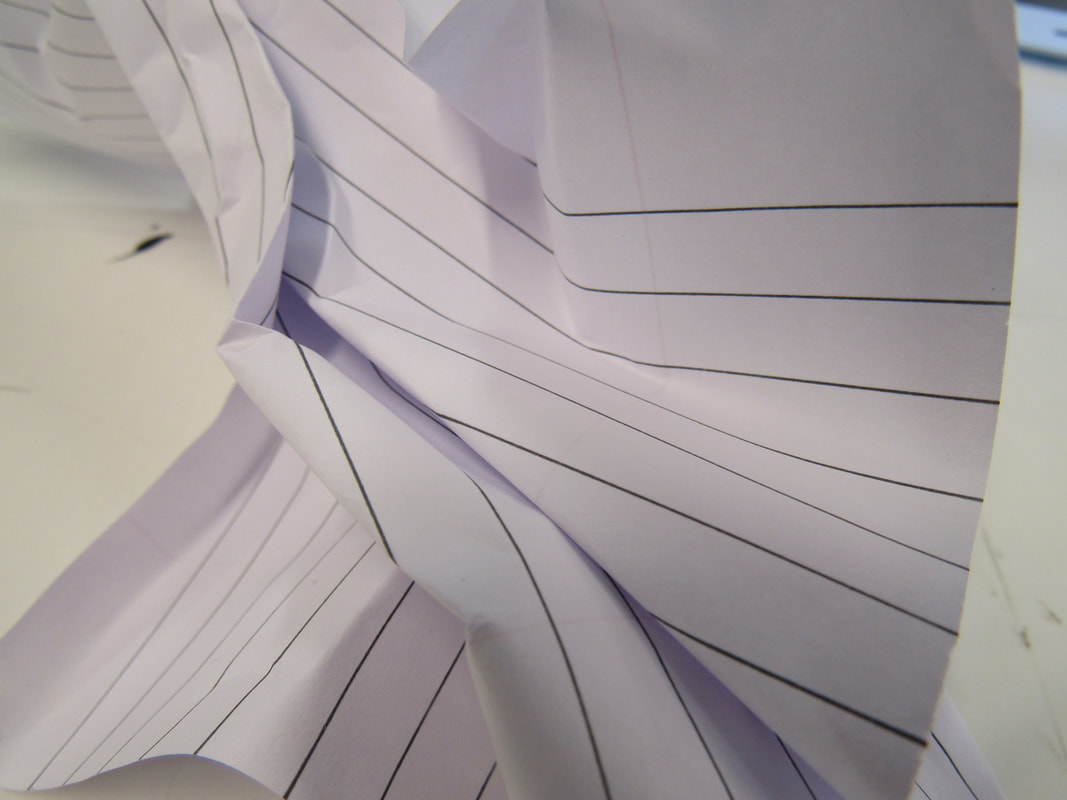
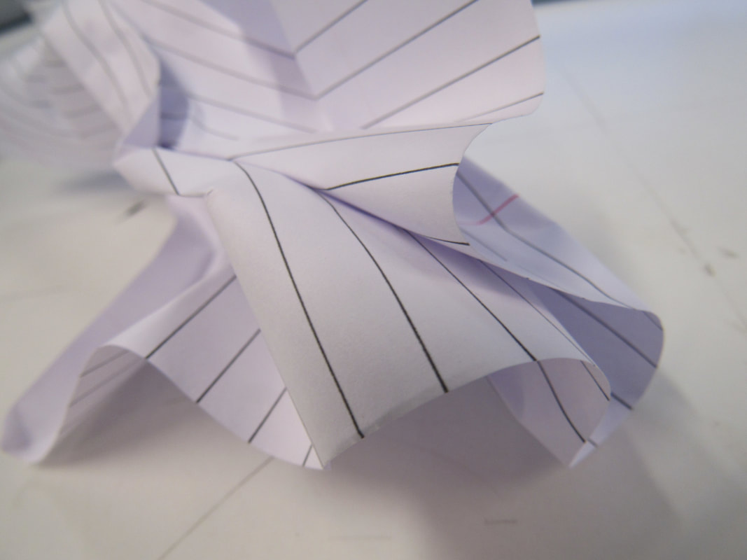
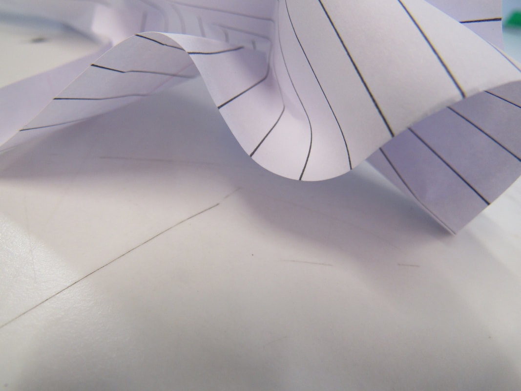
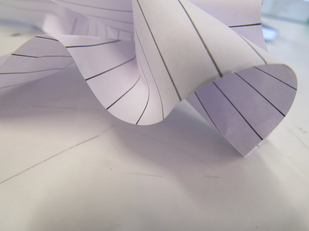
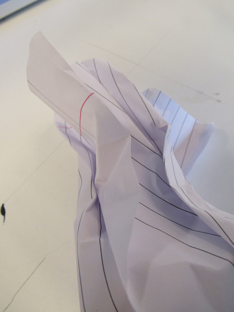
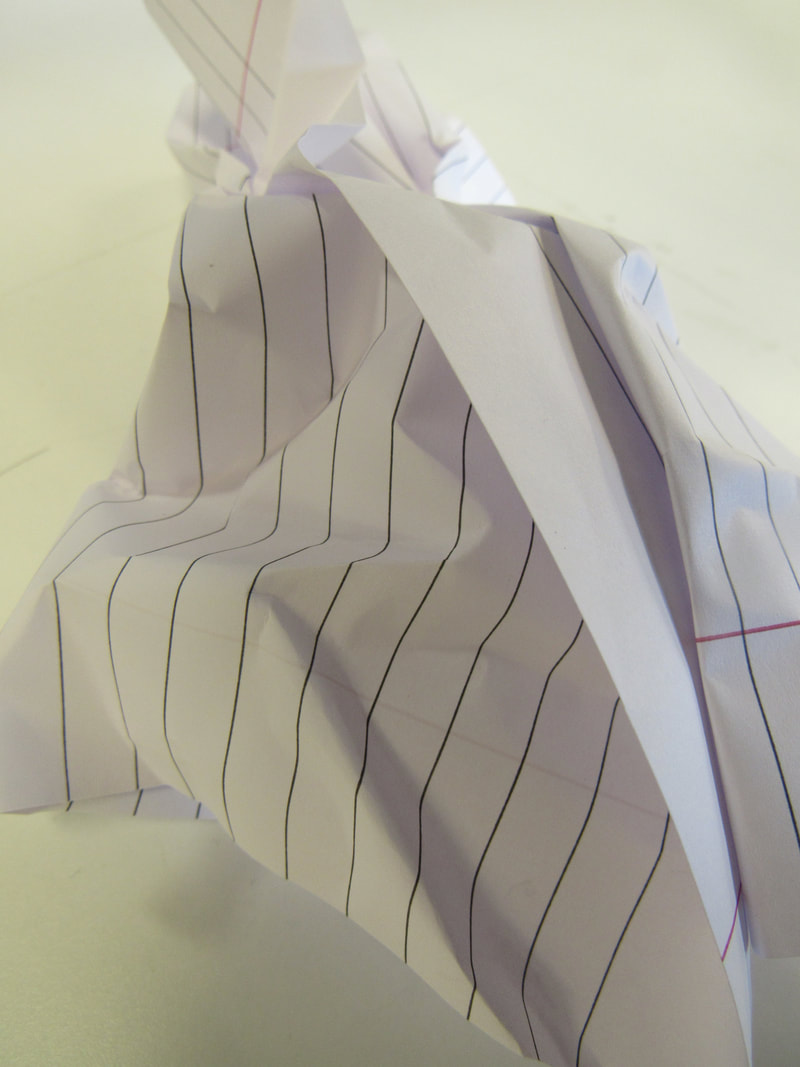
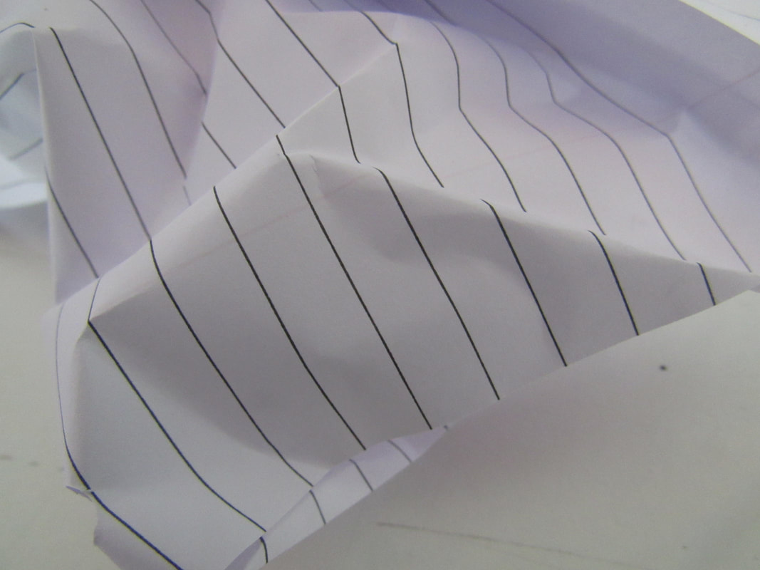
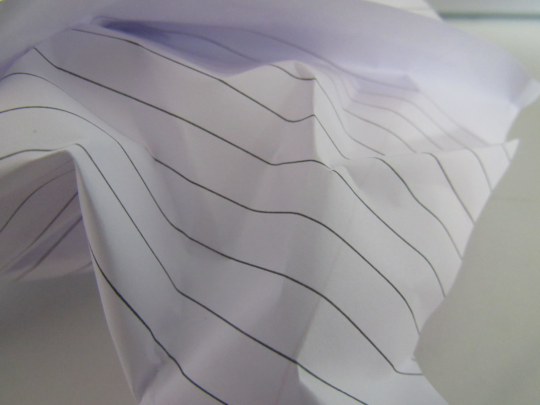
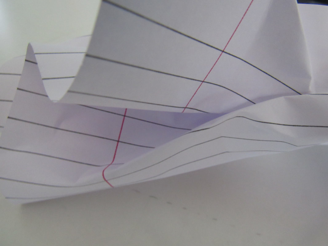
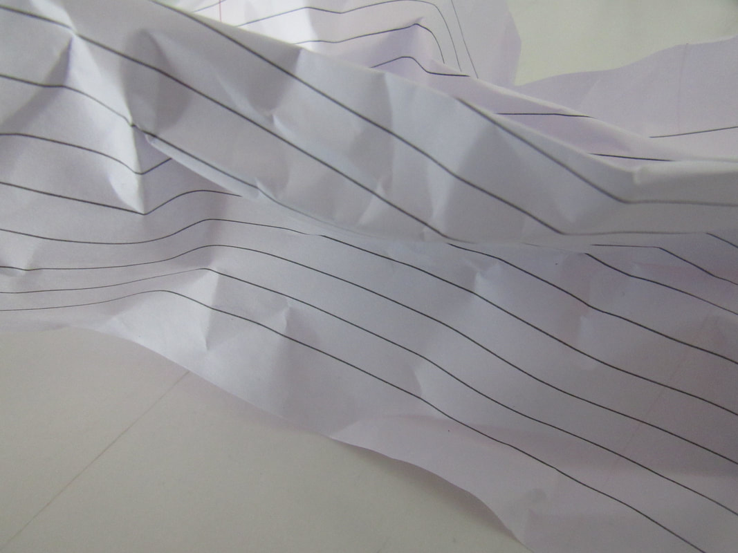
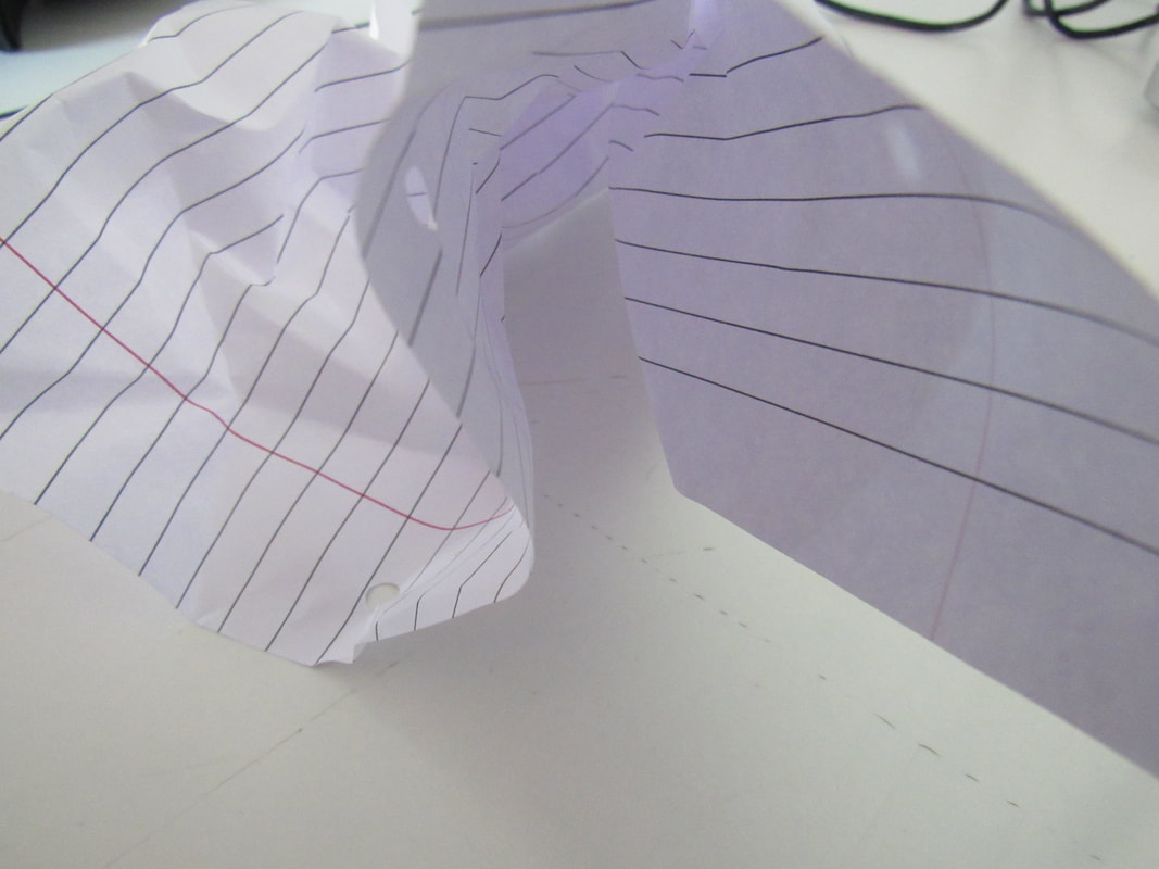
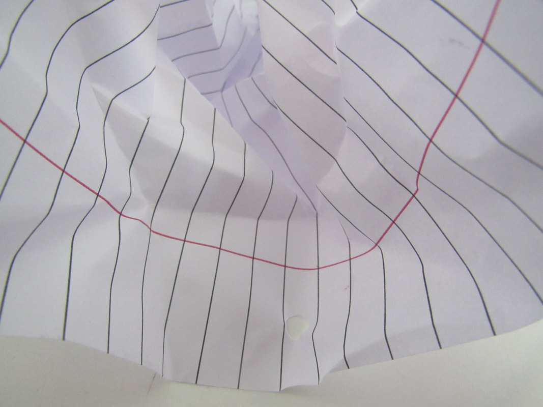
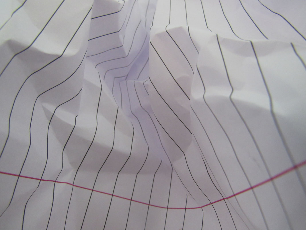
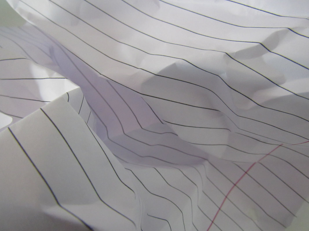
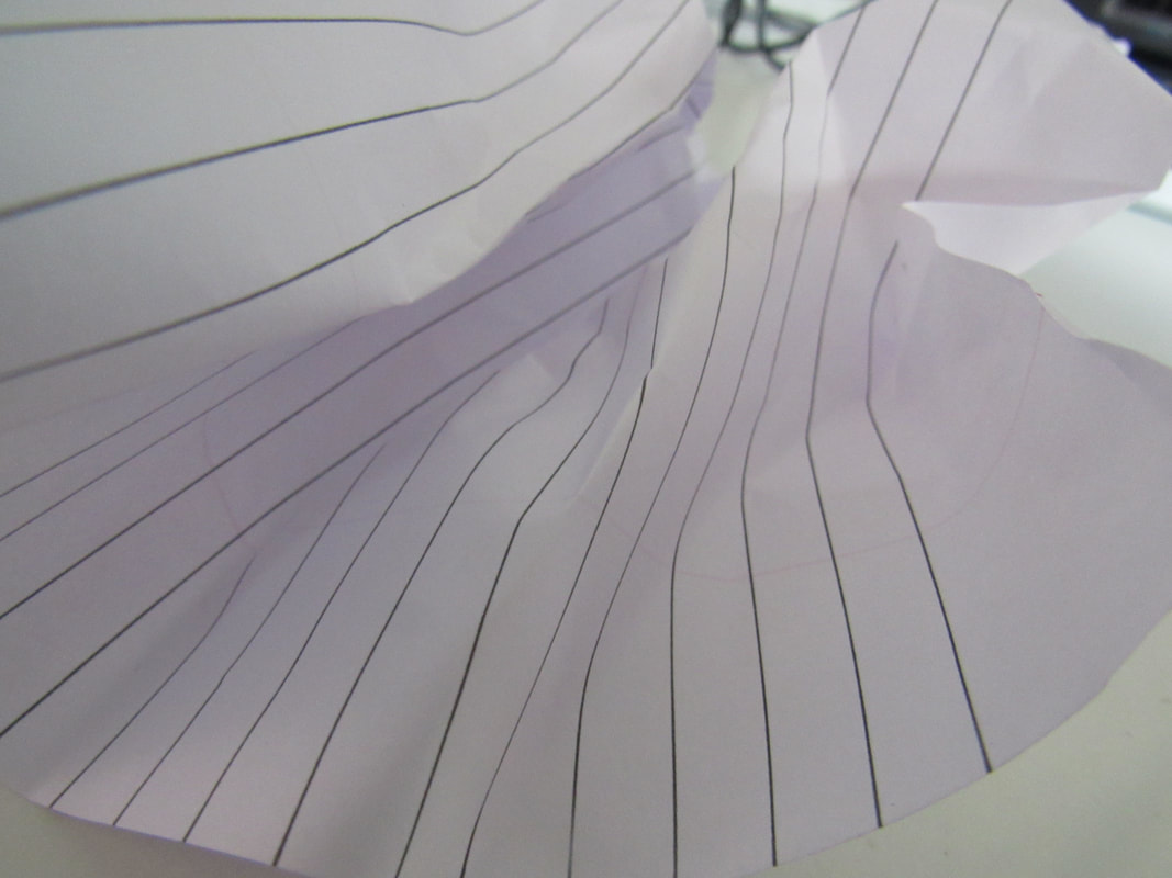
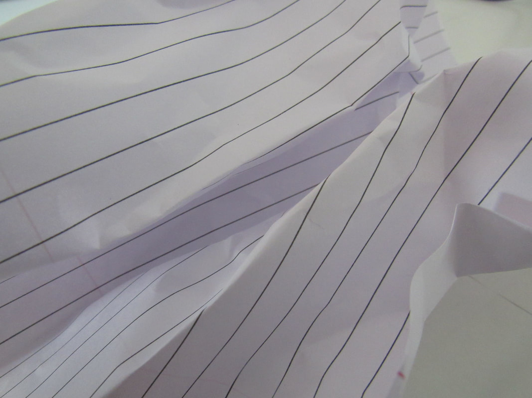
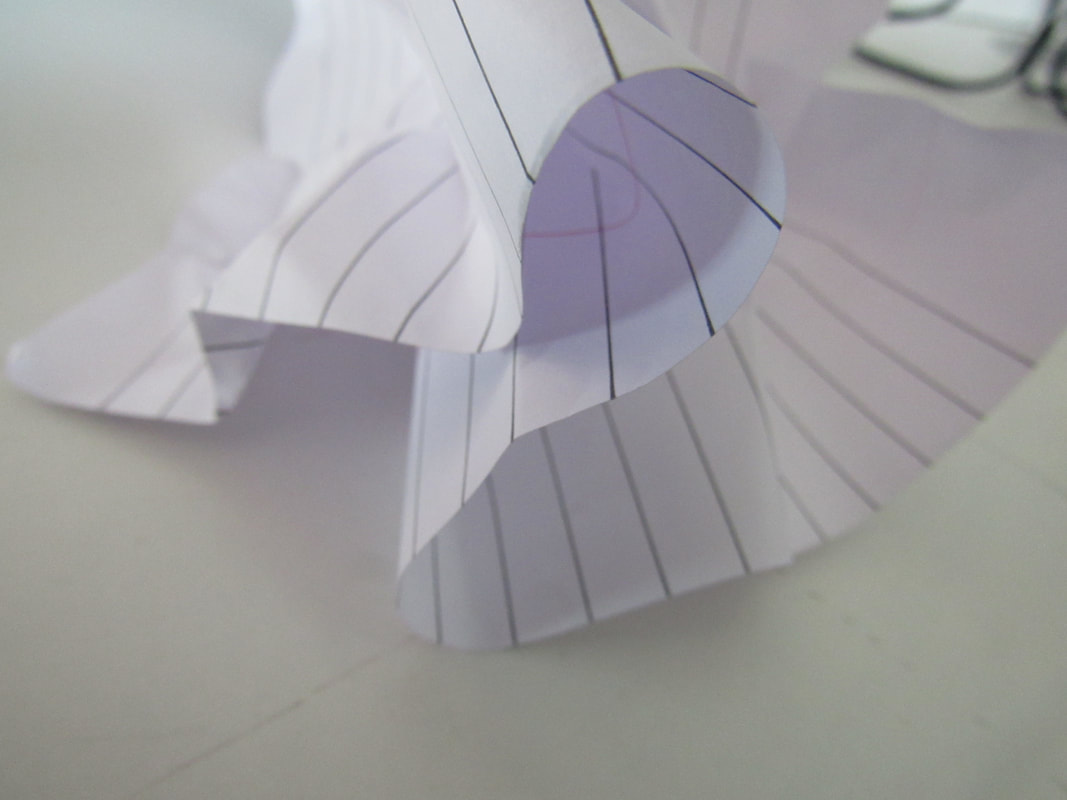
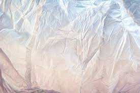
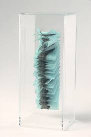
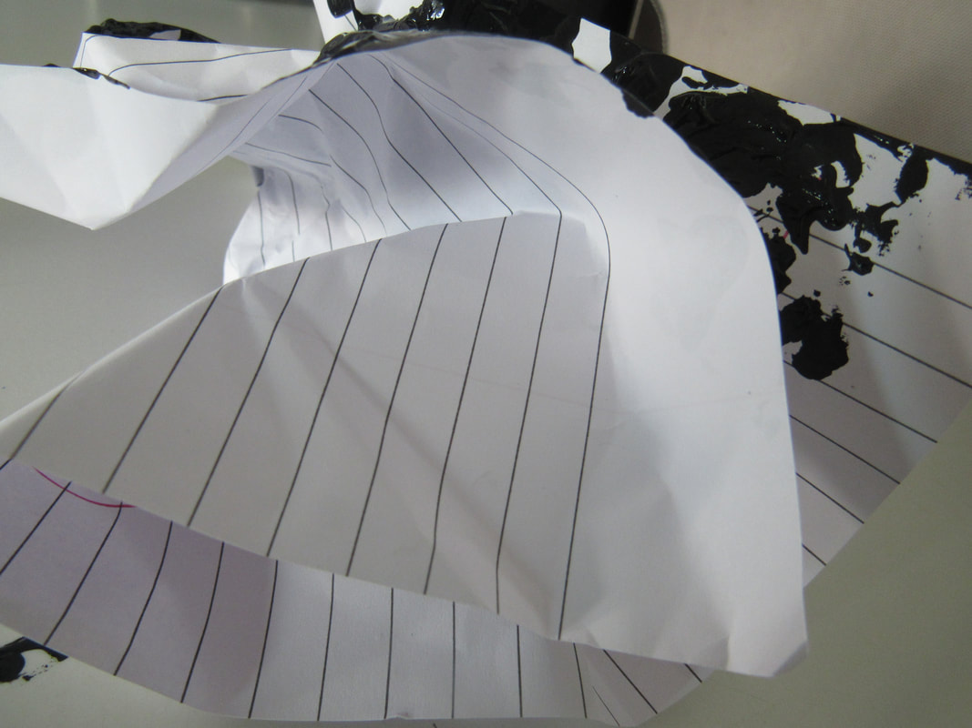
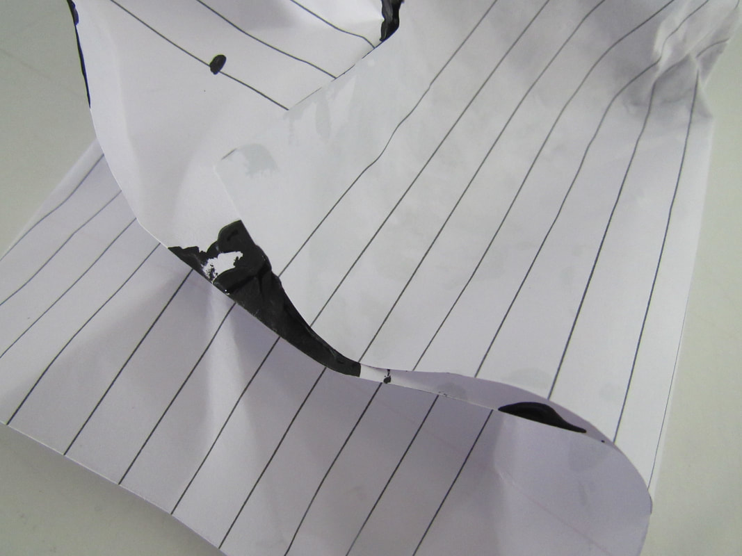
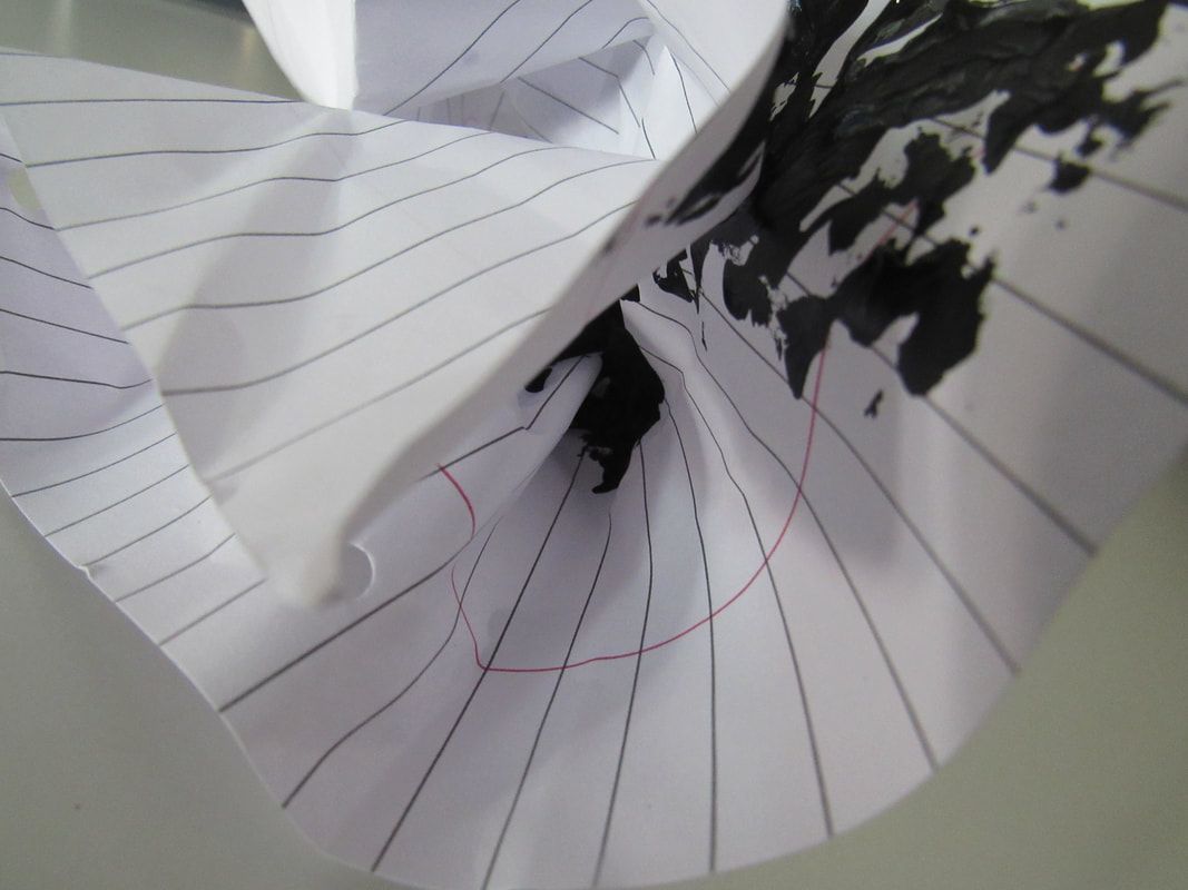
I got a piece of lined paper and I scrunch the paper up to get different textures, shapes, layers, folds and shading I only used one objected because you can turn the paper into different shapes and have a lot of different angels and I think it would look wrong if I put another object in the photos I also like the white paper and the black lines and the red line and the white background ( well I tried to have a white background but sometimes you can see something else ) as I do like the colour of the paper and the photos being just white I would like to have some colour or a lot of colour either in the background or on the paper maybe do both but I can do all three of those and see how they come.
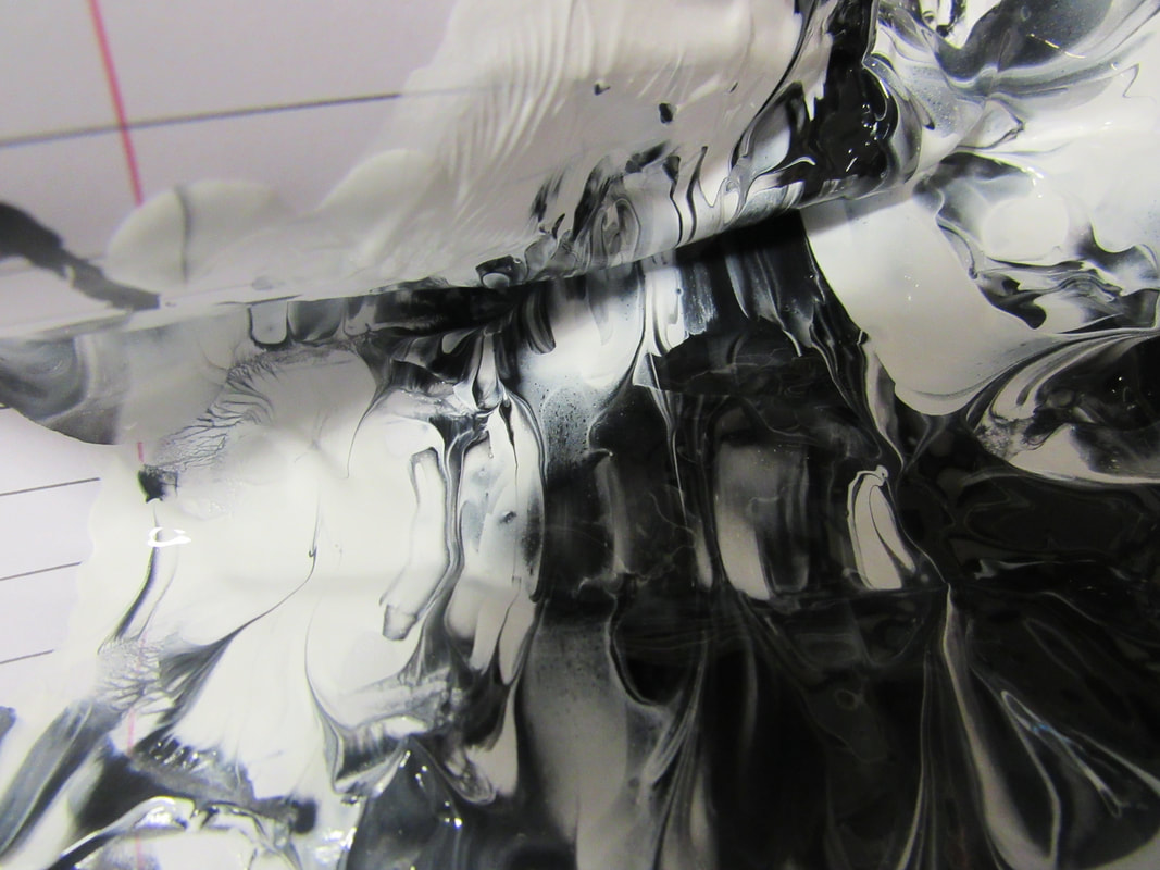
What I'm going to do next is I would like to is black and white I like look good together and I like the white on there but I would like to see more black so what I'm going to be doing is us black paint and just put it every where on the paper and do the same thing I did before and see how it goes.
What I'm going to do next is I would like to is black and white I like look good together and I like the white on there but I would like to see more black so what I'm going to be doing is us black paint and just put it every where on the paper and do the same thing I did before and see how it goes.
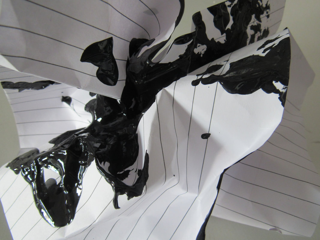
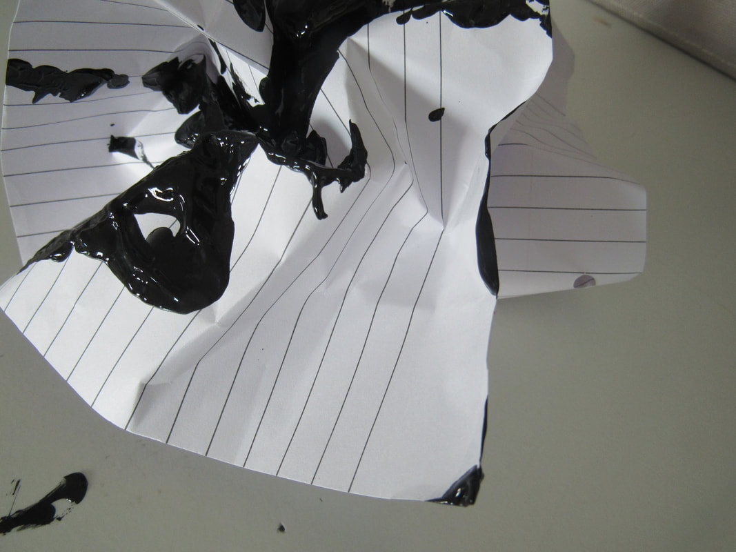
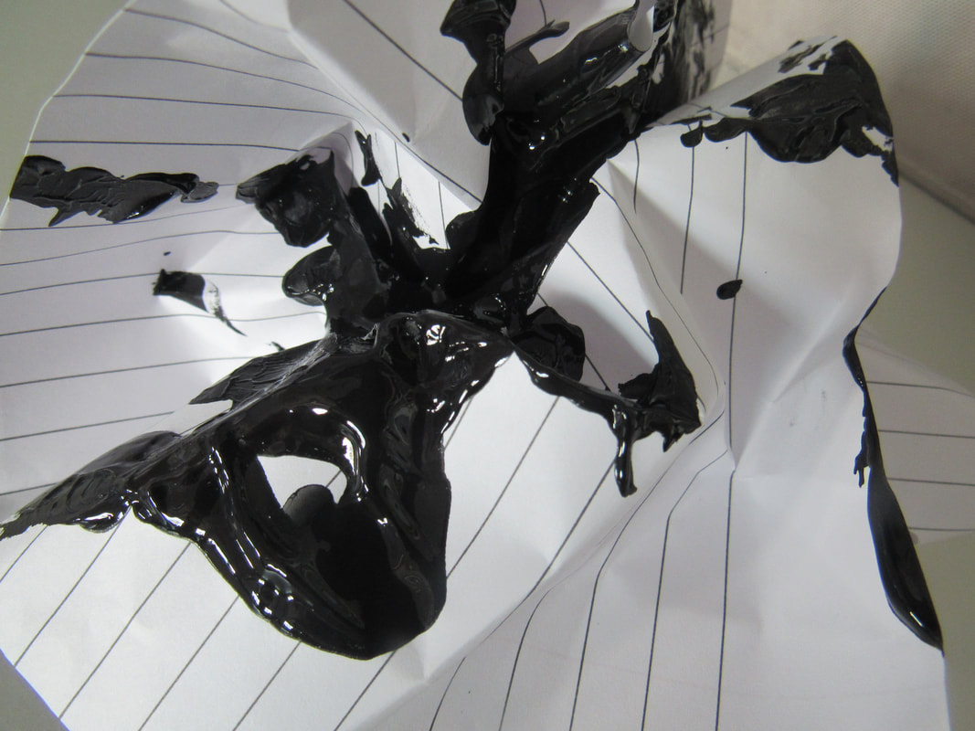
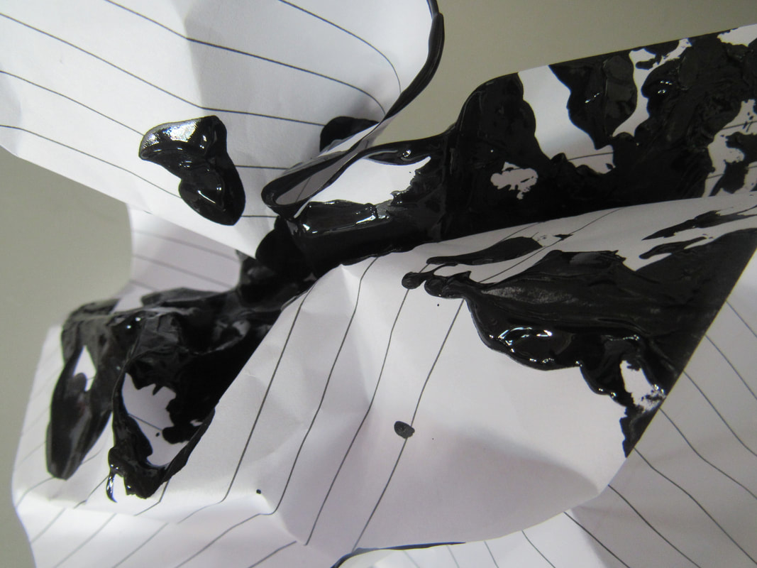
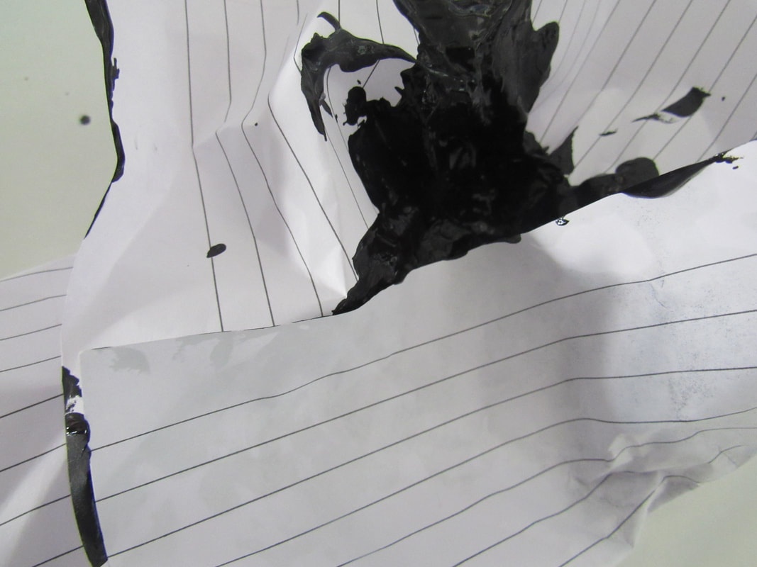
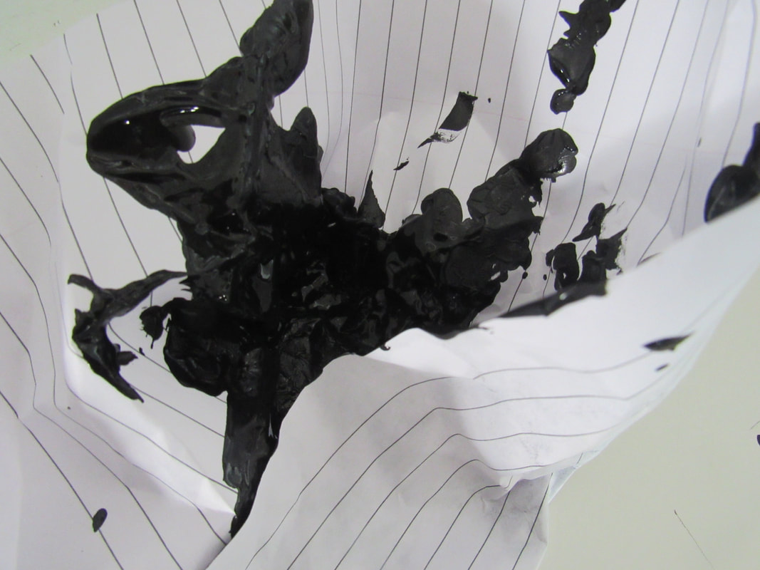
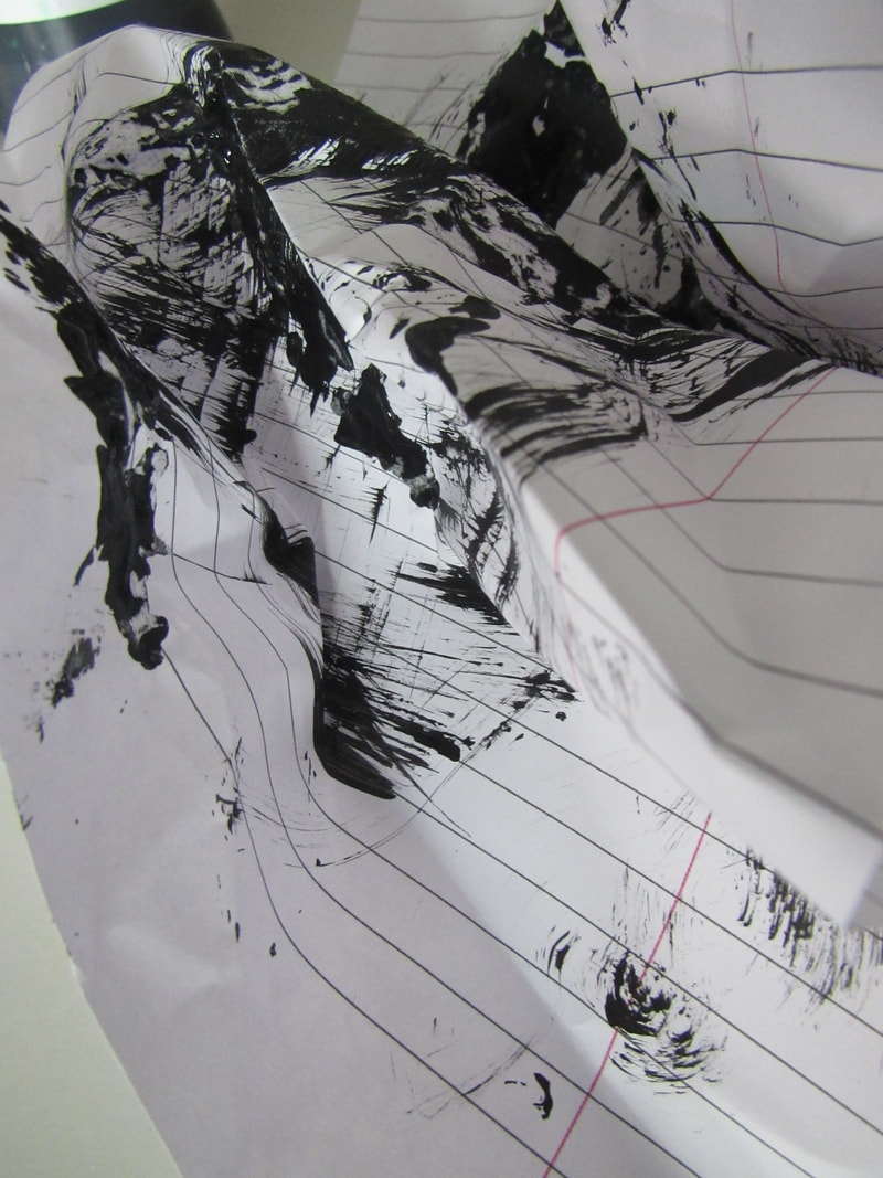
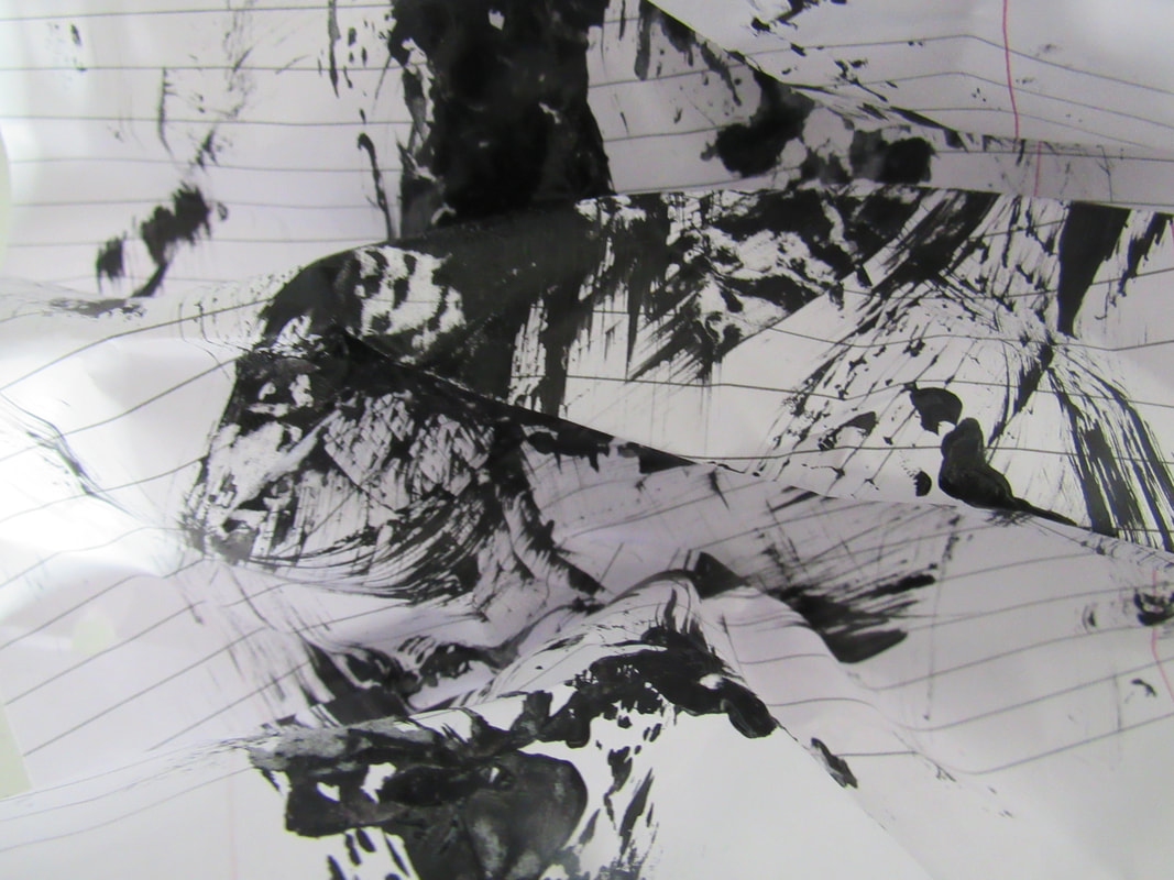
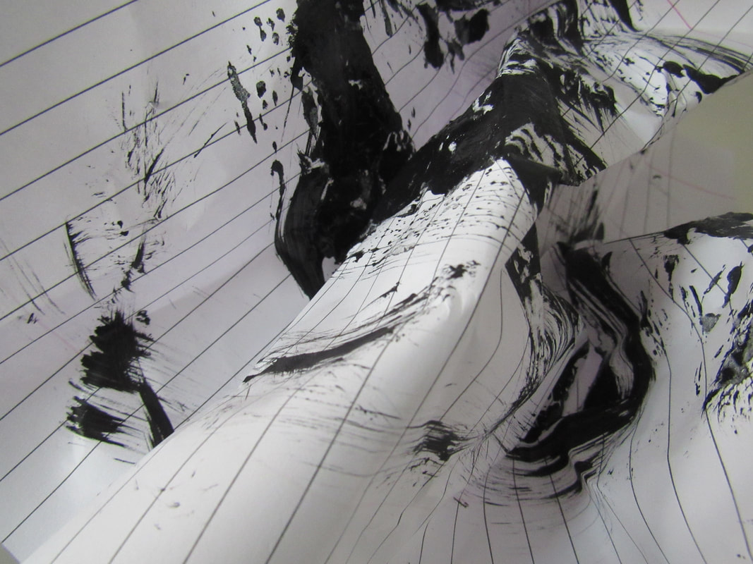
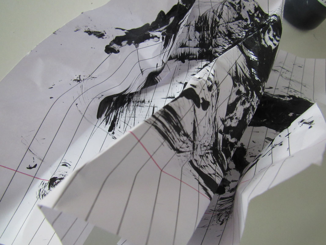
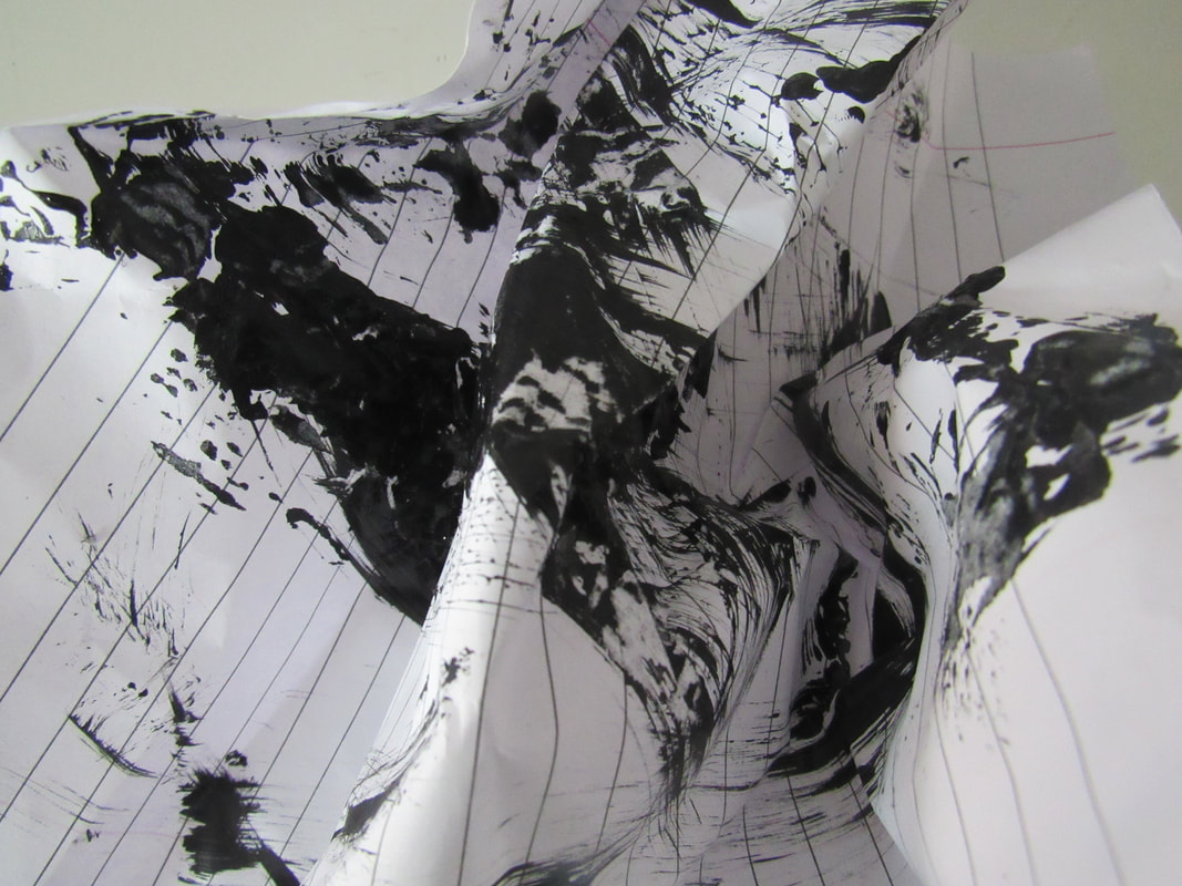
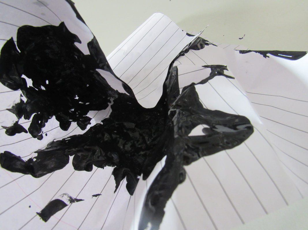
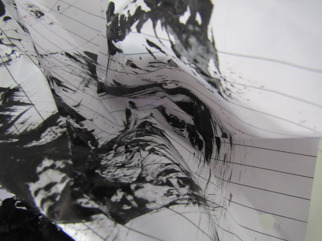
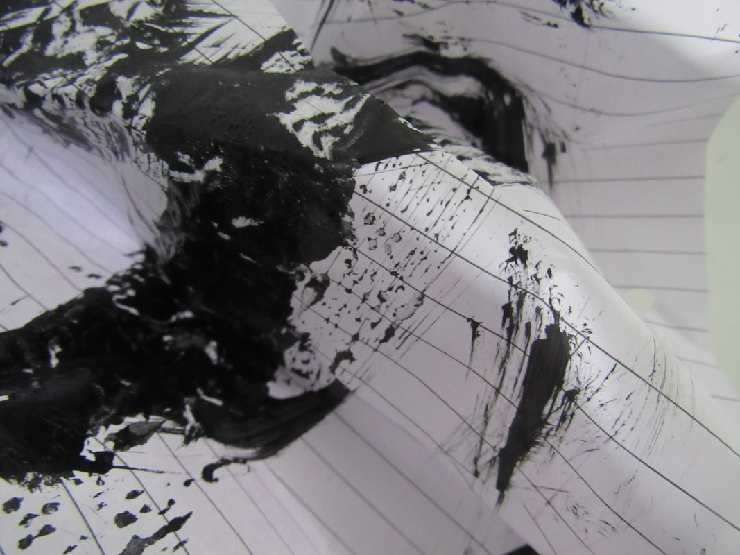
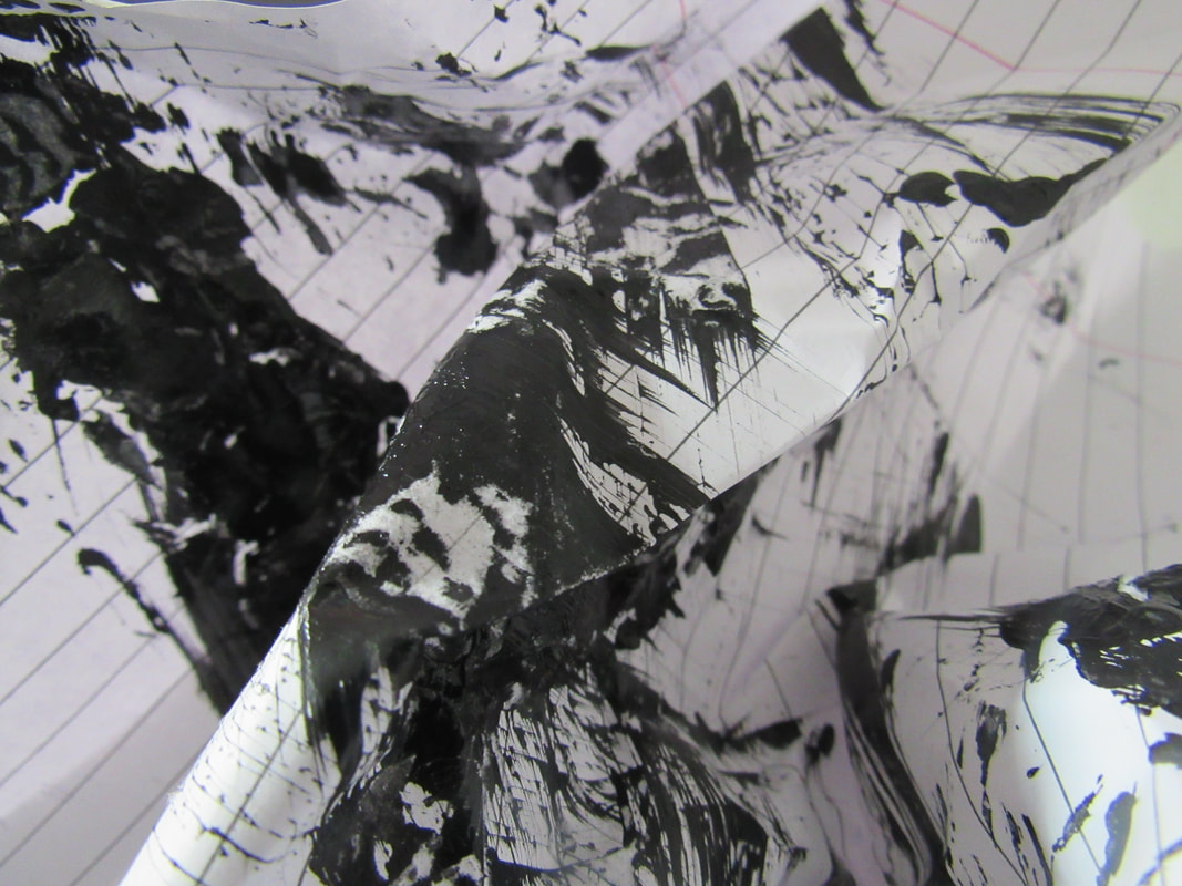
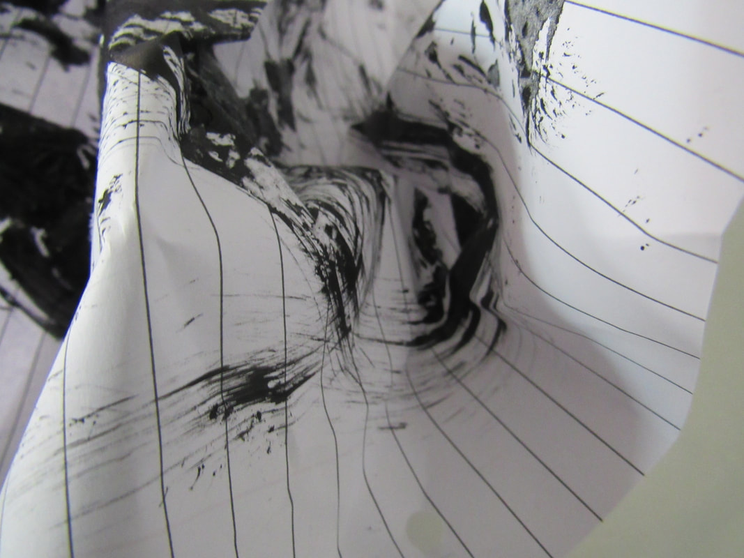
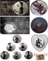
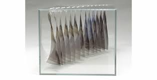
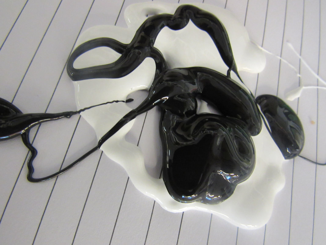
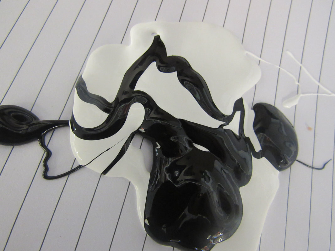
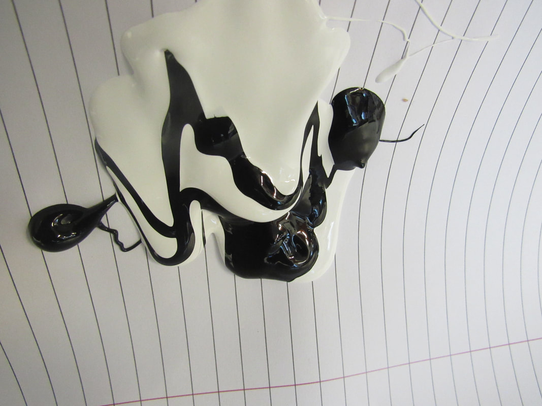
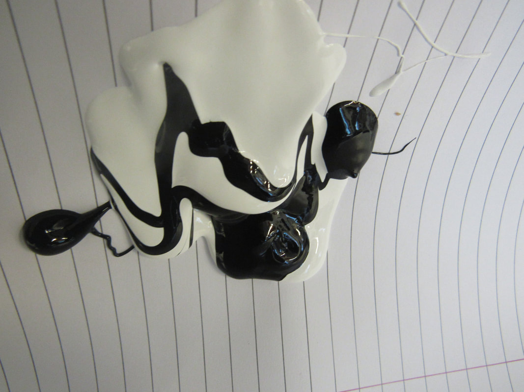
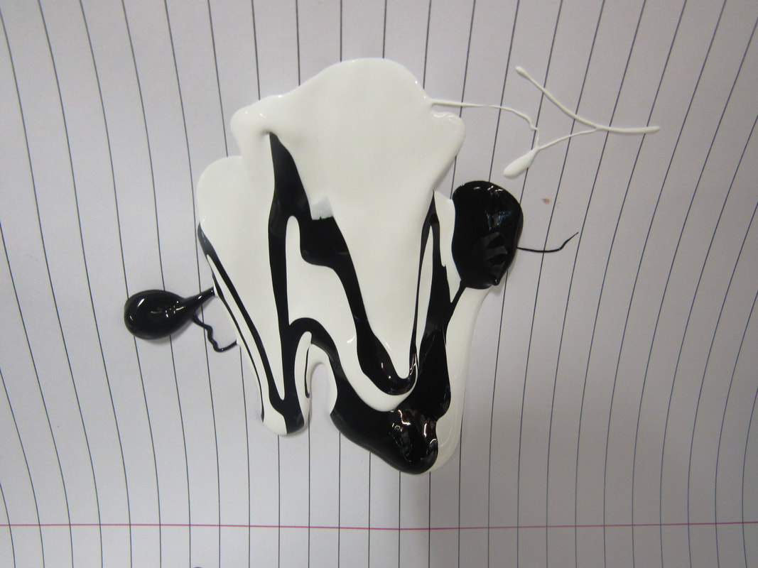
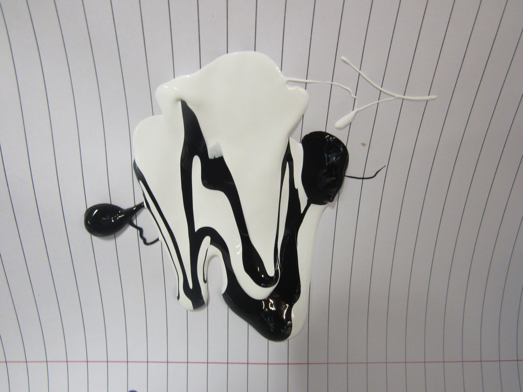
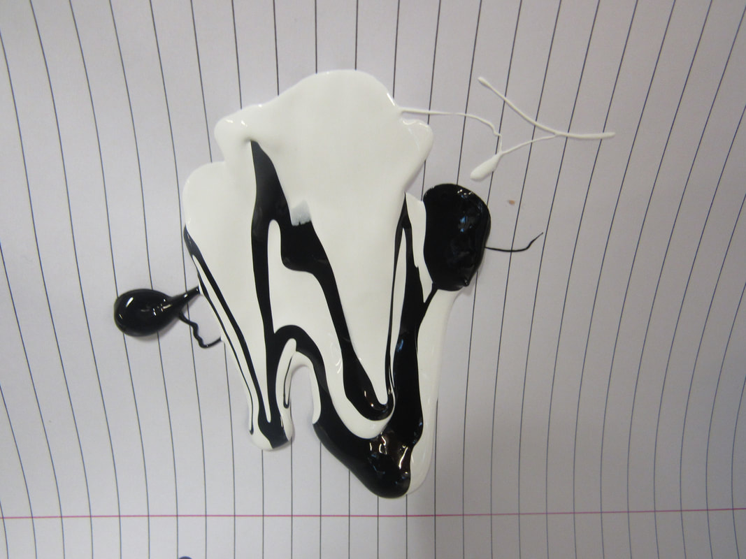
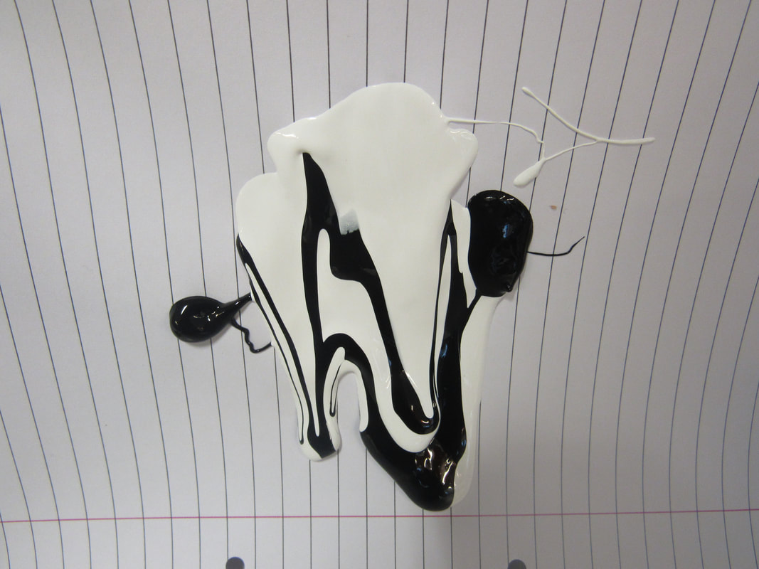
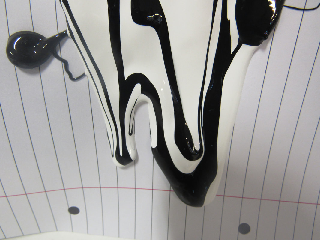
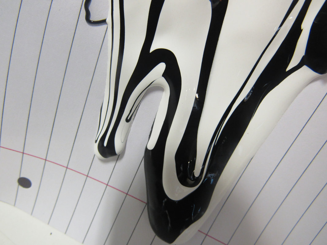
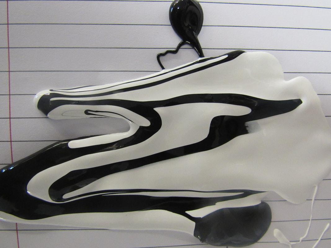
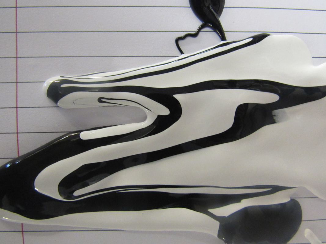
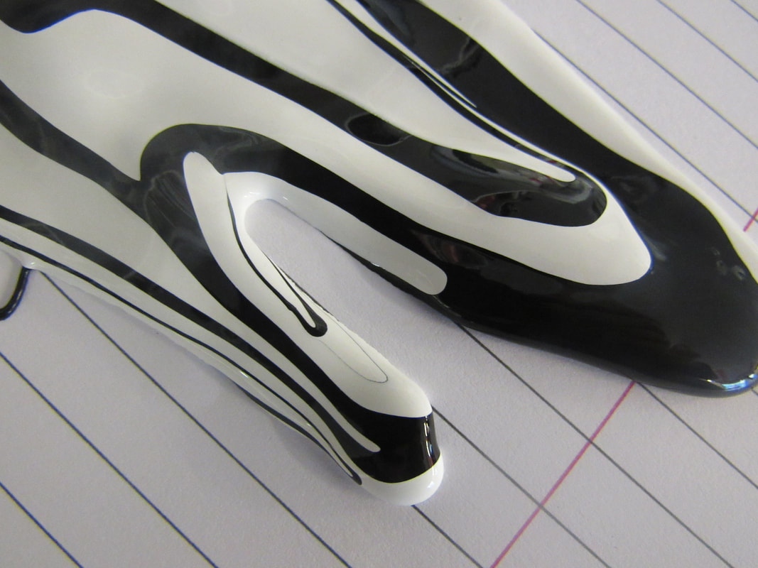
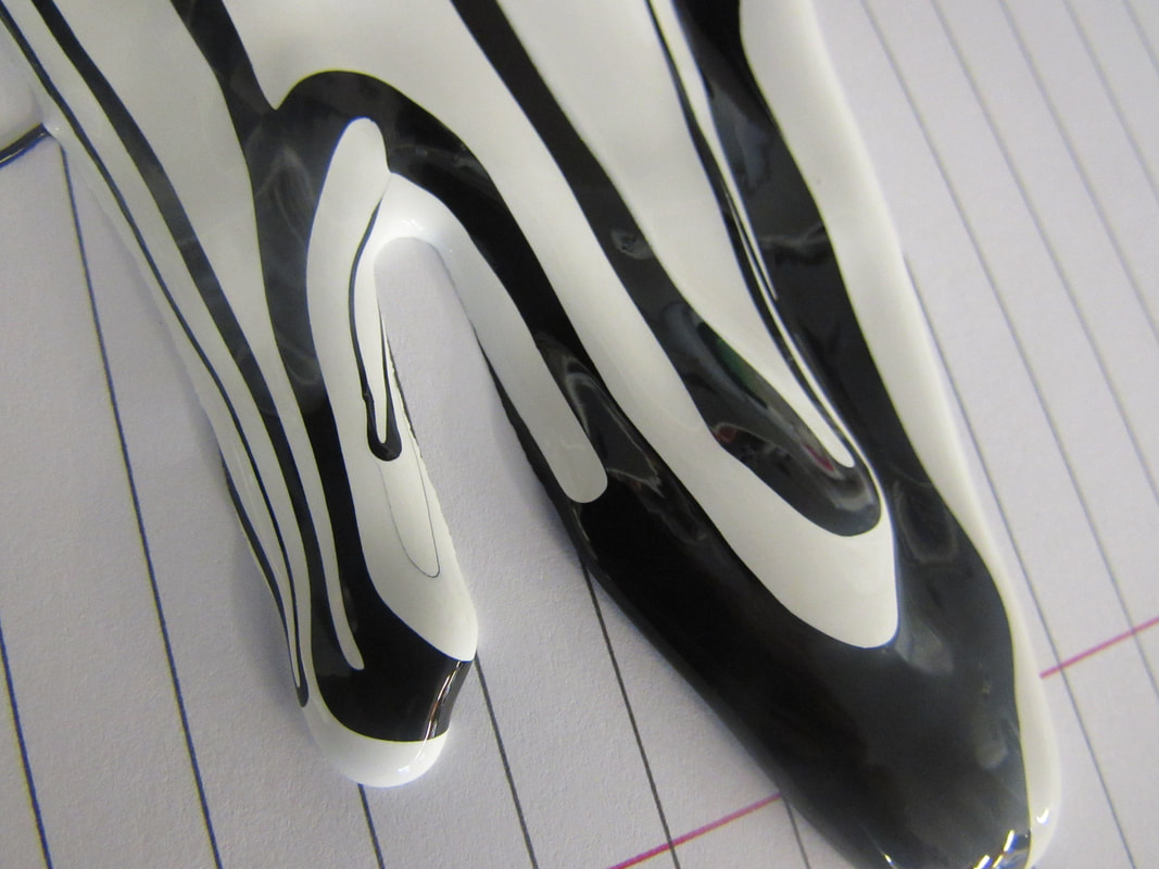
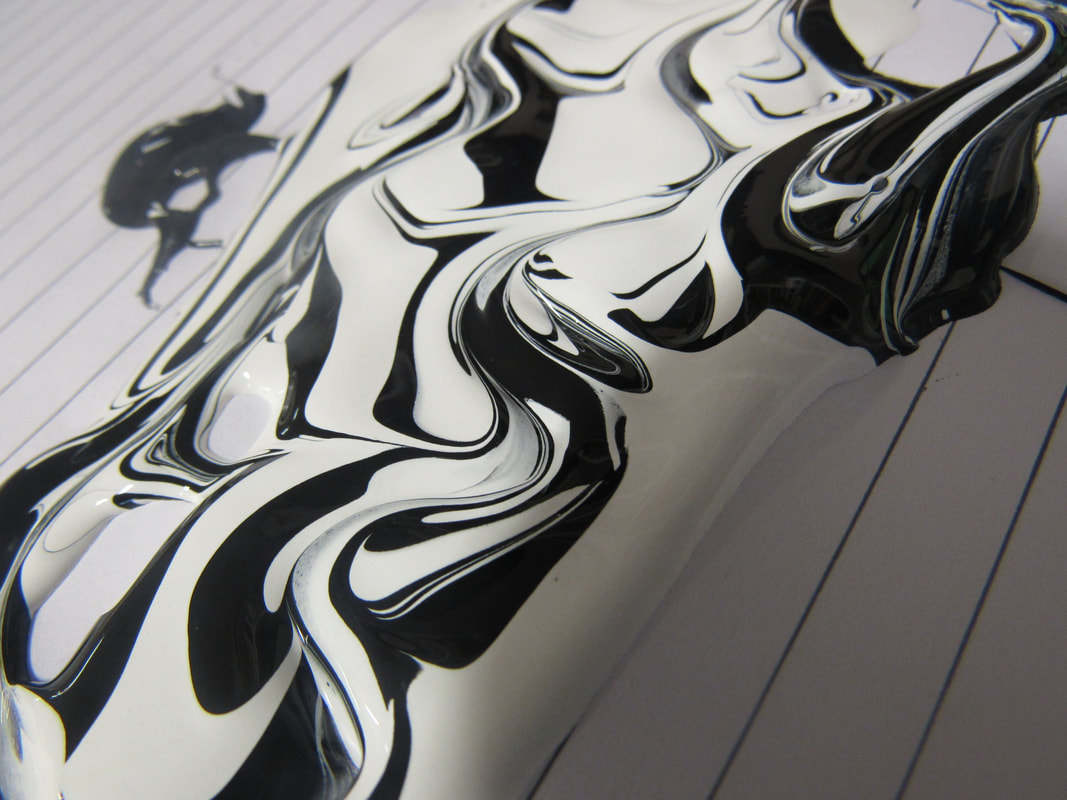
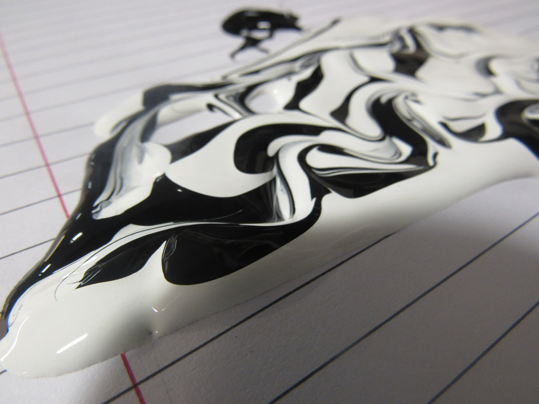
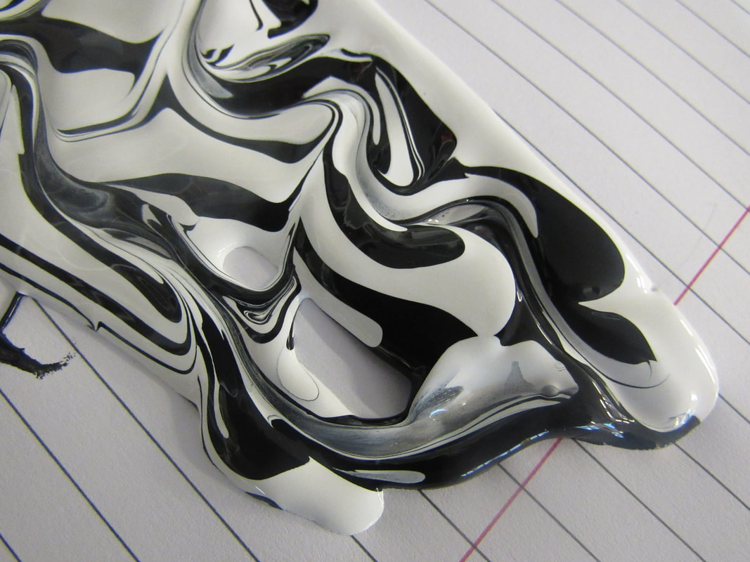
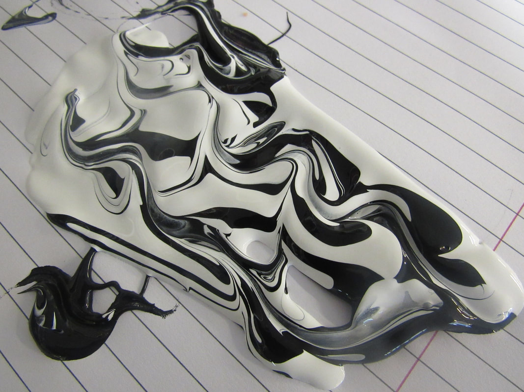
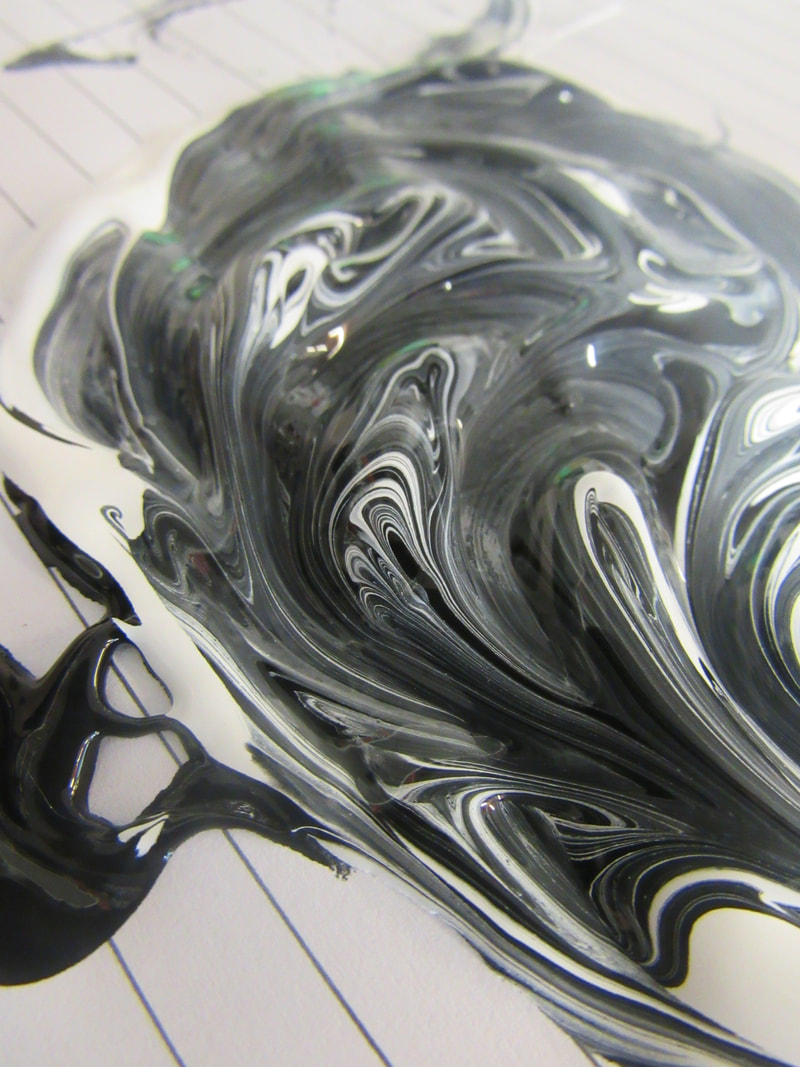
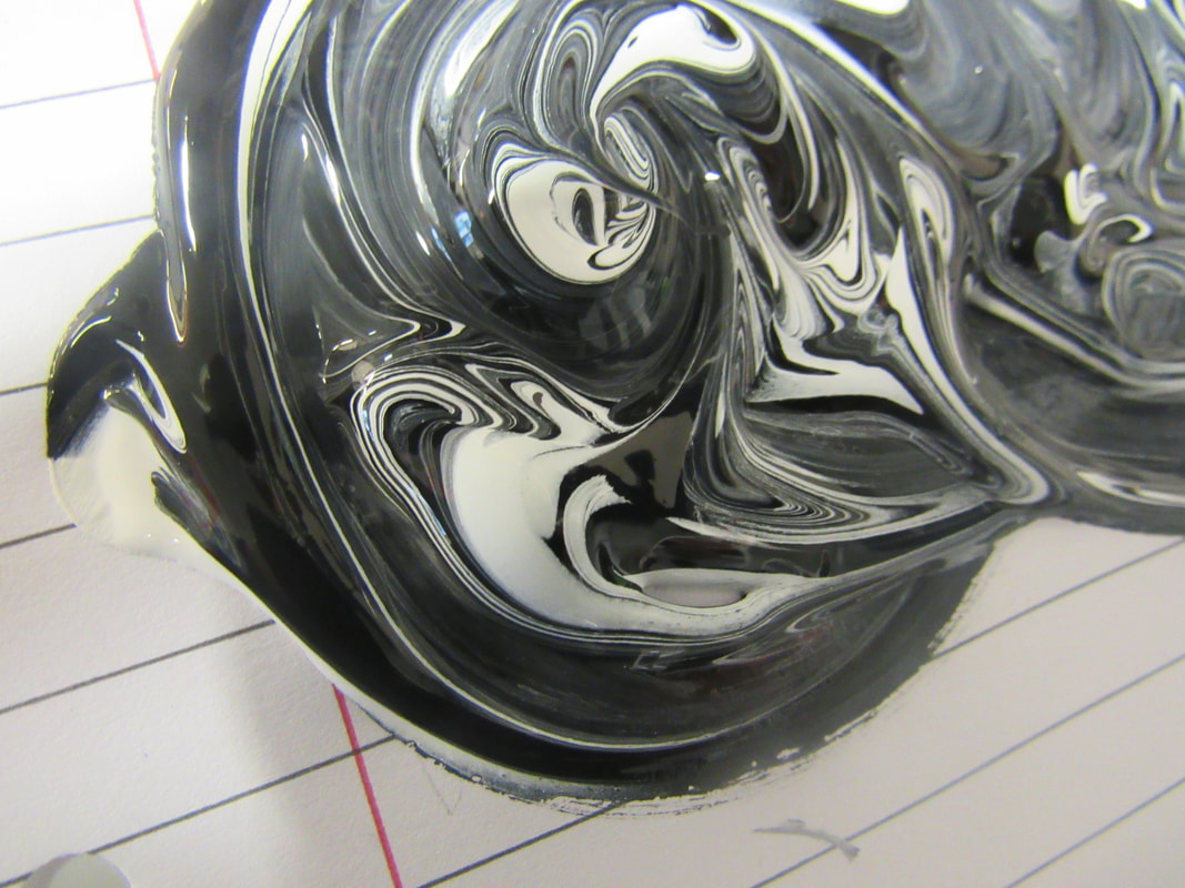
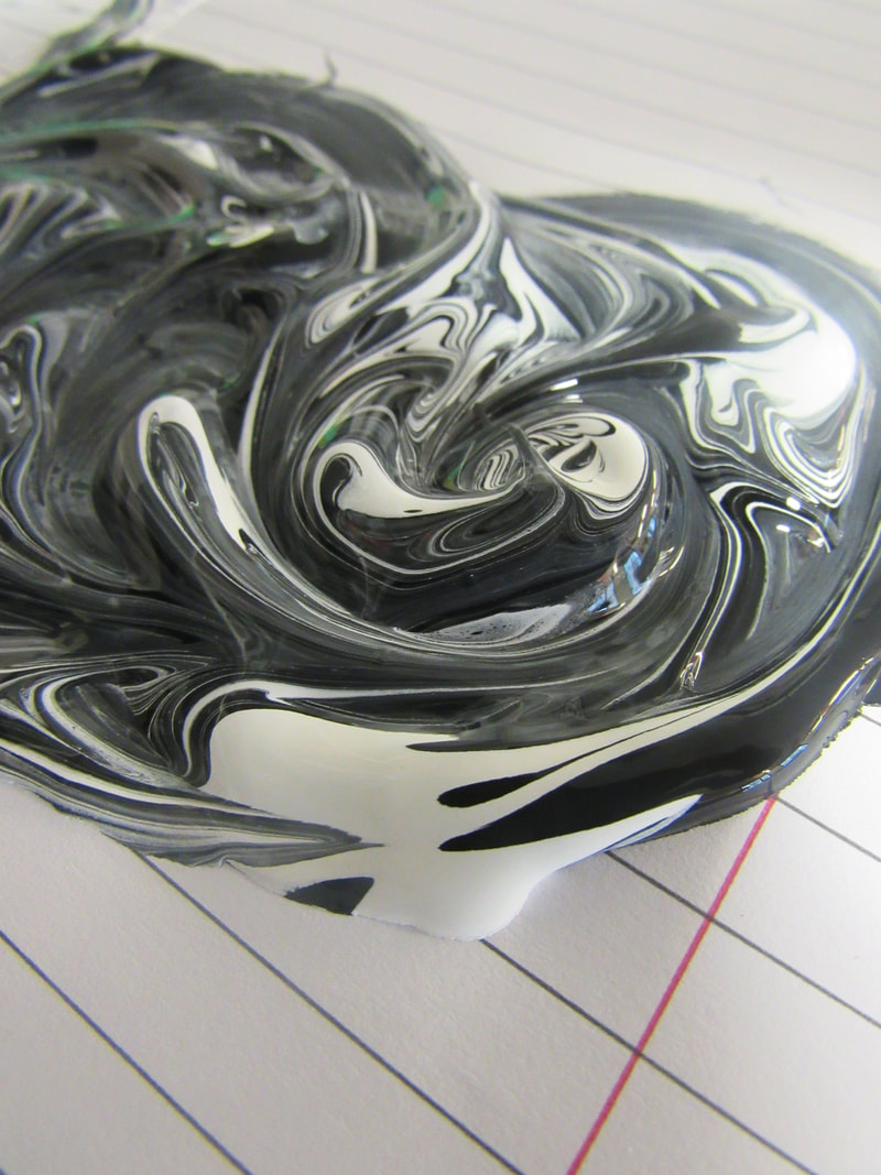
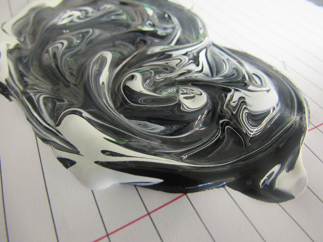
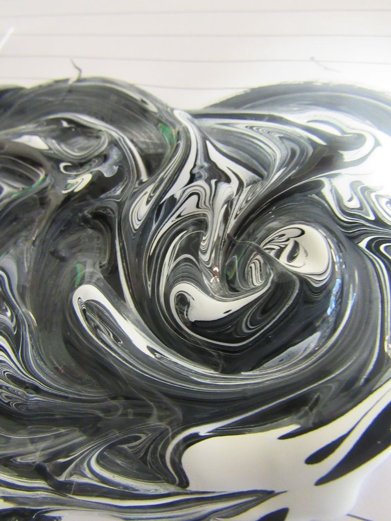
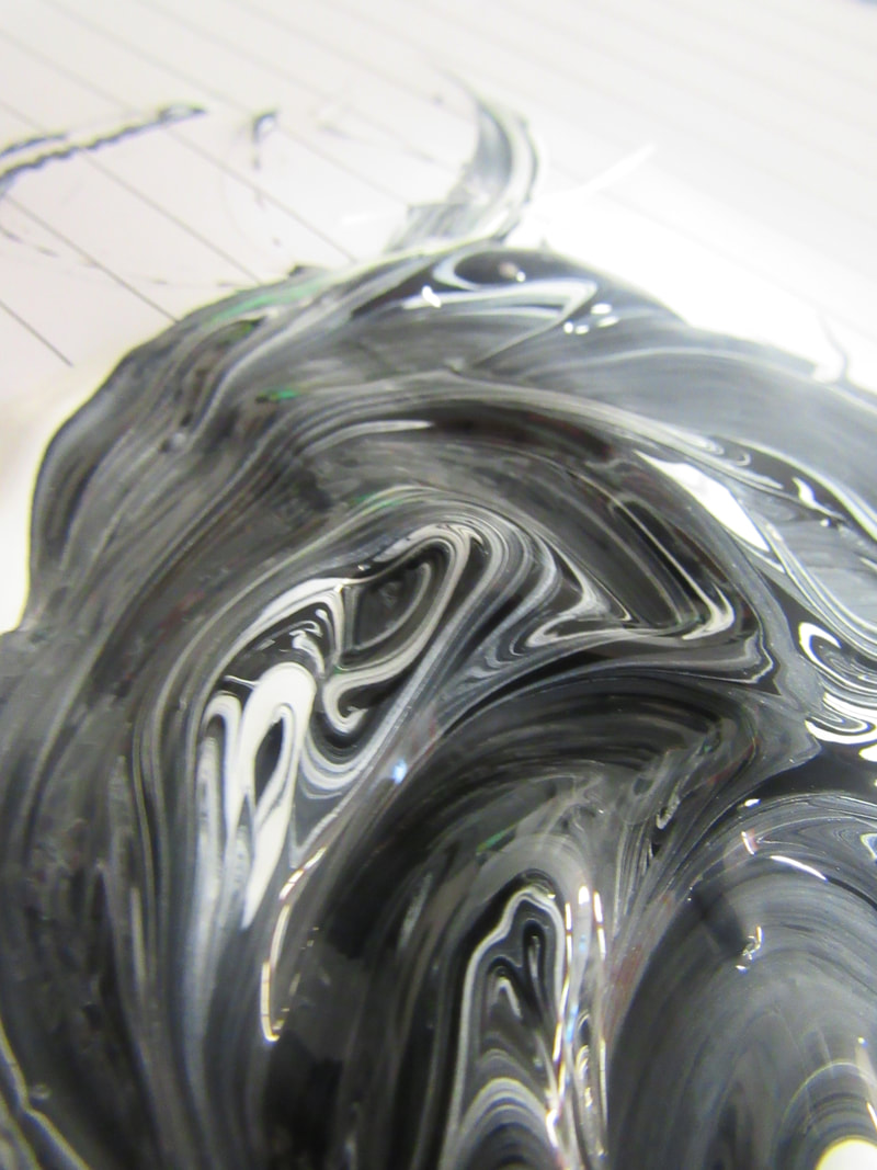
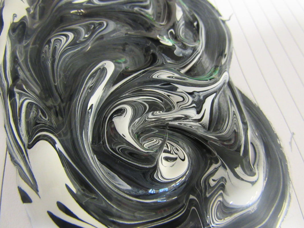
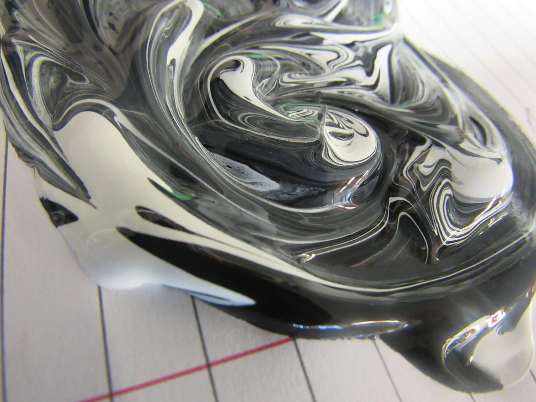
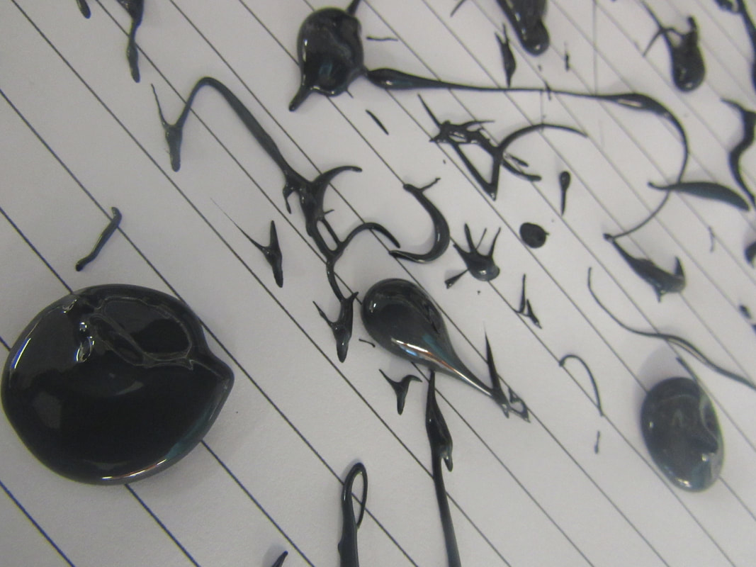
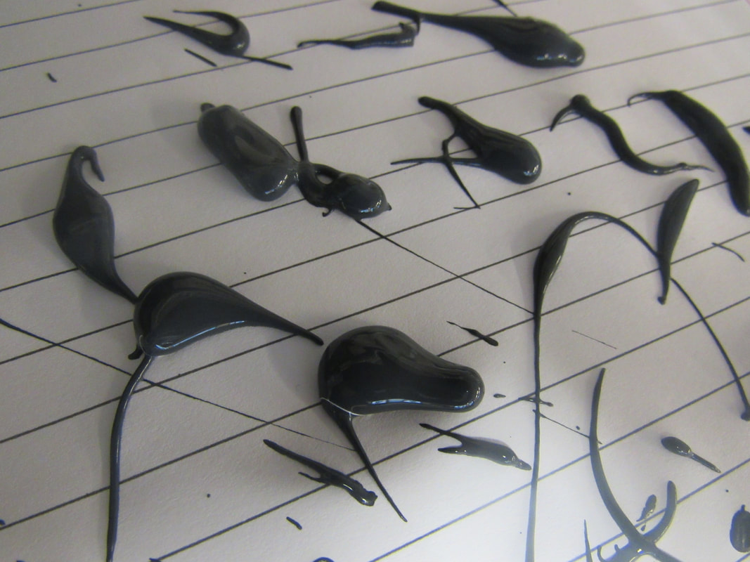
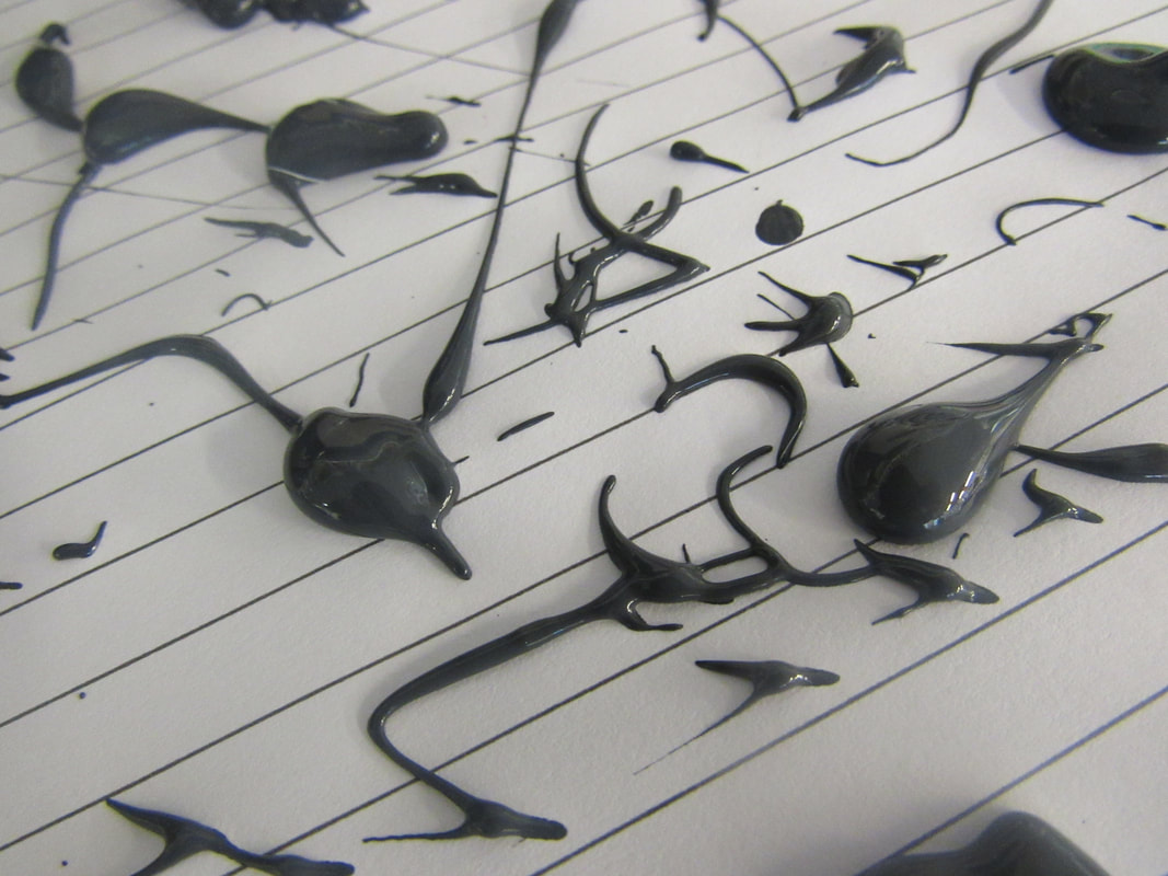
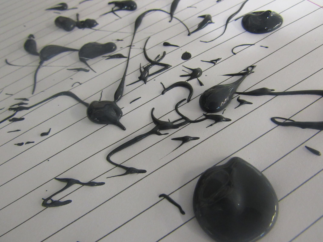
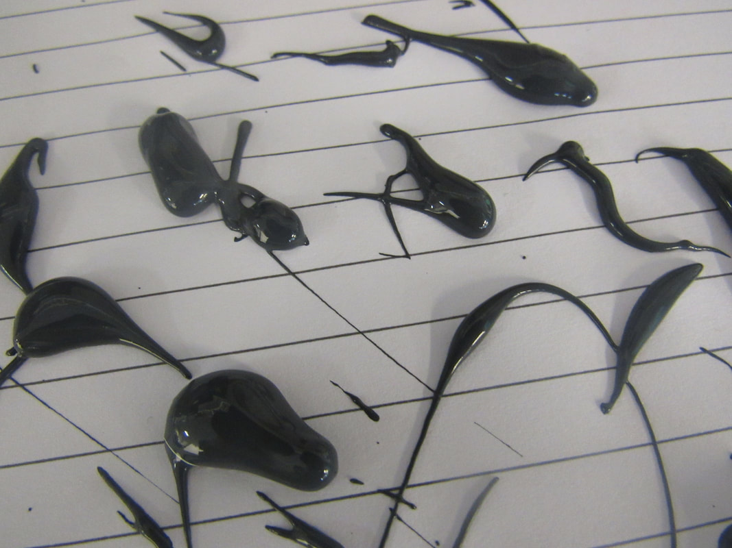
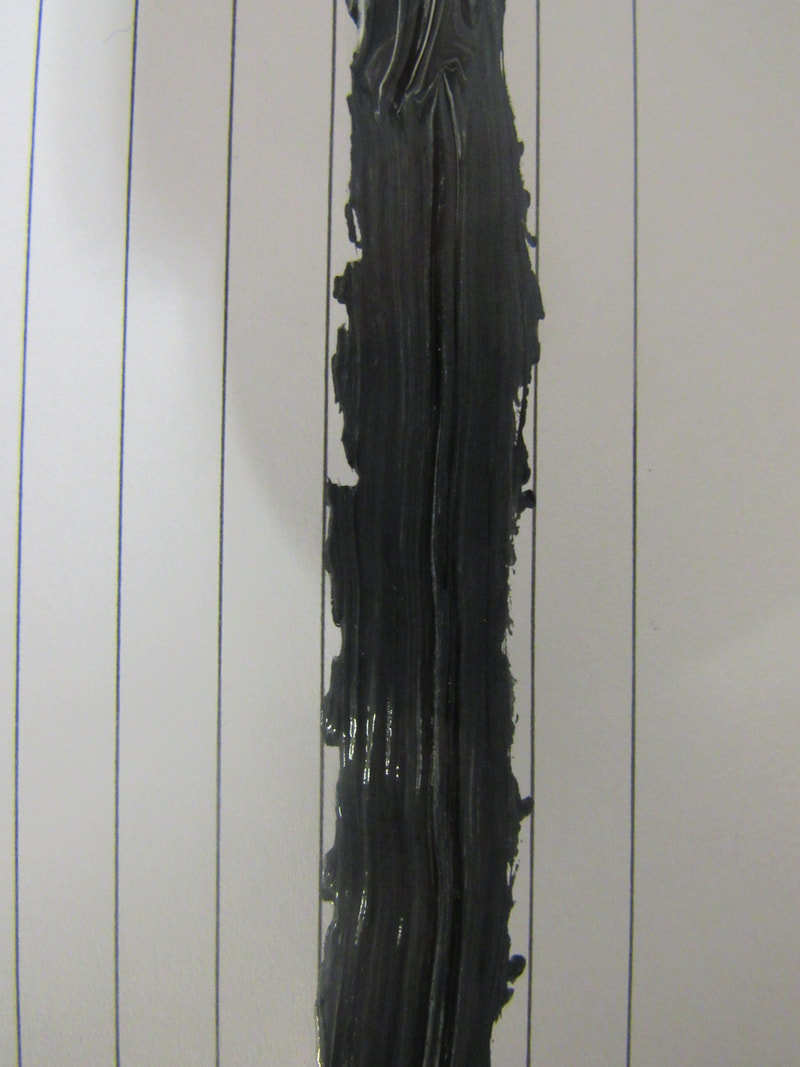
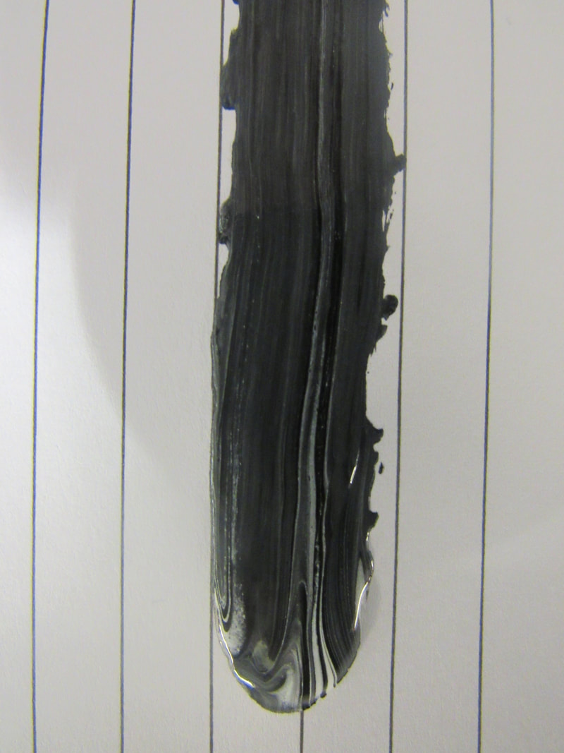
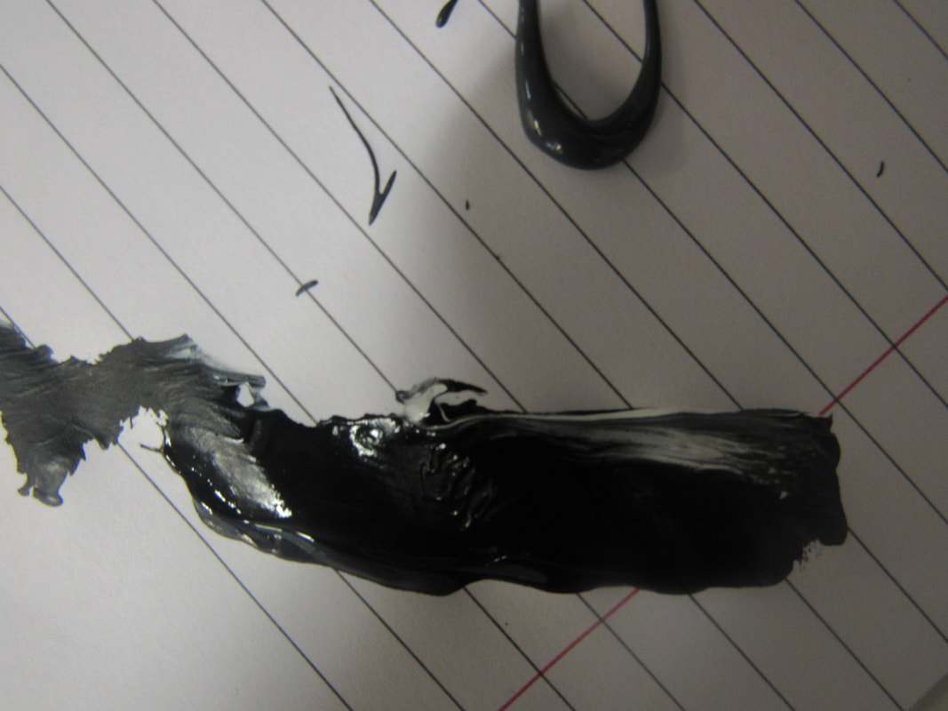
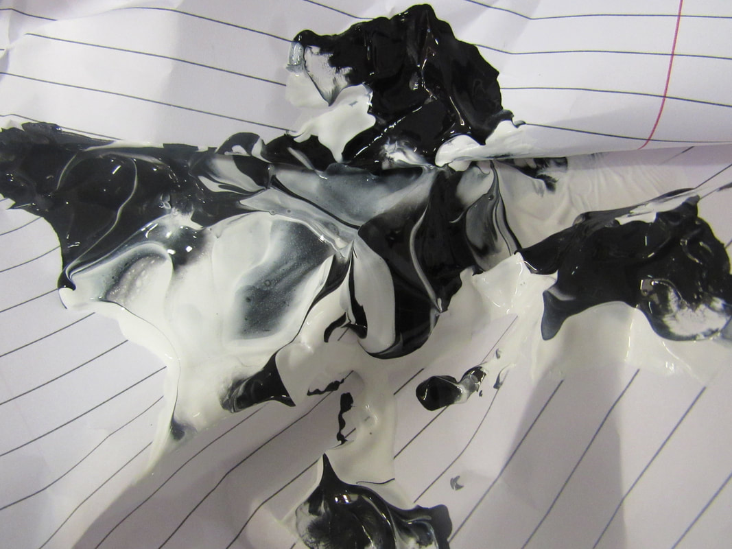
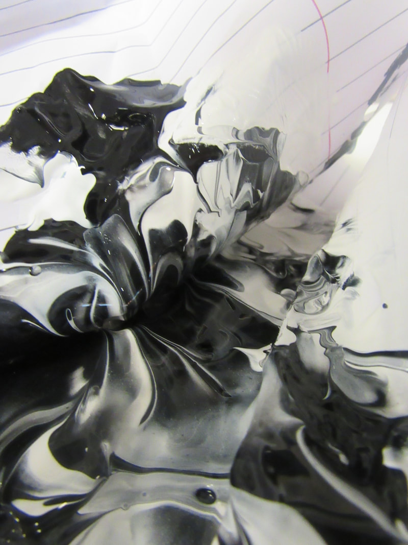
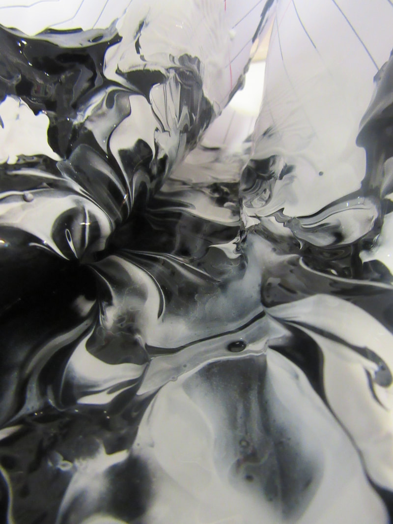
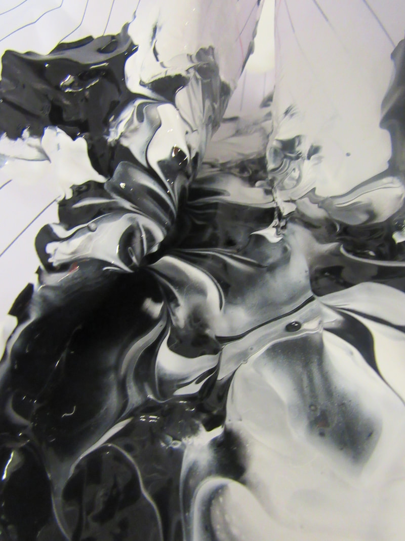
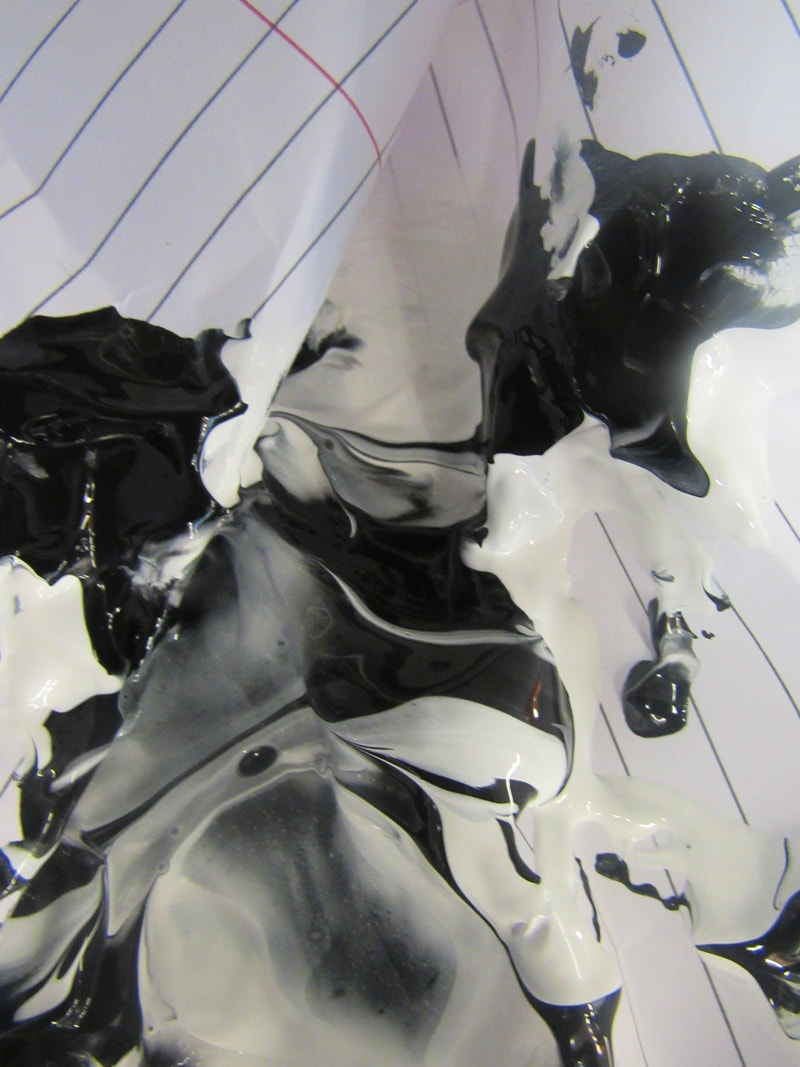
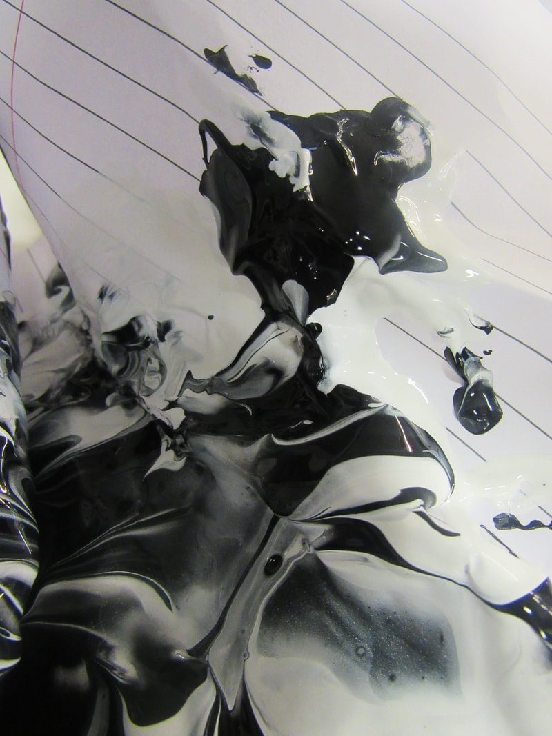
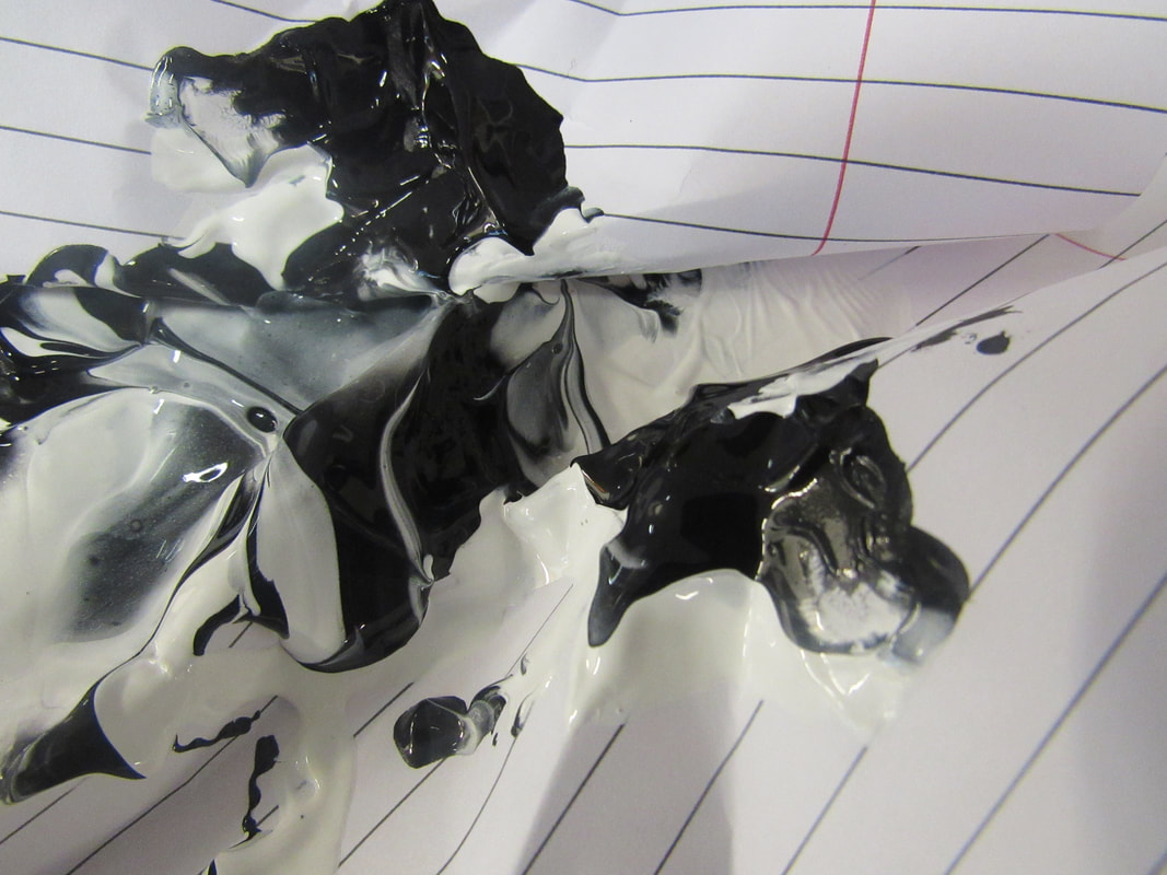
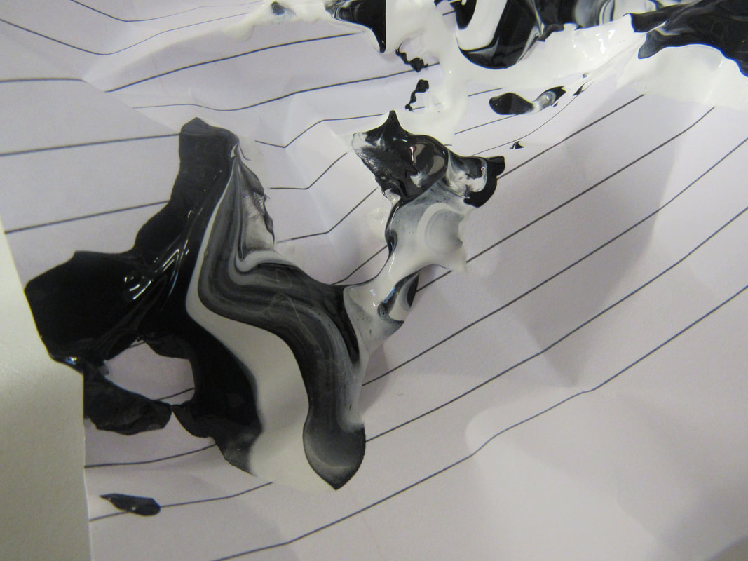
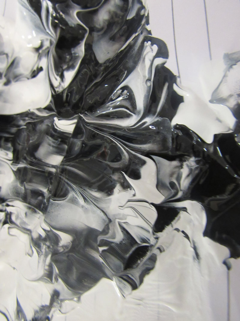
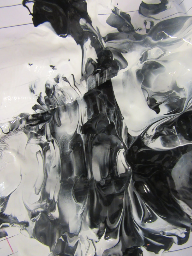
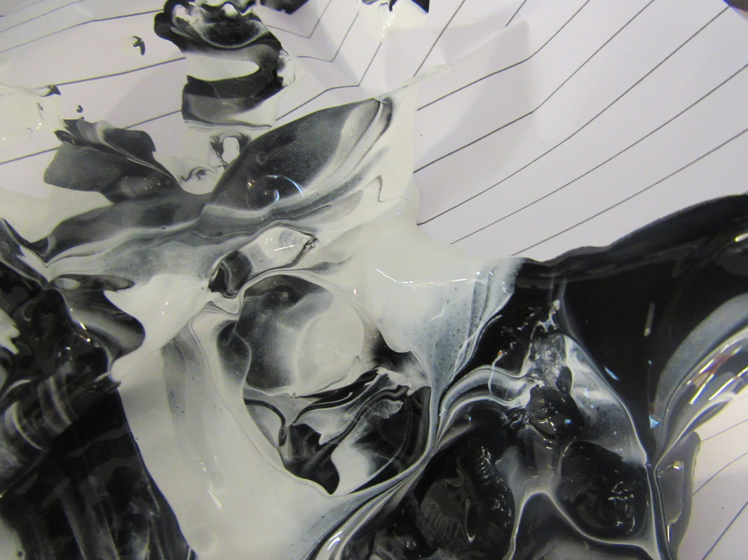
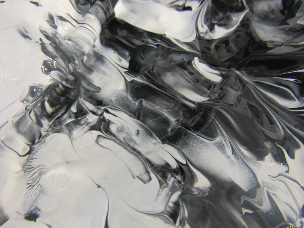
I did the same thing that I did before with the paper but I used black paint there was two reasons why I used black paint one because I want to experiment with paint and colour (which I have not used in this experiment but I will next time) and lastly because I thought there was to much white and I wanted more black and I do like the way it came out I like it a lot I think its the best one that I have done yet I put the black paint randomly on the paper when I look at the photos they give me the feel old, antic, weird, gory why it gives me those feels is because of the black paint.
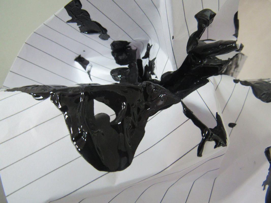
I'm going to do next time is use different colour paint but do the same as I did with the paper before I do not know how well it is going to come out but I hope it comes out well.
I'm going to do next time is use different colour paint but do the same as I did with the paper before I do not know how well it is going to come out but I hope it comes out well.
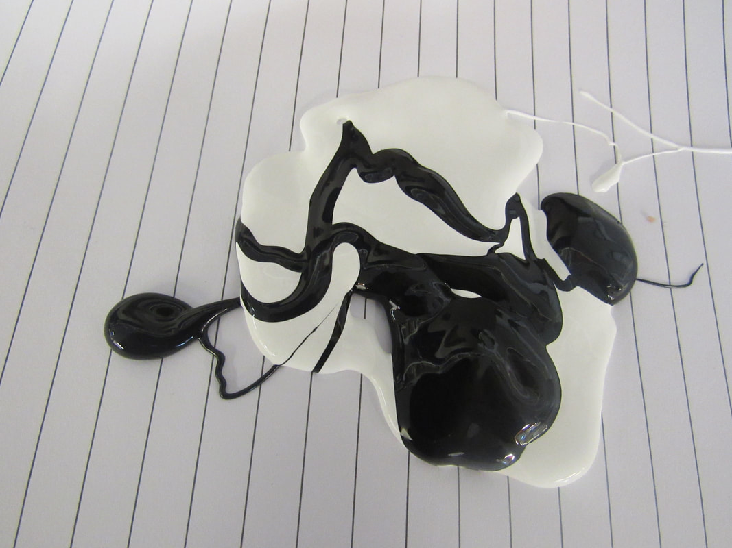
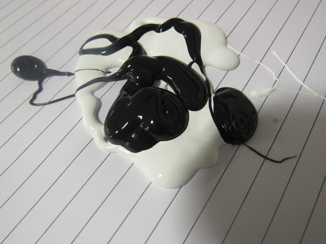
This is the beginning of this experiment and I do not like this and will not continue. What I did was I got paint and I put it on the lined paper.
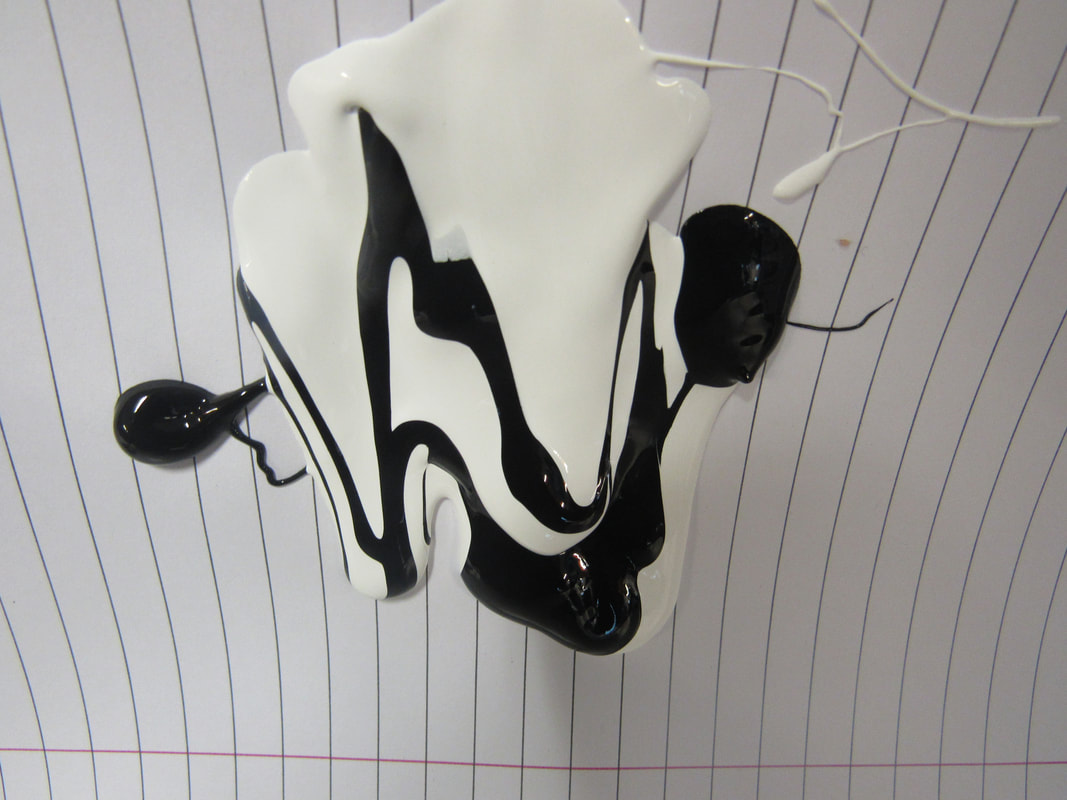
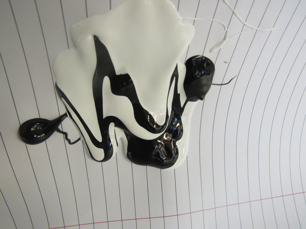
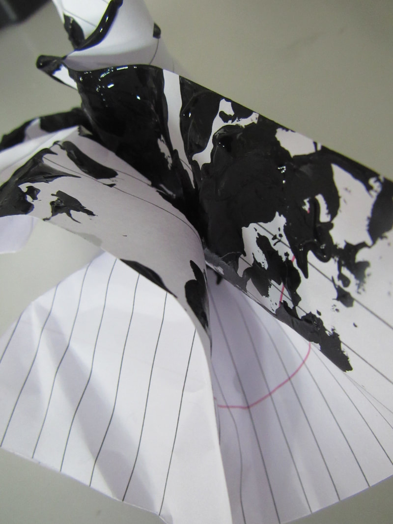
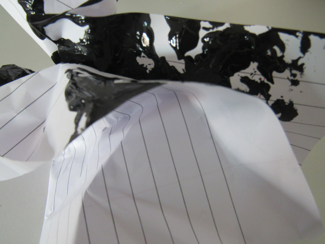
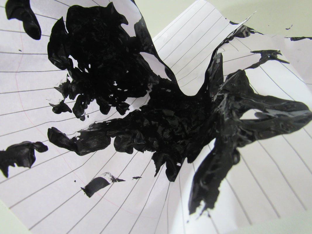
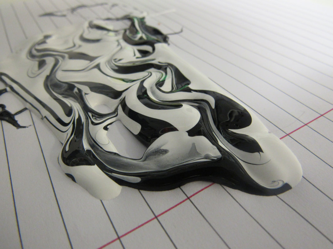
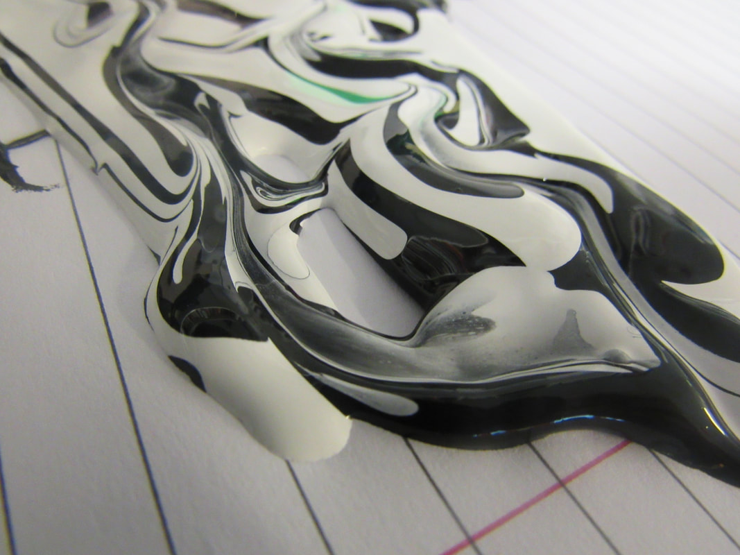
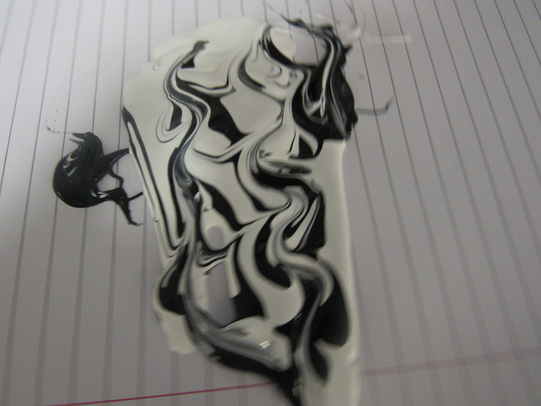
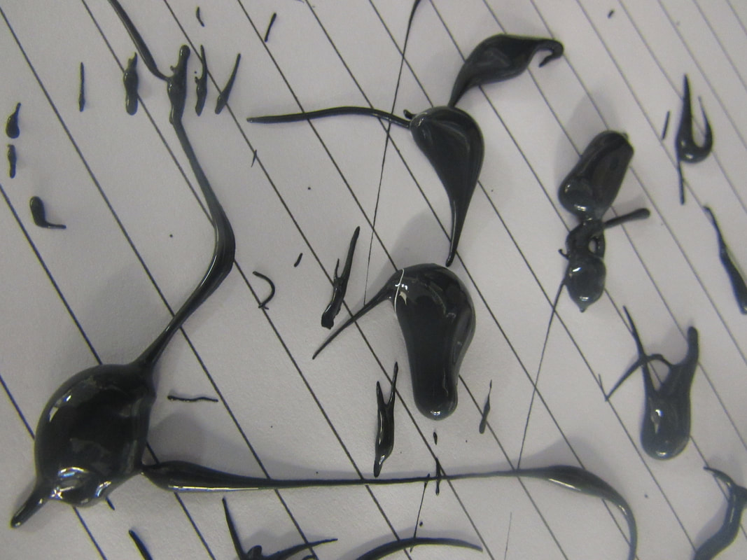
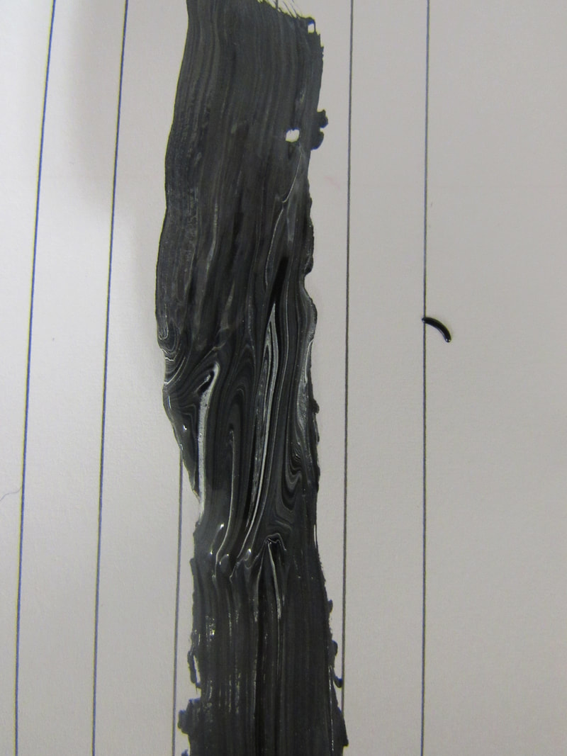
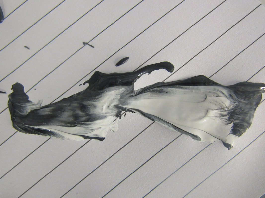
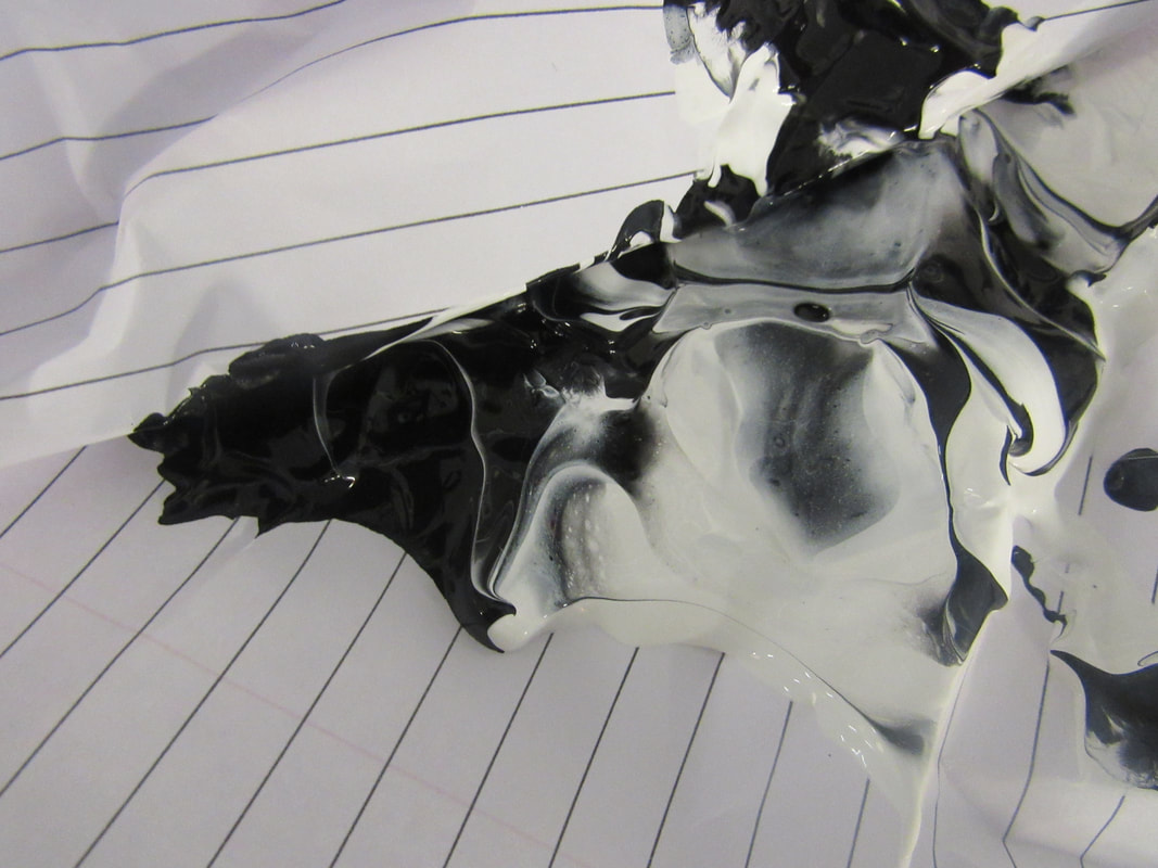
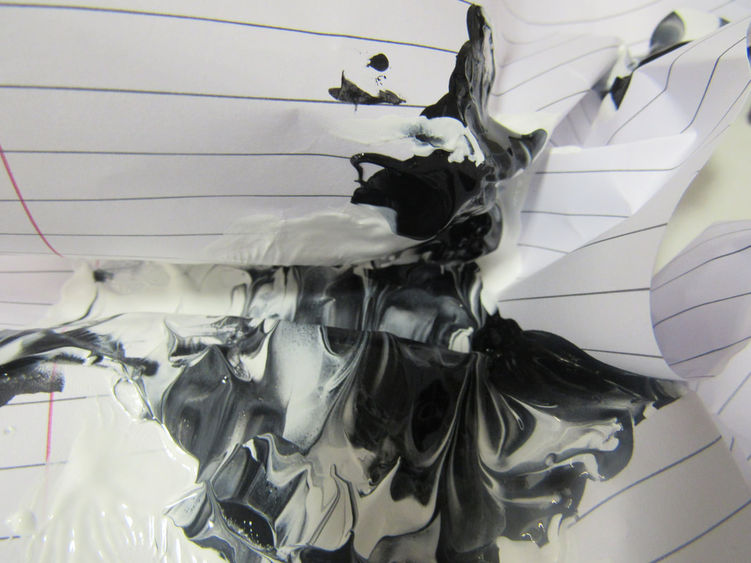
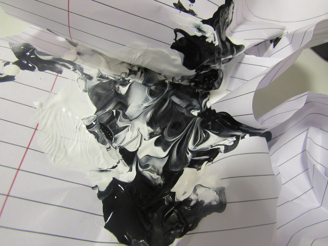
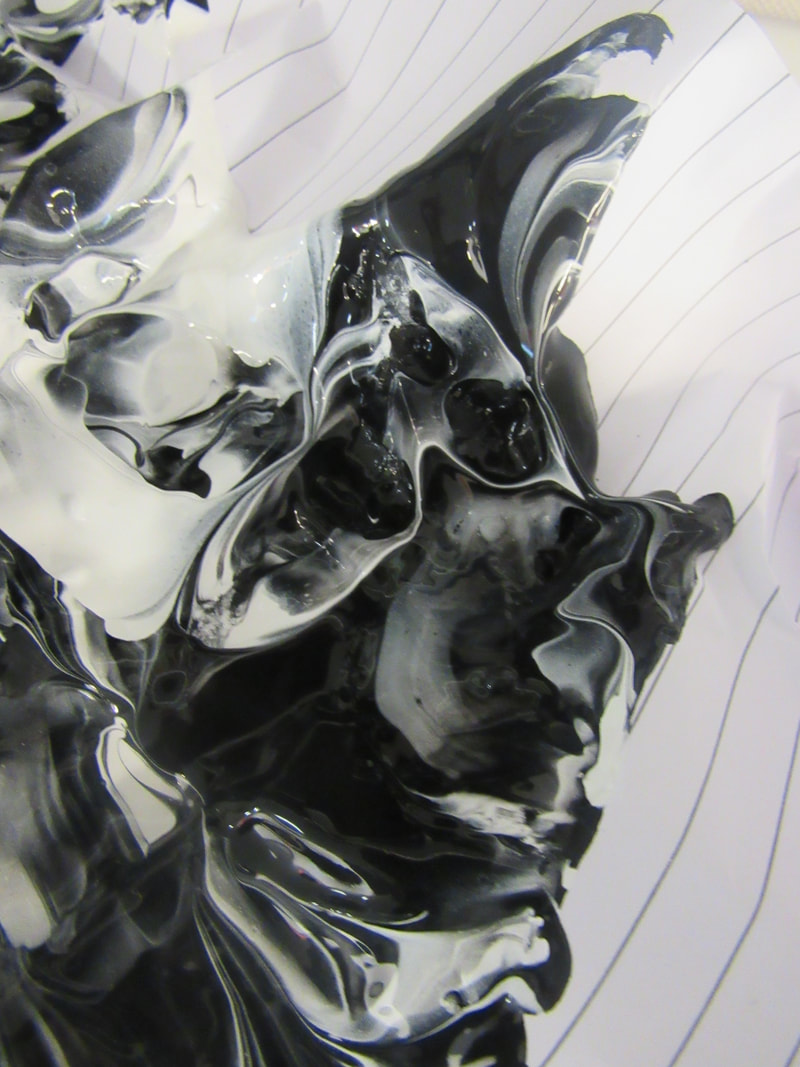
With this one I continued the experiment that I did before but what I did before and I put the paper on an angle because I wanted the dripping affect and I like how this came out and want to do more like this.
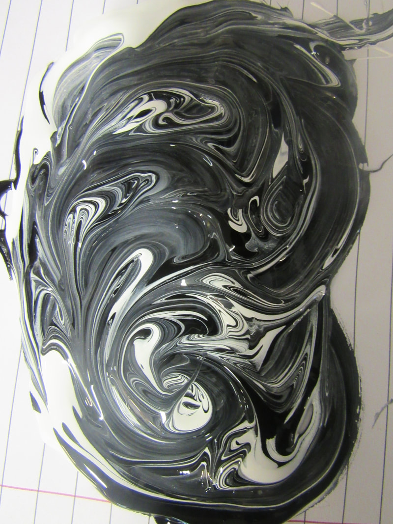
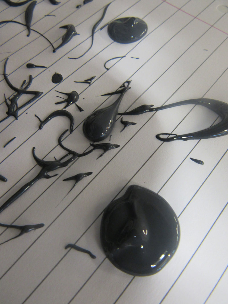
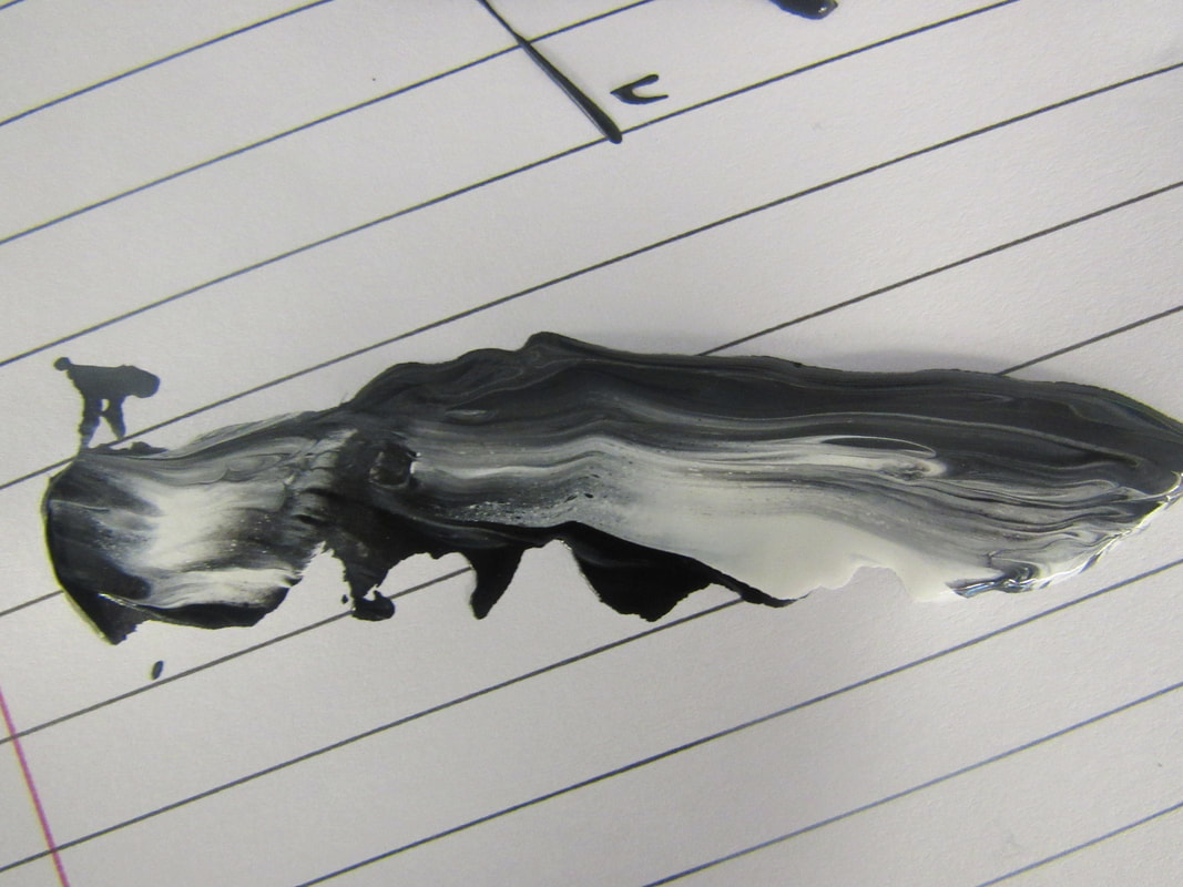
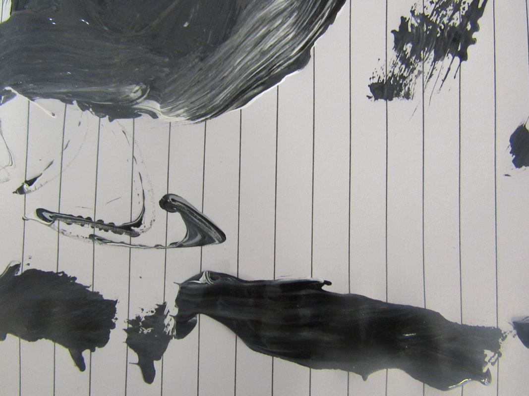
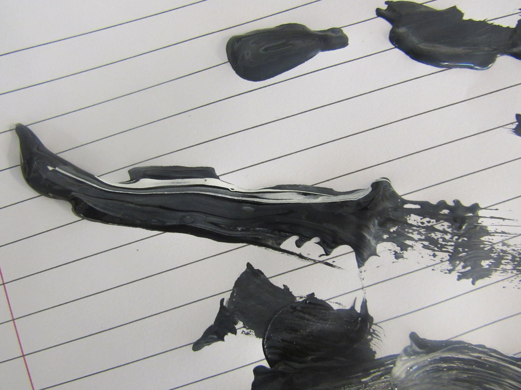
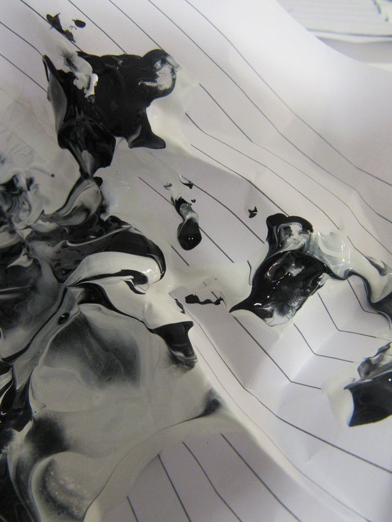
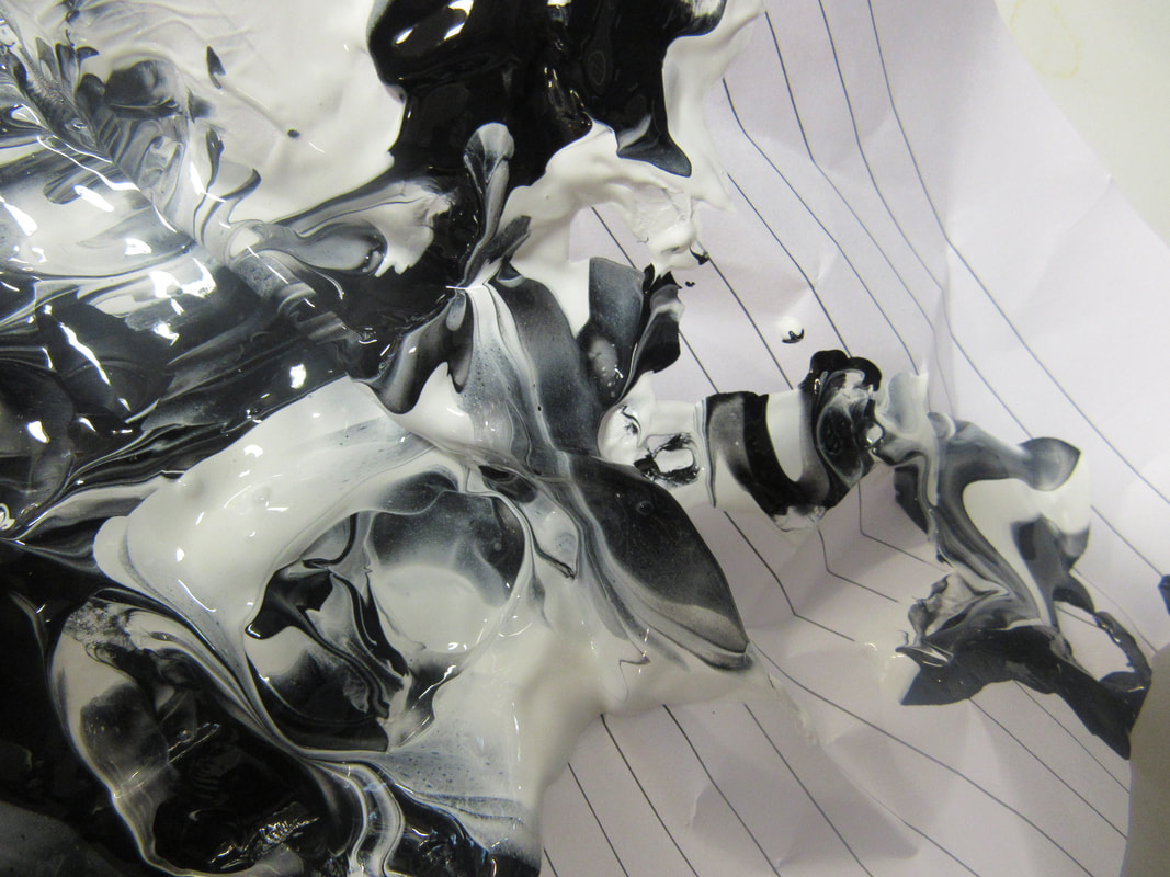
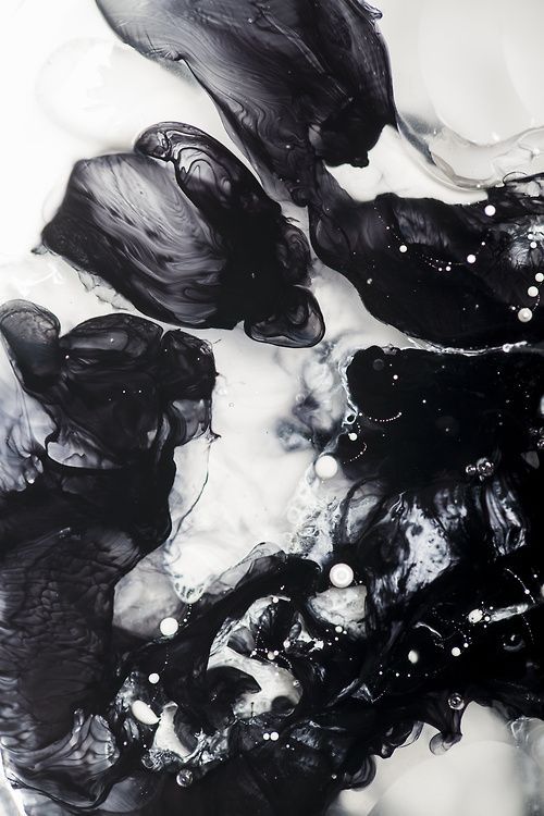
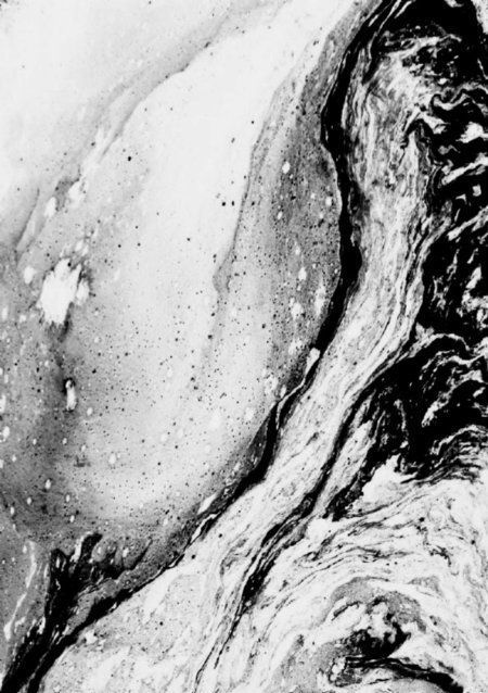
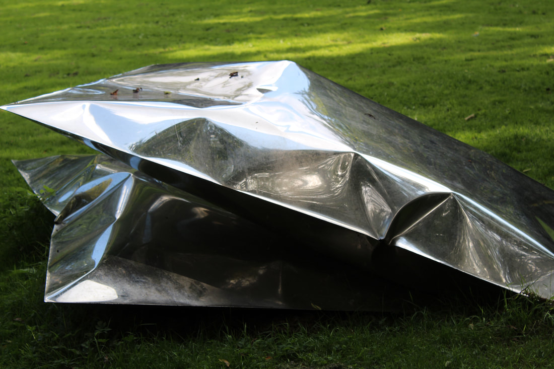
The photos that I just did look a lot like these photos because I was inspired be them they are different and some have different colours and I have not done that but I plan to do that so and use different colours instead of black, white and grey I do not think I will continue and develop this idea after I use colour. These photos were done by Andreas Nicolas Fischer; Schwarm VII, J.D Doria and Bobby Hutchinson
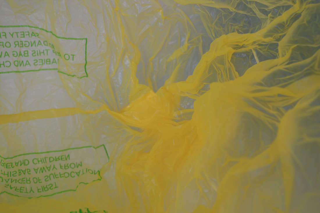
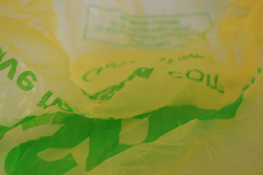

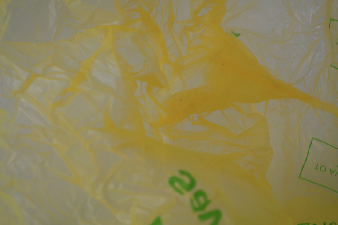
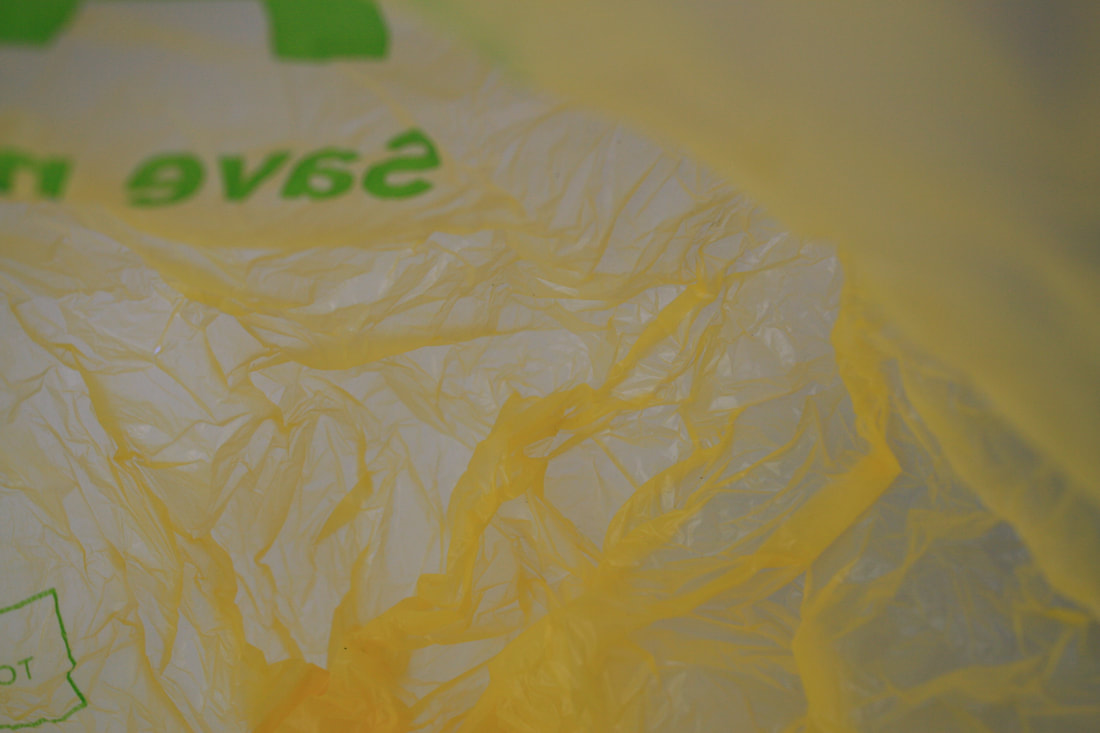
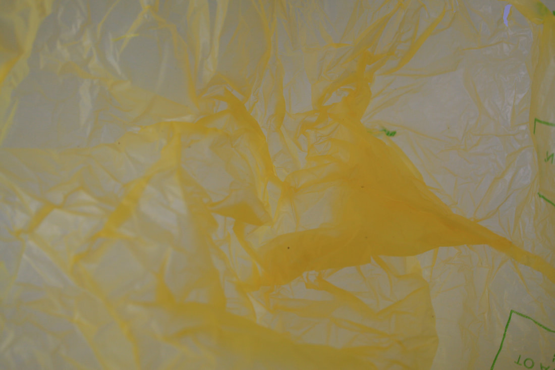
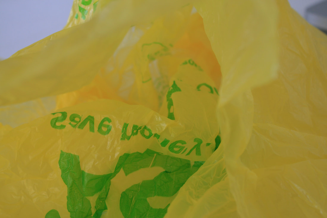
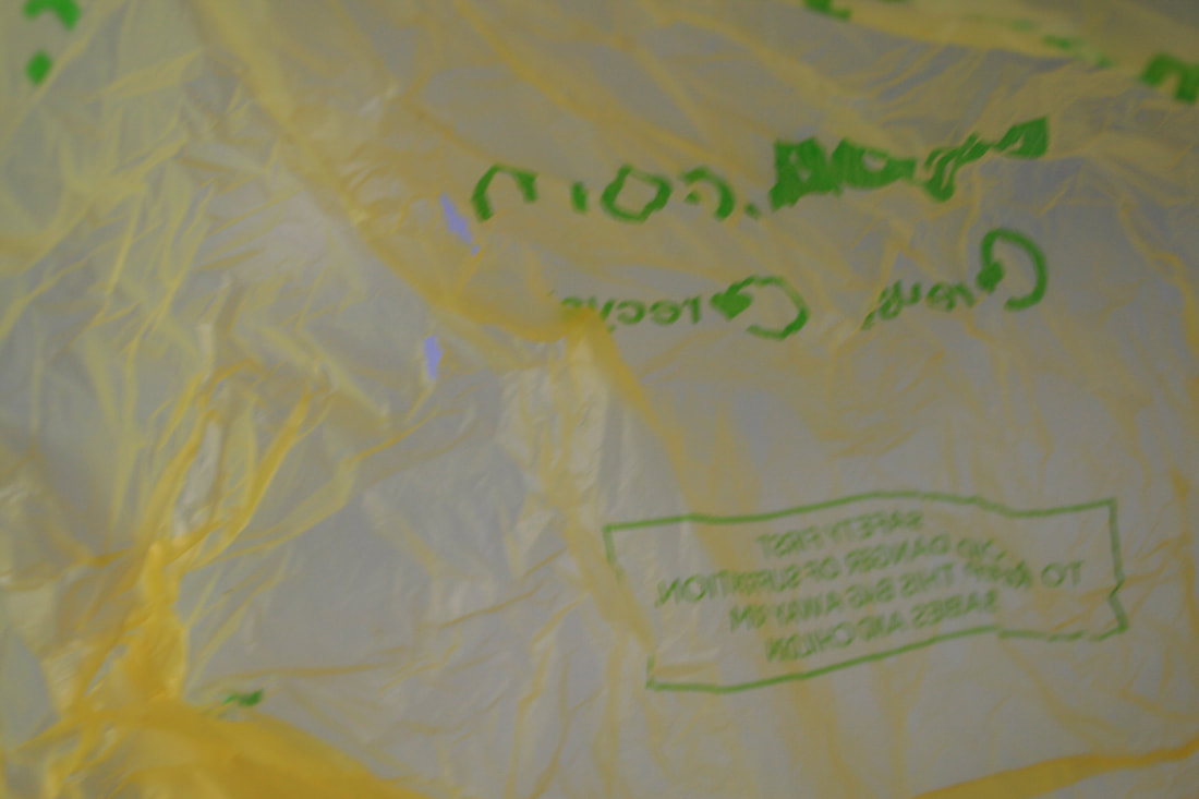
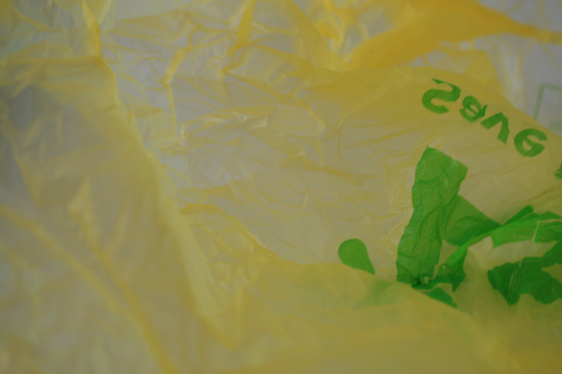
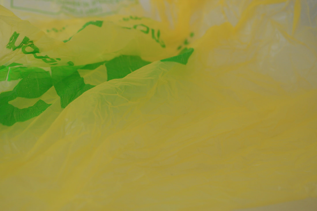
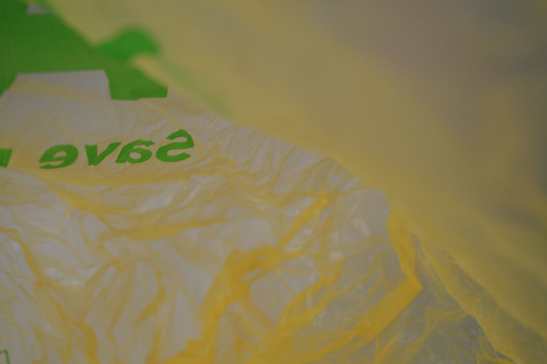
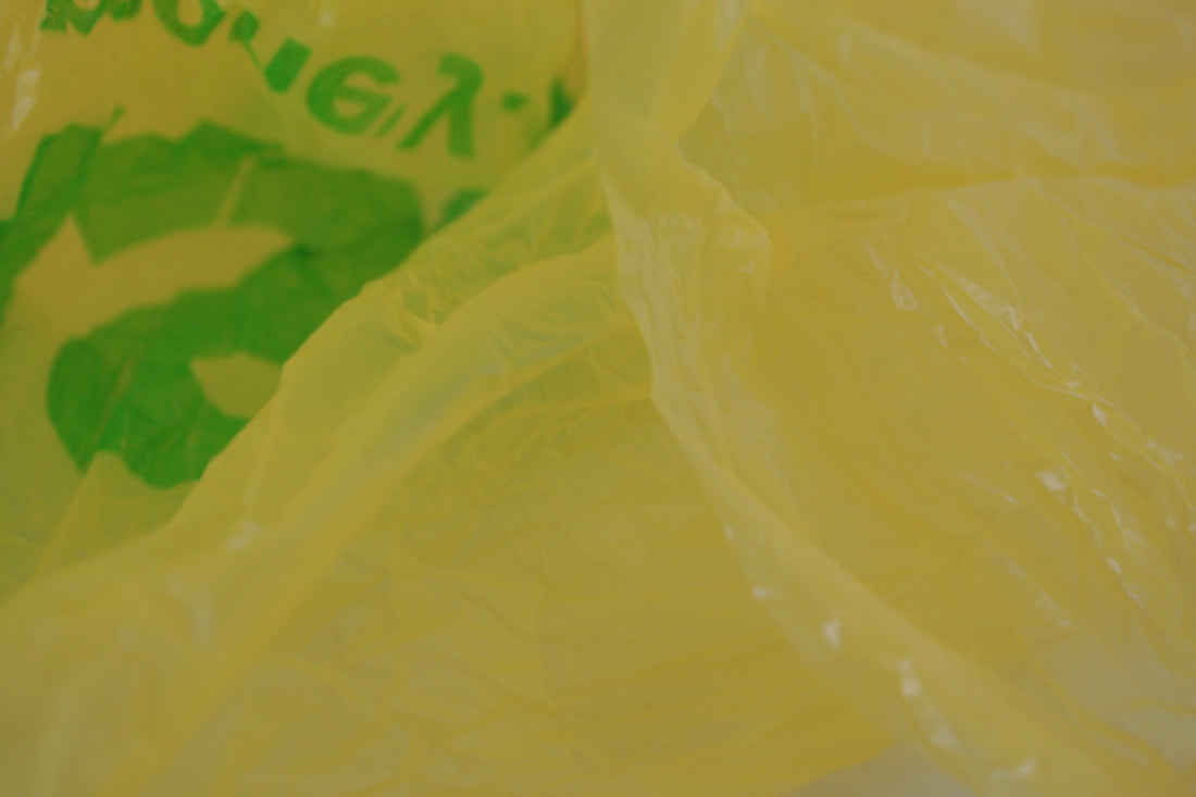
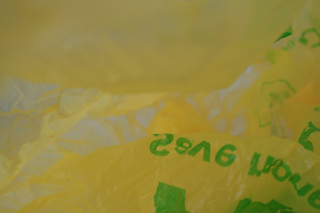

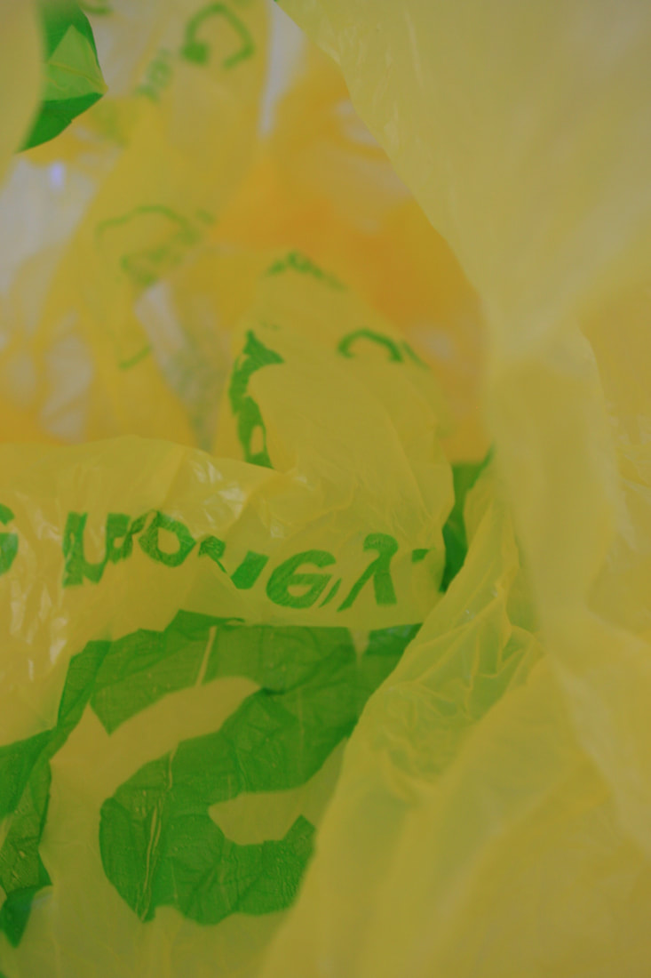
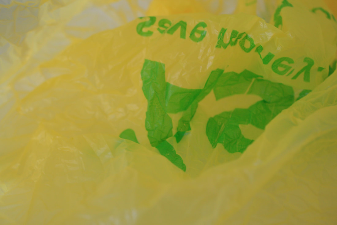
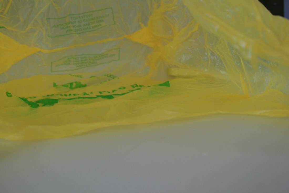
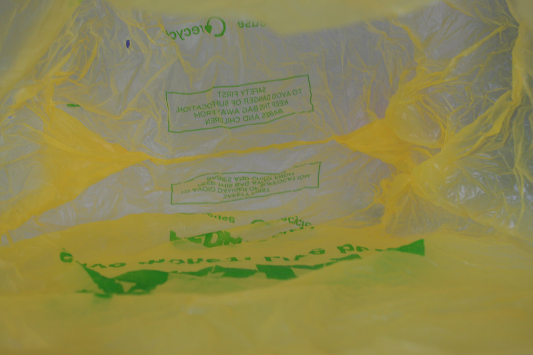

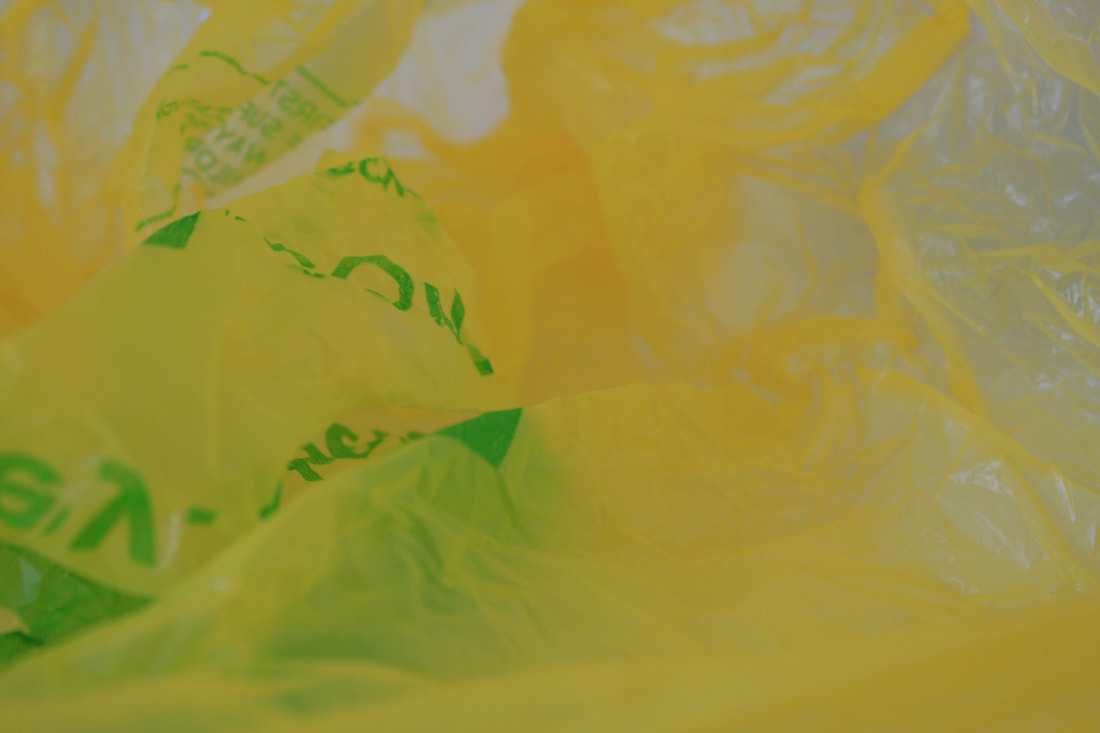
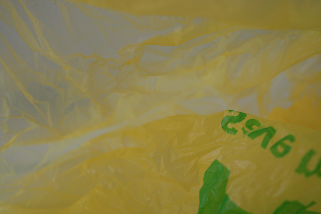
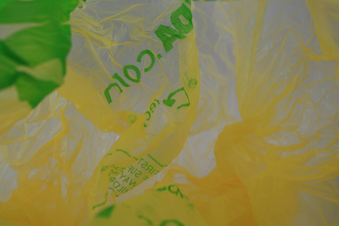
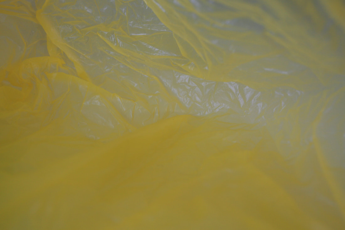
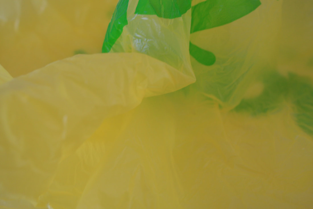
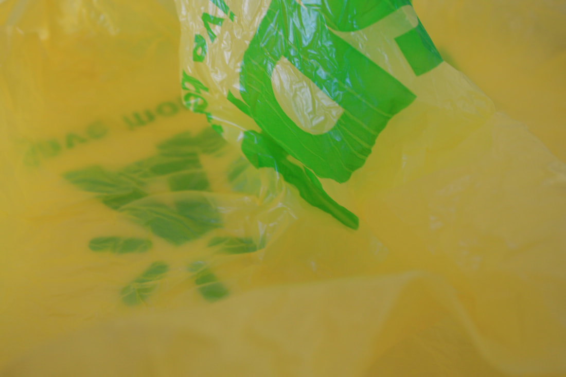
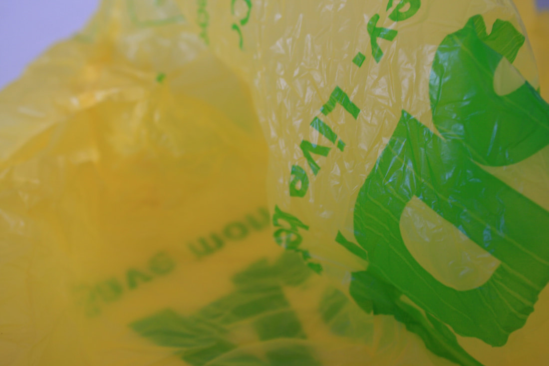
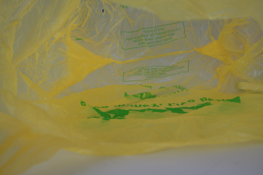
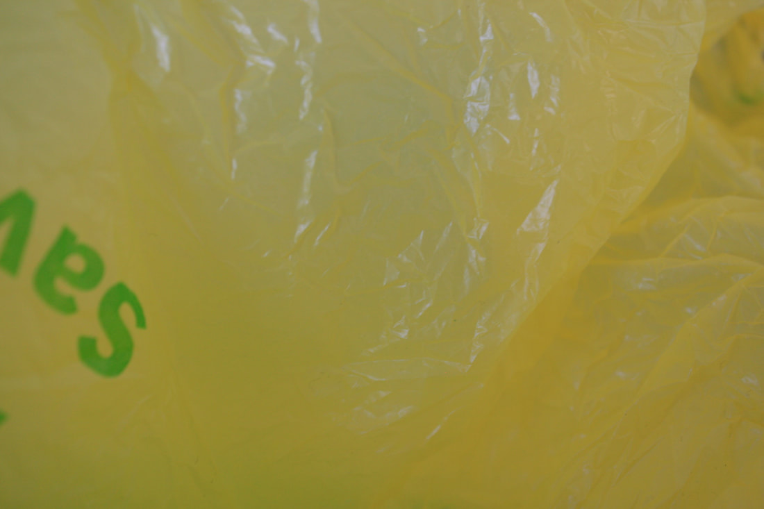
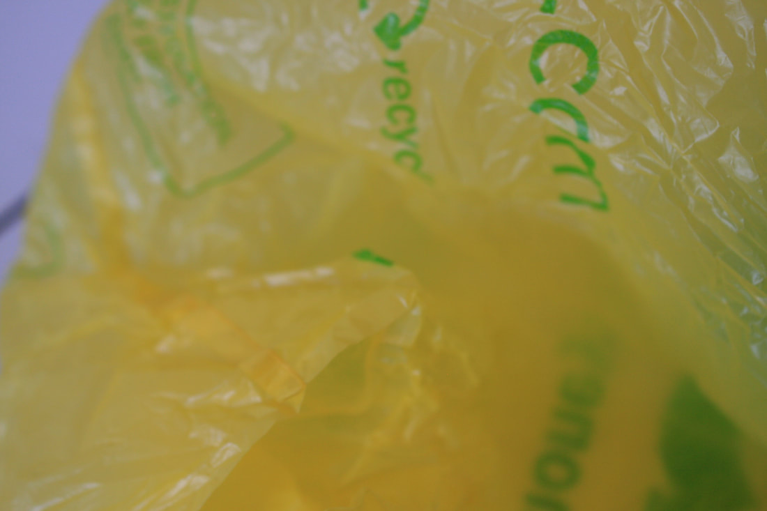
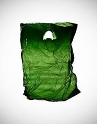
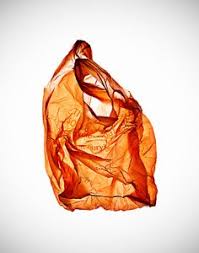
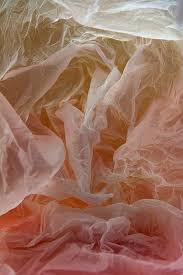
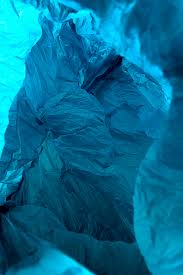
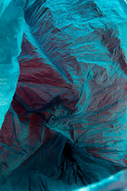
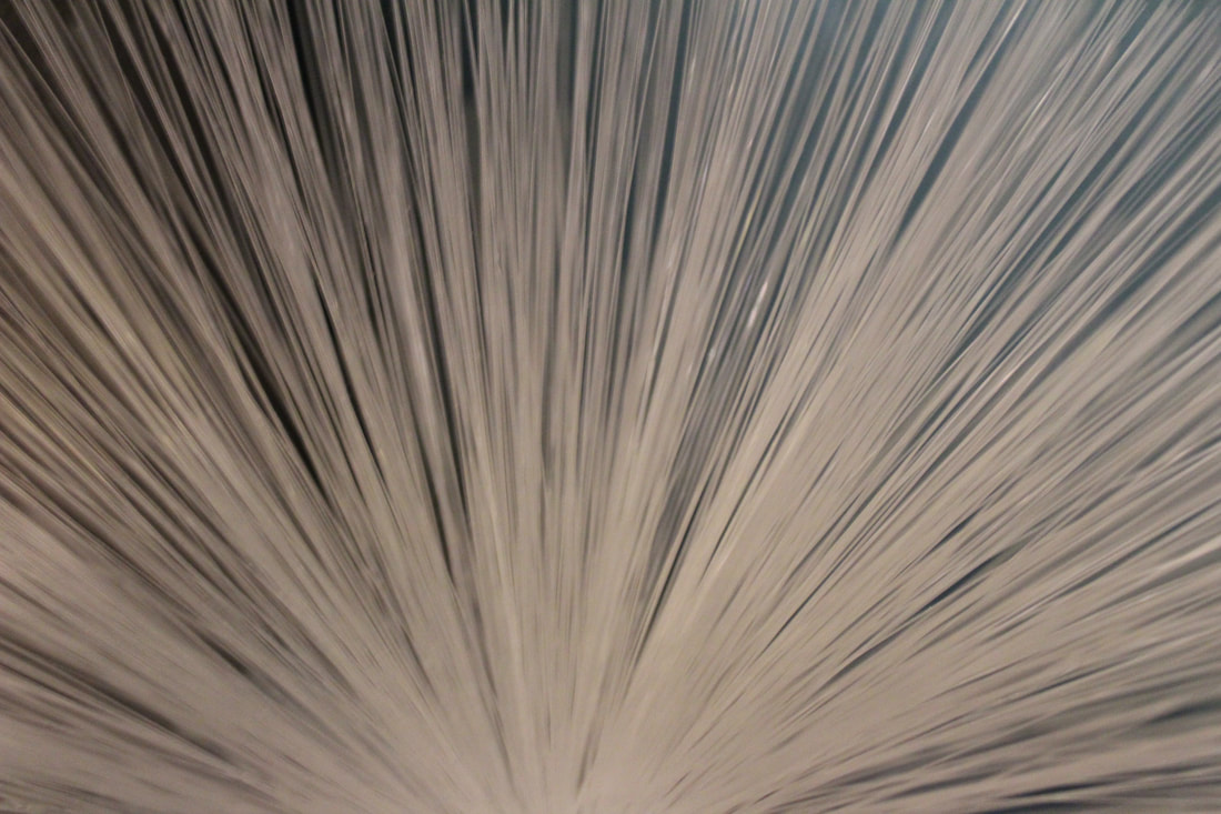
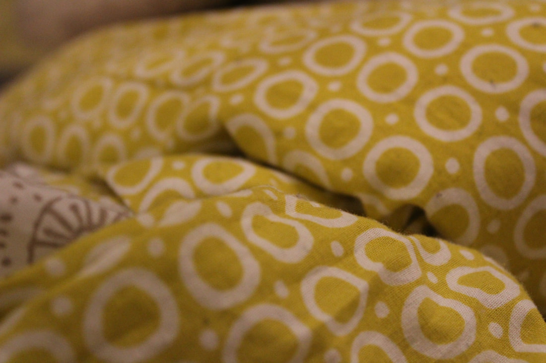
What I did here was use a plastic bag from ASDA because in my house we have a lot of them and I was inspired by Vilde J. Rolfsen photos and why I used ASDA's plastic bags was because they have different colour plastic bags.

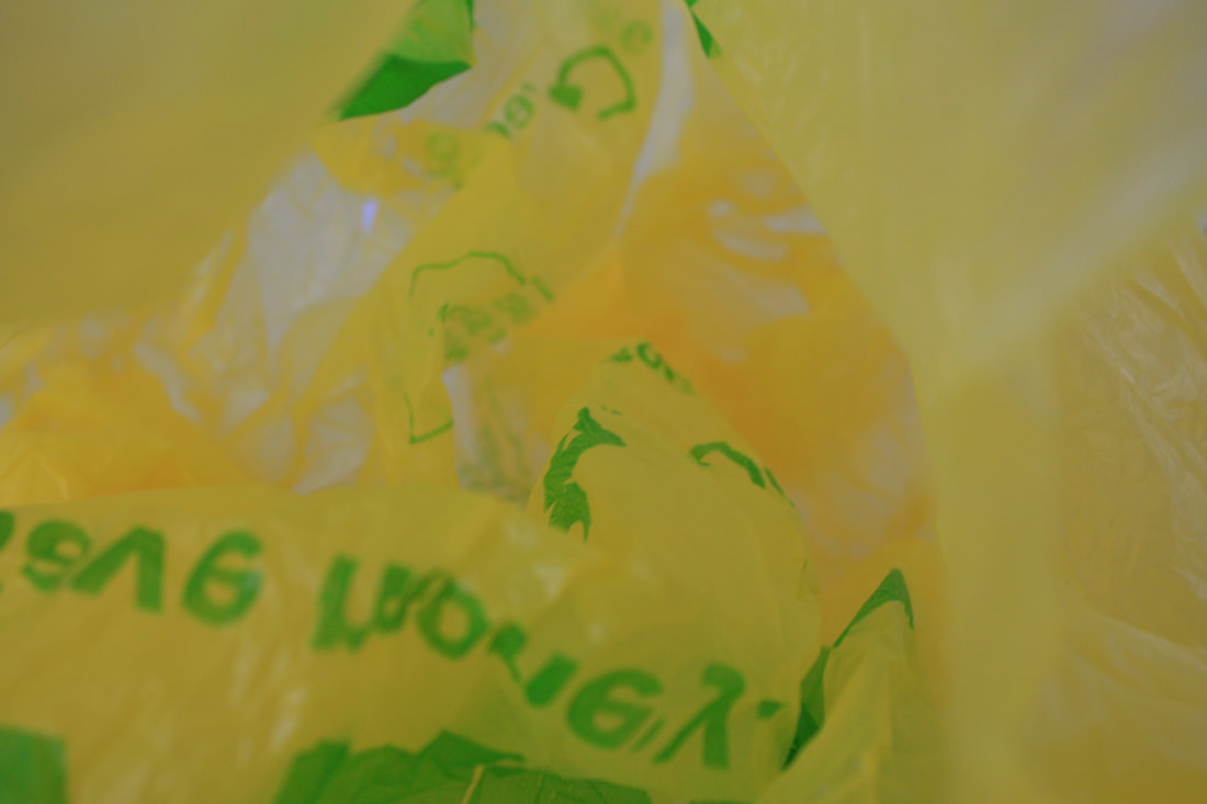
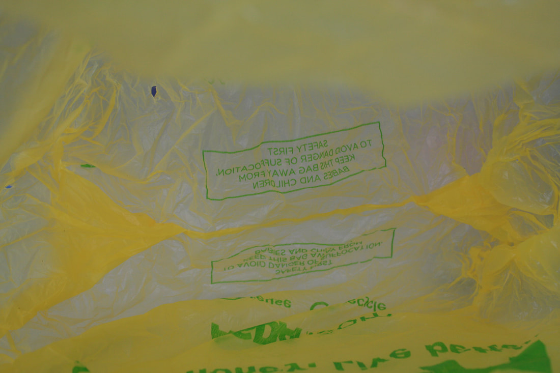
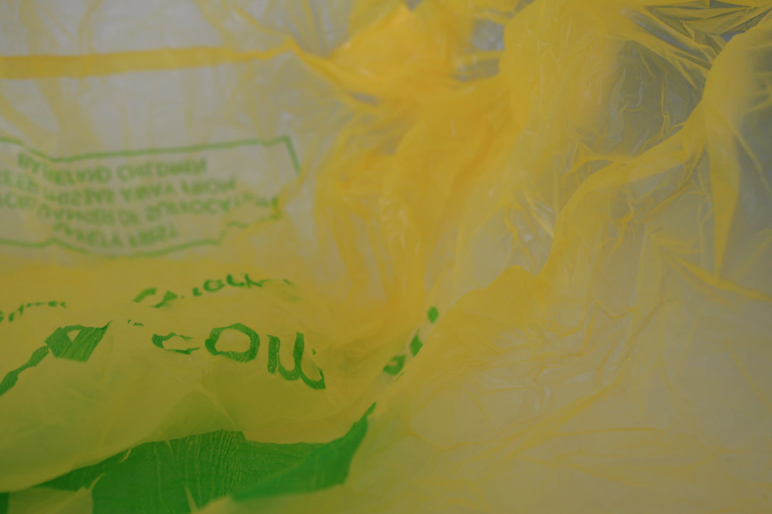
These four photos were the best out of the ones I just took photos why because you can see the bright yellow really well and see the faded yellow its almost look like you can see through it but you can't and you can see the folds and the writing thats in bright green I do like how the photos can out but there is a part of me that think it is missing something or needs something because it looks interesting but not that interesting at the sometime maybe if I do it again and go with the plan I have in minded I would feel better about these photos.
What I plan on doing next is use different colour bags like green, red and white\clear maybe more, play with lighting and mix the bags together to see different colours why I want to do this because I want to see different colour and see which one comes out because a different colour may make it more interesting and why light it might make the folds in the plastic bags come out more and you could maybe see them more.
What I plan on doing next is use different colour bags like green, red and white\clear maybe more, play with lighting and mix the bags together to see different colours why I want to do this because I want to see different colour and see which one comes out because a different colour may make it more interesting and why light it might make the folds in the plastic bags come out more and you could maybe see them more.
